Flat Theme
-
@itsnitro I wouldn't hold your breath on that. He's been busy with work, might be faster for you to check out some Photoshop/gimp/inkscape tutorials on YouTube ;)
-
@herb_fargus Alright, I might give this a shot.
It's gonna be harder though with my program, Paint.net. -
@lilbud Also, the IRC chat? How do I get into there?
-
@itsnitro https://kiwiirc.com/client
-
There's nobody on.
-
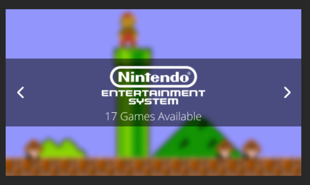
Started to think of ideas for the carousel, I had this one as I was walking home from school. I think it looks nice.
-
That looks cool, but the size and font of the "Games Available" section make it look awkward.
-
@thedeathstar so, would it be better if it wasn't there? or just different font?
-
@lilbud the font for games available needs to be way smaller. It shouldn't be the focal point, it should just be a small accent, providing a bit of information.
The width of 17 Games Available should be no wider than the word SYSTEM.
-
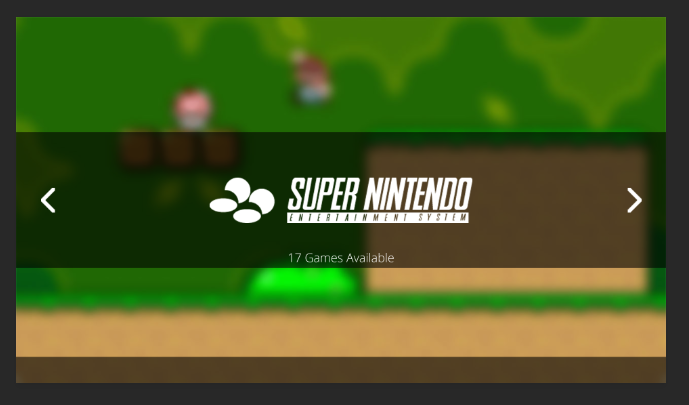
@Keigan how about something like this?
-
@lilbud Yeah, that looks a lot better. There's something about the bigger spacing between the numbers than between letters that made it look to me like that line was shifted right of the center. I think the smaller size fixes that.
-
@lilbud better!
Something still seems a bit off, I think I would us a condensed font and force caps, but that is just my preference.
-
A or B?
A:
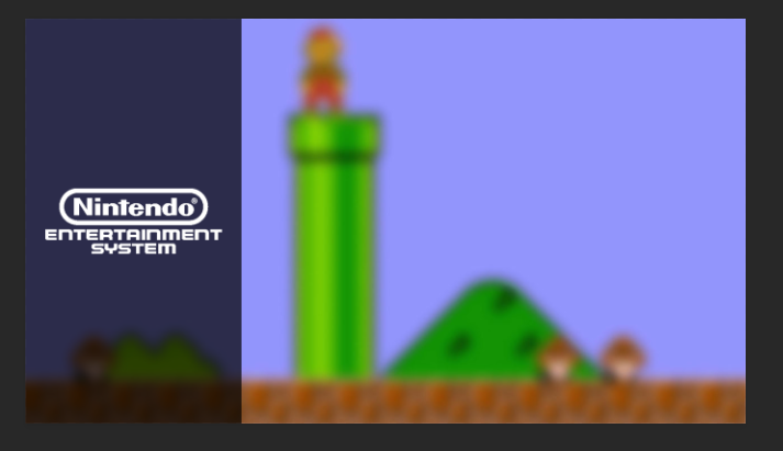
B:
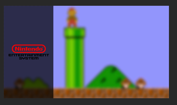
-
Just kidding! I like the red "Nintendo" but I would also like the white "Entertainment System" below it.
-
-
-
Hi, could you add a steam folder like other themes have?
Thank you!
-
@kbronctjr Steam has been added
-
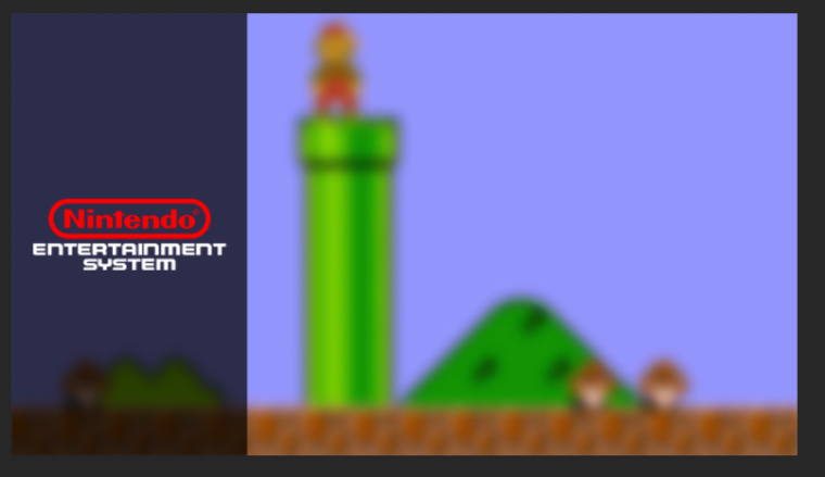
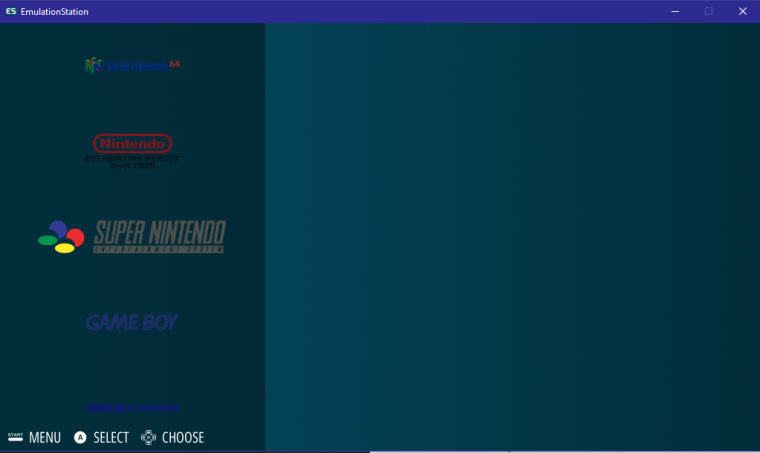
What does everyone think the system select background should be? When trying the new carousel, the colors don't end up looking that good.
-
Contributions to the project are always appreciated, so if you would like to support us with a donation you can do so here.
Hosting provided by Mythic-Beasts. See the Hosting Information page for more information.
