SNES UK Box Resto's...
-
Front is a good start ^^
And it works in both way ;) if you "look" for good starting picture, don't hesitate to take them on the website ;) -
@Danorak1981 Impressive work! Just like @screech said the community really need guys like you.
Keep up the great work mate!
-
Just wanted to point this out, someone over at the cover project did the same thing, but for all 700 official NES games.
www.thecoverproject.net/forums/index.php?PHPSESSID=6070a92efbc9ccead7cd7353f3daef2e&topic=20088.0
-
@lilbud said in SNES UK Box Resto's...:
www.thecoverproject.net/forums/index.php?PHPSESSID=6070a92efbc9ccead7cd7353f3daef2e&topic=20088.0]
::Edit:: seems to be working now...
Link doesn't work, would love to see them: not overly impressed with the NES ones I have now so any improvements would be welcomed!Yeah, no way am I committing to 700 boxes haha! I have a 16 month old girl, Pi time is precious enough as it is! I'd be happy with two a week I think. Responses have been positive though which is nice: I can't code to save my life but at least I've contributed a little something, with the scope to contribute a little more!
-
@Danorak1981 No one said to, it took him months
-
-
I stumbled across some nice artwork at Stone age gamer
they offer printable bit boxes, and though these are not the original dimensions, it may be useful to someone, and thought i would share.
though it costs for printing a bitbox, they do offer free downloads if you want to print your own.
for example, go to http://www.stoneagegamer.com/bitbox-snes-prints.html
scroll to the bottom where it says download art.
-
I think some of you guys might appreciate this.
This is my personal SNES 2D box art set. I've remade and touched up most of the SNES box art to make them look cleaner and more uniform (logos and such all in the same position). I've also made box art for some of the more popular ROM hacks that didn't already have box art floating around anywhere. There are also Super Famicom boxes as well.
This is not a complete SNES set, but has virtually all of the good games in it. There are a little under 800 boxes.
https://drive.google.com/open?id=0B1VEYI5Xz677YTVDTld2aExTM3M
Forgot to mention that all of the file names are shortened, so they're not using the typical NoIntro/GoodSNES naming convention. I did this so I could type the directory quicker in emulationstation.
-
@Rion Thanks, that's kind of you to say!
@screech Whats the best way to send the artwork to you? My translation skills aren't great so if I could send them to you for you to use as you see fit I'd be fine with that?
@lilbud I know, hence the 'haha'...
@detron Thats a really handy link: I've already found artwork that's better quality than some of the images I have downloaded: I've used another site similar to that, so it's good to have a collection of resources.
@cylum Those are really neat. You've got some nice clean images there, I may use some of them in replacement for some of the artwork I have that isn't up to scratch if you don't mind?
-
It's no problem. Use them as you wish.
-
Im impressed by the work submitted here by everyone. @screech Have you considered adding this to the screenscraper.fr database?
-
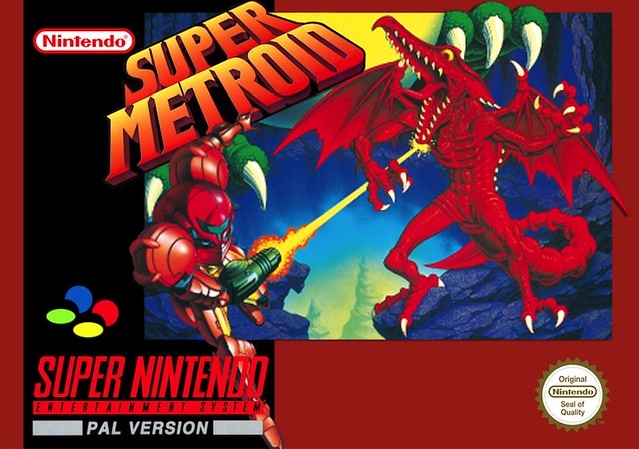
It's a slow pace, but I've added a few more since my original post: Metroid was particularly difficult, and not massively different from the original. Takes the total to 11 so far haha!
-
@cylum said in SNES UK Box Resto's...:
I think some of you guys might appreciate this.
This is my personal SNES 2D box art set. I've remade and touched up most of the SNES box art to make them look cleaner and more uniform (logos and such all in the same position). I've also made box art for some of the more popular ROM hacks that didn't already have box art floating around anywhere. There are also Super Famicom boxes as well.
This is not a complete SNES set, but has virtually all of the good games in it. There are a little under 800 boxes.
https://drive.google.com/open?id=0B1VEYI5Xz677YTVDTld2aExTM3M
Forgot to mention that all of the file names are shortened, so they're not using the typical NoIntro/GoodSNES naming convention. I did this so I could type the directory quicker in emulationstation.
Hi cylum, could you kindly provide a link to your box art set again? This one doesn't seem to be working. Thank you!
-
Sorry about that. I've been updating my drive a lot lately with new files.
There are now gamelist.xml files to go with the box sets along with other resources.
https://drive.google.com/open?id=0B1VEYI5Xz677cHR0QkRkTlphdms
-
@cylum Incredible work, and you have other systems too :)
I left you a little donation on PayPal.
Thank you, mate! -
@fabio78 said in SNES UK Box Resto's...:
@cylum Incredible work, and you have other systems too :)
I left you a little donation on PayPal.
Thank you, mate!Thank you!
Be sure to check the page every so often. I'm still working on other systems and continuing to update everything.
-
@cylum Will do!
-
Had a go at another last night. Quite difficult as I cannot find a good quality scan of the main artwork, so I just adjusted the levels and brushed out creases etc. I went to bed in the end, but wasn't happy with the main logo, so I spent a good 4 hours this evening recreating it from scratch. Quite pleased how it turned out over-all..
Original:
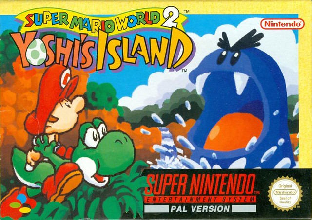
New Logo:
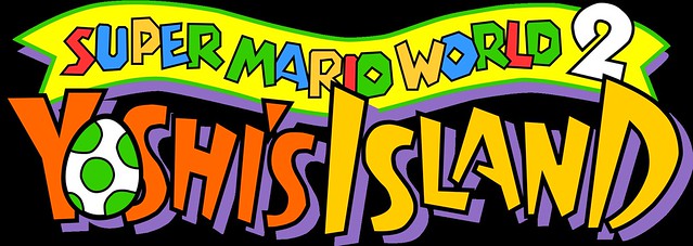
Completed cover:
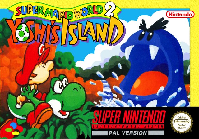
There is texture on the yellow backdrop on the new box, not really visible on here though. And at some point I added a small drop shadow to the box art but must have flattened the image before I realised because I can't remove it. Not too fussed though, still pleased with how it turned out! Labour of love this one!
-
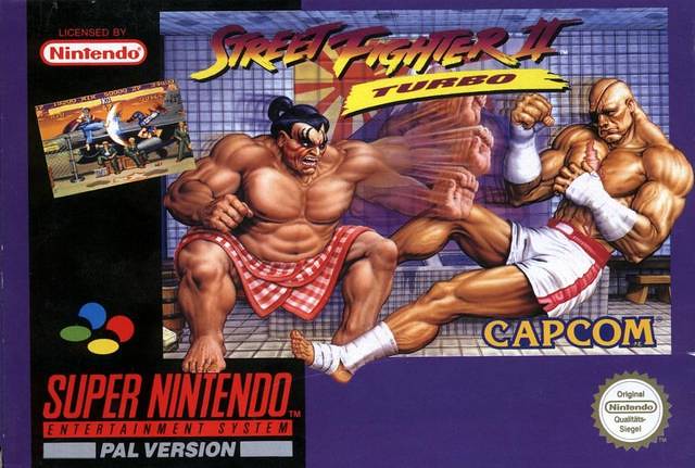
Another added to the collection this evening. Quite a poor quality UK scan, so pleased with how it came out:
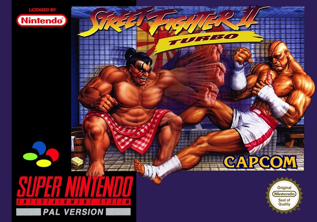
I recreated the logo in Illustrator too. I did create a second vector to use as a white drop shadow on the logo, as I was working on the logo from a US box originally-didn't realise there was no white drop shadow on the UK box until I'd finished. I added the drop shadow filter in PS, which doesn't make it as dark as the original as you can still see some of the white, but I don't think it looks too bad. And, you don't really see the box blown up full screen anyway, so I'm not too fussed. I dropped the really badly placed screen shot too, it's not uniform to the other UK boxes and looks so out of place-i think it looks better without it.
It's not 100% accurate-time will tell if I can live with the differences or not!
:: Edit::
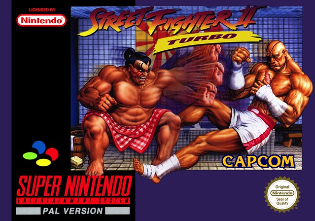
Yeah, couldn't leave it. Done it with the black drop shadow-I think it works better:
Contributions to the project are always appreciated, so if you would like to support us with a donation you can do so here.
Hosting provided by Mythic-Beasts. See the Hosting Information page for more information.