Cardboard Mini NES + Nes mini and Famicom mini themes
-
@felleg said in Cardboard Mini NES + Nes mini and Famicom mini themes:
I personally use the ! symbol to put my folders on top. Sadly, the ! symbol appears in many game names. Food for thought I guess
That's a shame it's such a commonly used symbol or it would be ideal - there must be something else that appears before numbers - I think I need to do some research.
@edmaul69 said in Cardboard Mini NES + Nes mini and Famicom mini themes:
@ruckage just to throw a monkey wrench in the ampersand "&". here is another ampersand that nintendo used. this is my favorite of the 3 and the one i use

That is a nice ampersand, and I agree best so far. I also like the exclamation mark, apostrophe etc. Out of interest do you know what games it was used in?
-
Just did a very quick bit of research and it looks like all these characters should appear before numbers:
! " # $ % & ' ( ) * , - . /We can definitely rule out ! & ( ) , .'
That leaves " # $ % * - /
Some of those probably can't be used in folder names so it's probably an even narrower list but what character do you think would be the best to use (and least likely to appear in a game name)
Edit: Just checked and it seems after excluding characters that are not allowed we have a choice of: # $ % -
-
@ruckage the "mario bros" and "press start k" fonts are the identical and this is the font set from them. The caps, numbers and some characters are from super mario bros. the exclamation point is from super mario bros as well. i cant find the complete super mario bros tileset to verify that the ampersand came from that one as well
-
@edmaul69 said in Cardboard Mini NES + Nes mini and Famicom mini themes:
@ruckage the "mario bros" and "press start k" fonts are the identical and this is the font set from them. The caps, numbers and some characters are from super mario bros. the exclamation point is from super mario bros as well. i cant find the complete super mario bros tileset to verify that the ampersand came from that one as well
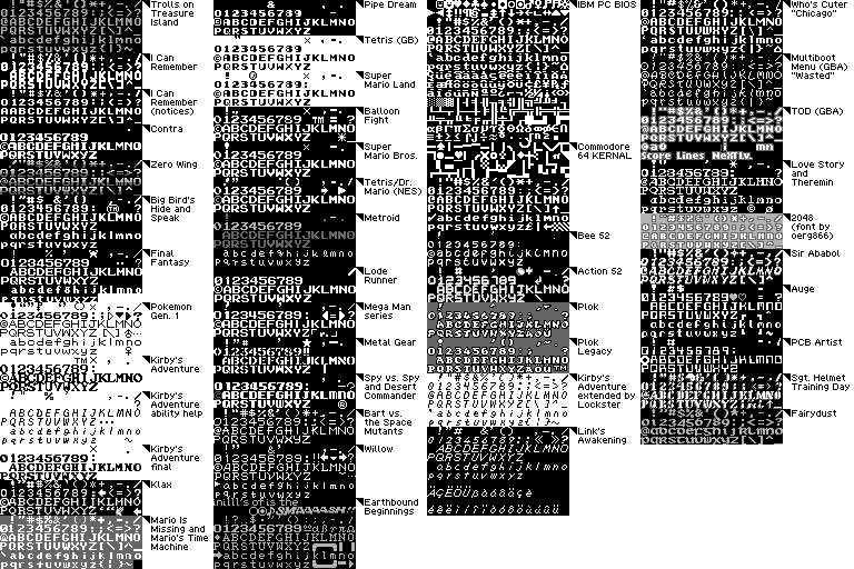
Thanks, I just found an image of lots of ripped font sheets from nintendo games which will be very useful.
-
@ruckage i found that too. You should download "nintendo nes font" and "classic nes font" both use the same "&" you use but they have other stuff. Both fonts has 3 exclamation points. One of them being the one i posted
-
@edmaul69
Wouldn't do any good downloading those fonts as they wouldn't work with the theme but I can easily edit those few characters into the current font using the font rips as a guide. -
@ruckage yeah thats what i figured. But at least you have a guide to help your font set. And their are alternate fonts for I, K, O, P, Q and R. Nintendo was weird for changing a couple font characters between some games and even in the same game.
-
Regarding the folder icon would anyone like to give any input into which character to use?
We have a choice of:
# $ % -I think # may be the best option as I can't think of any game name that would use that symbol and for other themes without an edited font the # symbol would still be quite a good way to distinguish folders.
-
@ruckage Definitely "#"
-
choose # :)
-
@ruckage #
-
@Squilenator @Stuart2773 @edmaul69
Thanks guys, # it is.
I'll update the font now and will also edit those few characters which could be improved (! & etc.) -
I've finished 3 more systems. No new file to download yet though as I should have a github repository working soon and then hopefully you'll be able to download the themes directly through Retropie.
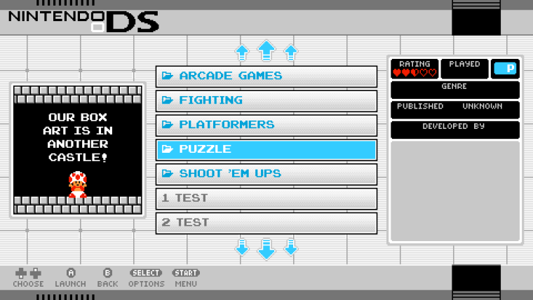
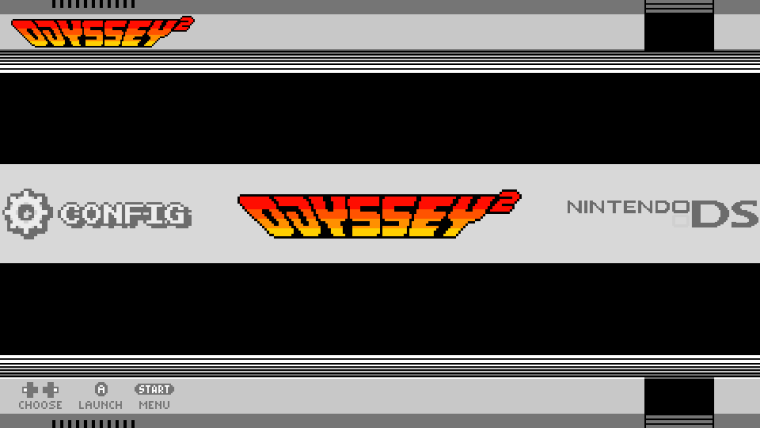
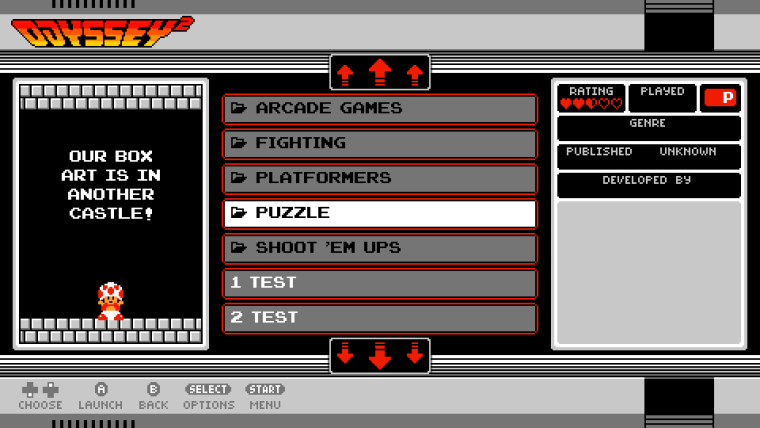
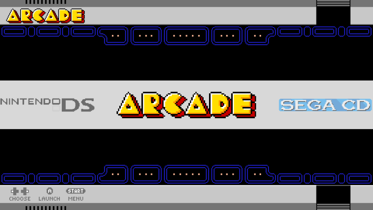
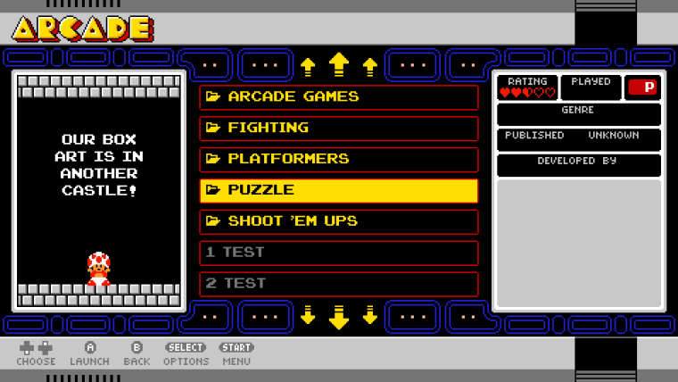
The 3 new systems I've added are:
Nintendo DS, Odyssey 2, and Arcade. You can see previews below.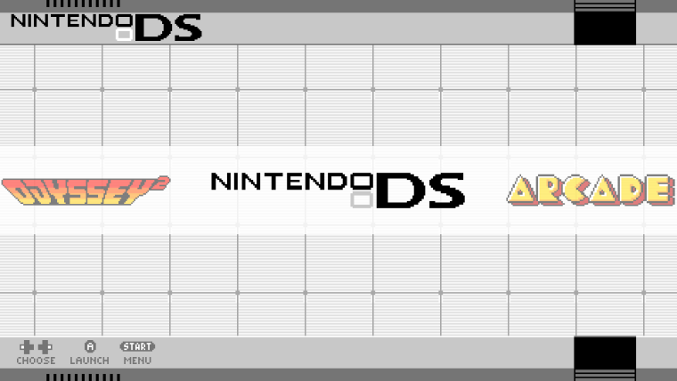
-
i really like the arcade theme :)
i think you should add the final version on here too, that gives the option then of downloading it via here and directly through retropie.
-
@Stuart2773 said in Cardboard Mini NES + Nes mini and Famicom mini themes:
i really like the arcade theme :)
i think you should add the final version on here too, that gives the option then of downloading it via here and directly through retropie.
Thanks - it was fun making the arcade theme.
I can certainly upload them here as well - I have a few more changes to make though as I need to change the way that the scraped artwork is displayed for all the arcade based systems. -
Just want to say thank you for your awesome work!
Dont know if you plan doing all systems, but i hope you could add Amiga to your to do list. :)
-
@ruckage said in Cardboard Mini NES + Nes mini and Famicom mini themes:
@Stuart2773 said in Cardboard Mini NES + Nes mini and Famicom mini themes:
i really like the arcade theme :)
i think you should add the final version on here too, that gives the option then of downloading it via here and directly through retropie.
Thanks - it was fun making the arcade theme.
I can certainly upload them here as well - I have a few more changes to make though as I need to change the way that the scraped artwork is displayed for all the arcade based systems.What do you mean by the way that the scraped artwork is displayed? It means you a planning on adding two formats to choose for boxart (Flyer and Screenshot)?
-
@AnalogHero said in Cardboard Mini NES + Nes mini and Famicom mini themes:
Just want to say thank you for your awesome work!
Dont know if you plan doing all systems, but i hope you could add Amiga to your to do list. :)
No problem - don't know how I didn't think of Amiga - will add it to the list. I haven't tried Amiga emulation yet and I should as I had so many years use out of my old faithful Amiga (I still miss deluxe paint - and did actually continue to use it emulated on my PC not so many years back as there was an iff import plugin for photoshop).
@Squilenator said in Cardboard Mini NES + Nes mini and Famicom mini themes:
What do you mean by the way that the scraped artwork is displayed? It means you a planning on adding two formats to choose for boxart (Flyer and Screenshot)?
No, you can only pick what artwork is scraped using the scraper itself (sselph scraper for example has setting for choosing which artwork to scrape).
What I'm actually doing is for the arcade systems (mame,fba arcade etc.) is changing the way the artwork is scaled. The way artwork is displayed at the minute is that it's stretched to fill the boxart area - this is fine for consoles as they tend to have standardized box sizes.
The trouble with arcade systems is the artwork scraped could vary wildly so could look very distorted. So instead I will just scale the art to fill the boxart area as much as possible without changing the aspect ratio. This means artwork wont fill the boxart holder but also won't be distorted which I think is the best option.
This may also be the best option for other systems that don't have standardized boxes. -
@ruckage you should hurry up and get that GitHub repo sorted I'm looking forward to it!
Great theme!
-
One that I don't think was mentioned that would be nice to add (low priority of course) would be Daphne as well. But overall love what you're doing so far.
Contributions to the project are always appreciated, so if you would like to support us with a donation you can do so here.
Hosting provided by Mythic-Beasts. See the Hosting Information page for more information.