Cardboard Mini NES + Nes mini and Famicom mini themes
-
@ruckage Didn't see C but like the top and bottom version :)
-
i choose the mystery box! (C)
-
@Syhles said in Cardboard Mini NES + Nes mini and Famicom mini themes:
@ruckage
I like the new look symmetry is important, but personally on the right metadata box I'd flip it, (rating, player etc.) at the bottom, genre at the top. Also this is my personal opinion, I'd use the theme regardless.I'd agree with this.
-
Oops, forgot to label the mystery box but that seems to be the most popular. Here's one last change then as requested, I've swapped 'rating/played/players' with 'genre'.

-
Im glad you like my mock-up AB, just after i realised that, it would look better if the ratings was balanced out on the right box , but obviously you had the same idea as me lol,
"C" is my favorite, if i was you i would just go ahead and make those changes and then release the next version :)
-
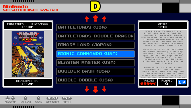
D>C>B>A
E is gonna be great. ;)
-
Lets just skip to F & upload that version!
;)
Only joking, D looks great.
I want the D!
Wait....that doesnt sound right.....
xD
-
-

I'm adding to the pile, but since you look at the box art first, wouldn't having the Rating/Played/Players work better on the right?
As a bonus, it starts matching the the tiled layout on the mini:

-
Thanks for the feedback everyone, I appreciate it.
I think we could go on forever rearranging things and everyone would have there own idea of which looks best so I'm going to go for option D as the official layout.
However what I'm going to try and do is make it so that the positioning of those elements is super easy to modify for those who would like to do so (it will probably be a single line change in the main XML with instructions for how to change it in the readme) does this sound like a good idea?
-
@mediamogul
love that movie! I haven't watched it in awhile though. -
@SystemLogoffSA said in Cardboard Mini NES + Nes mini and Famicom mini themes:

I'm adding to the pile, but since you look at the box art first, wouldn't having the Rating/Played/Players work better on the right?
As a bonus, it starts matching the the tiled layout on the mini:

I was thinking the same but didn't want to say it!
-
As I said I will be making it very easy to customize so everyone can set it up how they like, it will mean editing an XML file but it will be no more than changing a single entry.
For ease it will probably be an xml called layout.xml that will need changing and you would just change a line that will look something like this:
<include>./../layout_a.xml</include>
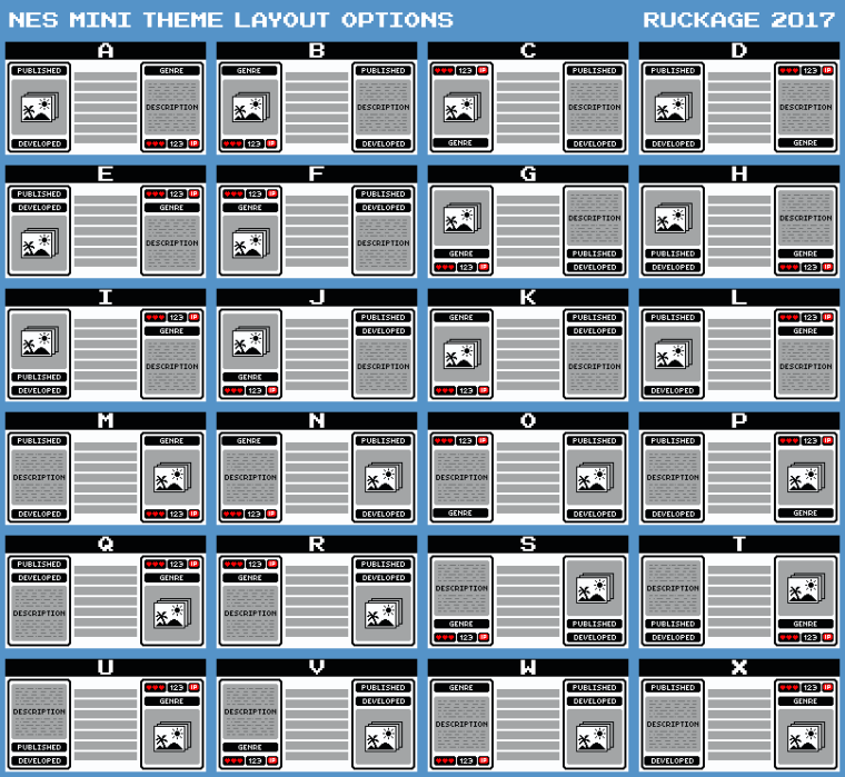
And you would only need to change the 'layout_a.xml' to 'layout_b.xml' to have a different layout (I will include a picture showing the different layouts with the corresponding letter for each).
-
ruckage this is a great theme and i wanna give you the thank you, please keep the good work, there is any chance to add a few more systems? Atari Lynx, Sega Dreamcast, Sega SG-1000, Sega 32x and Nintendo VirtualBoy, I think with that is more than complete, in any case again thanks for this great great work
-
@bjose2345
Hi. They are on the list but I can't say exactly when they will be ready but I will get to them eventually.~~~ PROGRESS UPDATE ~~~
I'm progressing well with the updates, it's quite a lot of work as a lot needed to be modified. The background and metadata containers are now separate elements, and the metadata containers are actually further split into separate elements so every element can be colored and positioned within the xml. The layout system seems to be working well so there will be a wide variety of ways to arrange the metadata so everyone should be happy :) . -
@ruckage Glad to hear word of you progress, take your time buddy, we know this is a hard work but you are doing very well. Many thanks again.
Kind regards
-
The metadata layout system is in and fully working now. I think there should be a layout to suit most peoples needs now so hopefully everyone will be happy :) (there are 24 options to choose from).

Still a few things to be done but I hope to have a new version ready sometime tomorrow.
-
Wow, someone's been busy, great guide, can't wait to try the new version :)
-
@ruckage looks excellent!
-
Could i request a simplified version? where every system would share the same background with the exception of system logo?
Contributions to the project are always appreciated, so if you would like to support us with a donation you can do so here.
Hosting provided by Mythic-Beasts. See the Hosting Information page for more information.
