Cardboard Mini NES + Nes mini and Famicom mini themes
-
@Stuart2773
Hi Stuart.Feel free to modify the theme how you like for your personal use however the rounded corners/drop-shadows are only actually on the Famicom mini menu (though I personally like the round corners and shadows as well). Also as much as I like the icons I didn't add them as they serve no function within ES so are superfluous and possibly confusing to a casual user (plus placing them at the top as you have on the nesmini theme would cause some problems as some of the system logos would cover that area.).
Personally I'm not sure about the help icons in red - I did try that myself when designing but it doesn't look right to me somehow - they work well against the dark blue which is where they appear on the real menu but not so well on the light grey.
Anyway, a lot of this is personal preference so modify it how you like it :)
-
I've been busy all evening and now feeling very tired but I have a Famicom-mini theme ready to try.
Ironically it doesn't support Famicom yet as I've just built it to the stage where it matches the Nes-mini theme but I should be adding Famicom, Snes, GBA and Megadrive/Genesis over the weekend. This version also has sound effects for the scroll list and game launch using wav's that reddit user soulctcher dumped from a real nes classic. Sadly ES doesn't seem to support playing sounds for any other events or I would add more.
You can download it here: Famicom-mini ES theme
Thanks to @Stuart2773 for the inspiration to make this
Edit: I've just noticed that retropie is showing lots of errors on exit due to a small mistake I made. I've already fixed it but won't upload a new version until I've added the new systems as it still works despite the error (just a missing image).
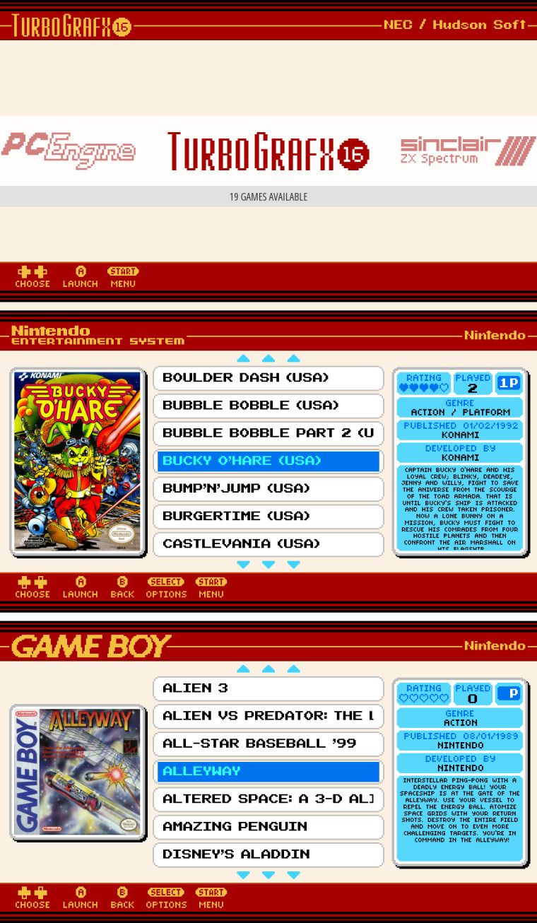
-
Great work!
Is it me, though, or are the background boxes for the tg16 boxart too small?
I've tried downloading three different versions and they all seem to be longer than the box background border is...
Do I just have the wrong set of boxart?
Thanks!
-
@momaw27 said in Cardboard Mini NES + Nes mini and Famicom mini themes:
Great work!
Is it me, though, or are the background boxes for the tg16 boxart too small?
I've tried downloading three different versions and they all seem to be longer than the box background border is...
Do I just have the wrong set of boxart?
Thanks!
Thanks for the feedback.
It's probably a mistake on my part, I think I've forgotten to adjust the image size in the tg16 xml file. (i'm fairly certain I didn't change it on the nes-mini theme either). I'll make sure I fix it for the next updates.
-
Thank you!!
-
Thank you ruckage! I can't wait to try this out on my rpiz.
-
I'm going to do some more work on both themes today, I noticed a few minor scaling artifacts with the Famicom-mini theme on the raspberry pi so I'm currently converting everything to vector to hopefully stop the issue.
-
Well, vectorizing everything got rid of the scaling artifact I was seeing at 1080p but introduced some different artifacts, and worse of all made the ES startup time painfully slow so back to the drawing board. I think I'll go back to PNG images and try pre-scaling everything to 1080p and see if that produces better results (ideally in both 720p and 1080p).
Out of interest are most people using retropie on a 1080p display? I assume they are.
-
im using 1080p display,
BTW, was the scaling artifact appearing on the 2nd from top game selection tab?
-
@Stuart2773 said in Cardboard Mini NES + Nes mini and Famicom mini themes:
im using 1080p display,
BTW, was the scaling artifact appearing on the 2nd from top game selection tab?
Thanks for the reply.
Yes, you can see it on the 2nd from top game selection tab (on the very right) and also on the gold stripe at the top for some systems (try gameboy).
The reason it's happening is that this is all based on an image which is 240 pixels tall. This multiplies evenly into 720p but doesn't into 1080p. This means when scaling the size of some of the pixels has to vary - this usually happen on a row or column basis so for example one row of scaled pixel may appear as 4 pixels high while another may be 5 pixels high.
For some reason though ES when scaling doesn't seem to scale the same across the entire length of the row so you end up with a step like this:
This is just a mockup but it shows exactly how the artifact appears on the pi.
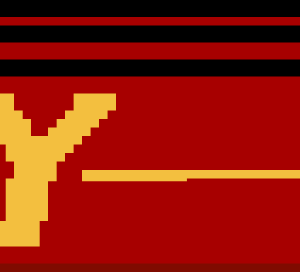
I could of originally used a base resolution height of 270 pixel which would divide evenly by 1080 but I was trying to mimic the nes classic menu as faithfully as possible and that uses 240 pixels (i believe it outputs at 720p). 30 extra pixels doesn't sound a lot but it would have altered the overall look quite a bit.
Pre scaling works well however and fixes the issue at 1080p but does produce a very slightly anti-aliased picture at 720p but still very acceptable. I have several options now.
-
I can scale using Nearest neightbour - this produces the sharpest pixels but will result in varying row heights (this is unavoidable but it doesn't have the artifacts which the ES built in scaling produces). For me this is the best option as it's a lovely clean image at 1080p. Downside is it's very slightly anti-aliased 720p display.
-
I can scale using bicubic - this will give the illusion that all rows and columns of pixels are the same width/height but the image is noticeably softer. Downside - neither 1080p or 720p will have really sharp defined pixels.
-
I can leave everything thing as it is - perfect 720p image but artifacts with 1080p - not particularly keen on this as the 1080p artifacts although quite minor are annoying me.
-
-
my mockup
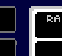
thats what i was experiencing on mine, and it was driving me mad
also i noticed a gap on the top when the boxart image has been added -
@Stuart2773 said in Cardboard Mini NES + Nes mini and Famicom mini themes:
my mockup

thats what i was experiencing on mine, and it was driving me mad
Yep, that's it. It seems to be a raspberry pi/linux specific issue as the artifacts don't happen on windows.
also i noticed a gap on the top when the boxart image has been added
Could you provide some more info regarding this - do you have a screenshot of the issue and does it only occur with a specific boxart image?
-
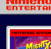
i get a thin black line above the boxart image,
some games its not too bad but on others its noticable,not sure if its just a resizing issue when scraping images?
-
@Stuart2773 said in Cardboard Mini NES + Nes mini and Famicom mini themes:

i get a thin black line above the boxart image,
some games its not too bad but on others its noticable,not sure if its just a resizing issue when scraping images?
Thanks Stuart.
The theme should be re-sizing the images to fit exactly (again though it could be due to a scaling artifact). Is it just that image or all of the boxart? could you post an offending boxart image here so I can check it and then I can modify the theme if needed?
Thanks.
-
Actually, don't worry Stuart. I've just double checked on mine and the black line is there as well (I just hadn't noticed it as most of the box art on mine was quite dark).
I think its due to the scaling of the background image - it doesn't happen on the famicom-mini theme interestingly enough but that is setup differently.
I'll work out a fix - it may just resolve if I scale the images to 1080p as I intend too but if not a small tweak in the xml files will fix it.
EDIT: small adjustment to the boxart position in xml file seems to fix it so I will apply that to all systems affected.
-
your a genius, can't wait to try the next update :)
-
@Stuart2773 said in Cardboard Mini NES + Nes mini and Famicom mini themes:
your a genius, can't wait to try the next update :)
:)
I'll hopefully have more updates sometime this weekend. I've been busy again but mainly just tidying up the theme so it's easier to work with and maintain. I've moved as much of the code as possible into the main nesmini.xml so that global changes are easy to do and I've created separate xml files for each of the box art sizes, many systems are using the same boxart size/shape so now if there is a problem like the black line above the boxart I only need to edit 1 file instead of 15. -
I've decide I will be scaling up the images to 1080p - I'd be very surprised if that wasn't the most commonly used screen res. The question is what scaling method should I use.
Below is a picture comparing Nearest Neigbour and Hermite scaling, (I think it should display fullsize but if your not sure right click and select view image and if needed click on the image again to see at full size)
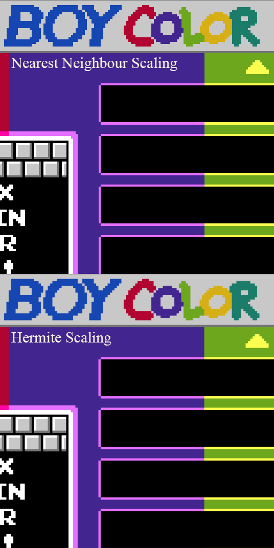
Nearest Neighbour
-
Pro. Perfectly sharp pixels
-
Con. Pixels can vary in size (can be seen quite clearly on the gamelist border and the arrow)
Hermite
-
Pro. Pixels appear to be uniform in size.
-
Con. Image looks a little softer
Opinions would be appreciated as I'm quite undecided at the moment.
-
-
not sure if i'm reading these last few posts right but FYI emulationstation already applies some sort of subtle smooth scaling on the pi. if you're only testing on windows you won't see it i guess!
@Rookervik 's pixel theme has a similar style and i think it has small source images. looks crisp here!
-
Nearest Neigbour all the man!
For a pixel theme I think sharp pixels are a must!
Contributions to the project are always appreciated, so if you would like to support us with a donation you can do so here.
Hosting provided by Mythic-Beasts. See the Hosting Information page for more information.