Cardboard Mini NES + Nes mini and Famicom mini themes
-
my mockup
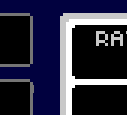
thats what i was experiencing on mine, and it was driving me mad
also i noticed a gap on the top when the boxart image has been added -
@Stuart2773 said in Cardboard Mini NES + Nes mini and Famicom mini themes:
my mockup

thats what i was experiencing on mine, and it was driving me mad
Yep, that's it. It seems to be a raspberry pi/linux specific issue as the artifacts don't happen on windows.
also i noticed a gap on the top when the boxart image has been added
Could you provide some more info regarding this - do you have a screenshot of the issue and does it only occur with a specific boxart image?
-
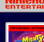
i get a thin black line above the boxart image,
some games its not too bad but on others its noticable,not sure if its just a resizing issue when scraping images?
-
@Stuart2773 said in Cardboard Mini NES + Nes mini and Famicom mini themes:

i get a thin black line above the boxart image,
some games its not too bad but on others its noticable,not sure if its just a resizing issue when scraping images?
Thanks Stuart.
The theme should be re-sizing the images to fit exactly (again though it could be due to a scaling artifact). Is it just that image or all of the boxart? could you post an offending boxart image here so I can check it and then I can modify the theme if needed?
Thanks.
-
Actually, don't worry Stuart. I've just double checked on mine and the black line is there as well (I just hadn't noticed it as most of the box art on mine was quite dark).
I think its due to the scaling of the background image - it doesn't happen on the famicom-mini theme interestingly enough but that is setup differently.
I'll work out a fix - it may just resolve if I scale the images to 1080p as I intend too but if not a small tweak in the xml files will fix it.
EDIT: small adjustment to the boxart position in xml file seems to fix it so I will apply that to all systems affected.
-
your a genius, can't wait to try the next update :)
-
@Stuart2773 said in Cardboard Mini NES + Nes mini and Famicom mini themes:
your a genius, can't wait to try the next update :)
:)
I'll hopefully have more updates sometime this weekend. I've been busy again but mainly just tidying up the theme so it's easier to work with and maintain. I've moved as much of the code as possible into the main nesmini.xml so that global changes are easy to do and I've created separate xml files for each of the box art sizes, many systems are using the same boxart size/shape so now if there is a problem like the black line above the boxart I only need to edit 1 file instead of 15. -
I've decide I will be scaling up the images to 1080p - I'd be very surprised if that wasn't the most commonly used screen res. The question is what scaling method should I use.
Below is a picture comparing Nearest Neigbour and Hermite scaling, (I think it should display fullsize but if your not sure right click and select view image and if needed click on the image again to see at full size)
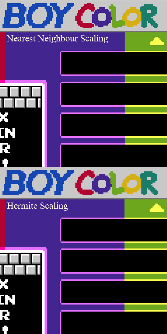
Nearest Neighbour
-
Pro. Perfectly sharp pixels
-
Con. Pixels can vary in size (can be seen quite clearly on the gamelist border and the arrow)
Hermite
-
Pro. Pixels appear to be uniform in size.
-
Con. Image looks a little softer
Opinions would be appreciated as I'm quite undecided at the moment.
-
-
not sure if i'm reading these last few posts right but FYI emulationstation already applies some sort of subtle smooth scaling on the pi. if you're only testing on windows you won't see it i guess!
@Rookervik 's pixel theme has a similar style and i think it has small source images. looks crisp here!
-
Nearest Neigbour all the man!
For a pixel theme I think sharp pixels are a must!
-
@dankcushions
Thanks for the reply, I'll test it and see(I thought it applied a bilinear filter?) but the problem I was having was there was some ugly scaling artifacts I was trying to eliminate. -
@dankcushions said in Cardboard Mini NES + Nes mini and Famicom mini themes:
not sure if i'm reading these last few posts right but FYI emulationstation already applies some sort of subtle smooth scaling on the pi. if you're only testing on windows you won't see it i guess!
@Rookervik 's pixel theme has a similar style and i think it has small source images. looks crisp here!
I was wrong, I just did a test and contrary to what I thought it actually appears to do nearest neighbour scaling but the scaling artifacts still appeared with the low-res images. Its not easy to see on busier backgrounds but as this theme has large areas of single colours it's more apparent think.
Thanks anyway, it was worth checking.
-
Are any of these themes going onto Github? Would love this to be added to RetroPie too :)
-
This is incredible! Sorry if this has been asked before but where do you get the HDMI cable which screws onto the back of the machine from? I really like how neat they make projects look but have never known where to find them. Don't even really know what to search for to be honest! Great project dude :)
-
@robertybob said in Cardboard Mini NES + Nes mini and Famicom mini themes:
Are any of these themes going onto Github? Would love this to be added to RetroPie too :)
Maybe, though I've never used Github so I'll have to look into it.
@postmangav said in Cardboard Mini NES + Nes mini and Famicom mini themes:
This is incredible! Sorry if this has been asked before but where do you get the HDMI cable which screws onto the back of the machine from? I really like how neat they make projects look but have never known where to find them. Don't even really know what to search for to be honest! Great project dude :)
Thanks :). I bought the HDMI panel mount from ebay.
Here is the link to the one I bought: HDMI Panel MountThere are cheaper ones but this one had a shorter cable which was ideal for my project. I did strip off the plastic sheath on the cable to make it slightly more flexible.
-
I really wasn't happy about the image scaling at 1080p so I took the plunge and re-made everything at a resolution of 480x270 which scales cleanly to 1920x1080. I really wasn't sure how it would look but I'm quite pleased with it. I've redone the graphics for both themes but have only started editing the famicom-mini theme xmls so far.
There are few benefits to this change:
-
Slightly longer game names will be displayed without being cropped
-
The game description window is a bit bigger.
-
The low-res images can be used as they should hopefully scale to 1080p now without any artifacts. This should reduce the amount of GPU memory needed which has been a problem in the past when using lots of systems (I think that has been fixed now but I still think it's good to save memory)
Here's a screen capture of how it looks.
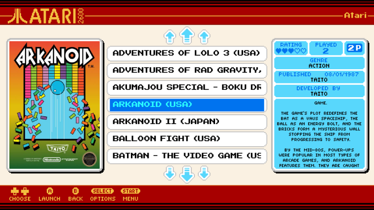
I wanted to keep the number of entries in the game list as an odd number so that the selection bar is in the middle when scrolling so I decided to stick with 7 names displayed at a time. As this left more space at the top and bottom of the list I have drawn some new larger arrows to use a little more of that empty area.
-
-
that looks pretty good :)
-
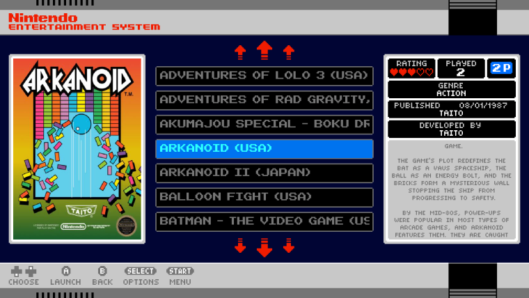
Here's a mockup of the 1080p version of the nes-mini theme (based on the famicom-mini capture). The arrows are simpler than the famicom version to fit the style and are coloured red now so I have some of the red on dark blue as seen on the real nes classic menu.
-
@ruckage So impressive , I cannot wait to see the SNES , Super Famicom Themes you are planning :)
-
Oh yeah!!!
Looking great!
Do you have your next release planned yet?
Contributions to the project are always appreciated, so if you would like to support us with a donation you can do so here.
Hosting provided by Mythic-Beasts. See the Hosting Information page for more information.