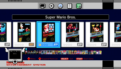
Horizontal Game List
-
Is it possible for the gamelist to scroll horizontally rather than vertically? Like the ps4 menu.
-
@lilbud not without coding changes to the ES core.
-
It's an interesting idea though. It sort of ties into something I've been wanting for a while, which is having a different meta tag for each image type (a <screenshot> tag for screenshots, <logo> tag for logos etc). That way you could use the game logo instead of the game name, the same way the system logo works.
-
I think the gamelist could definately benefit from some improvements and bug fixes though I appreciate it's easier said than done - especially as there is the potential to break old themes and not to mention the work it would require.
Horizontally scrolling gamelists would be nice but to expand upon that it would also be nice to be able to rotate the gamelist and other element by 90 degrees (or maybe arbitrary angles would be possible for more interesting design options) - this would enable the creation of menus designed for vertically oriented menus for arcade cabinets.
Another nice feature would be a way to theme the selector bar for the gamelist (perhaps ninepatch could be used?) or allow it to be placed behind other elements so that you can use transparency of an overlayed image to change the look of the selector bar that way.
Bug wise there seems to be some quite nasty bugs with the gamelist for example changing the linspacing stops the selector bar from lining up with the text (I actually had to modify a font on my theme to make the selector bar line up). It also doesn't seem to scale correctly - e.g for my theme I need the text to line up with boxes in the background. At 1080p it works perfectly but if you view it at 720p the text no longer lines up but tecnically it should as sizes and coordinates are all defined as a ratio of the screen and no other elements have the same problem.
I understand though everyone has there wishlist for features and it comes down to the time and work involved to add these changes.
Sorry, seems like I rambled a bit there - didn't mean to hijack the thread.
-
@ruckage The main reason I brought this up is because I wanted to make a theme based off of the Nintendo Switch UI. But your NES-Mini theme could be closer to the real one with a horizontal game list.

-
@lilbud said in Horizontal Game List:
@ruckage The main reason I brought this up is because I wanted to make a theme based off of the Nintendo Switch UI. But your NES-Mini theme could be closer to the real one with a horizontal game list.

I haven't even seen the switch UI - I'll have to look it up.
Regarding my theme I wouldn't change it now anyway as too much work has been put into it and it doesn't matter that it deviates anyway to be honest - it was just good inspiration as a starting point. Also to really match it you would need images rather text for the list.The other problem I can see with a horizontal gamelist is if its text based unless you rotate the text as well you will only be able to display one or two game names at once.
-
@lilbud You may be able to create something using the Gridview mod for ES by specifying a grid size of 5 columns and 1 row.
Alternatively there is a theme already available for Attract Mode.
-
@dudleydes I'm not screwing with gridview further until its official.
Contributions to the project are always appreciated, so if you would like to support us with a donation you can do so here.
Hosting provided by Mythic-Beasts. See the Hosting Information page for more information.