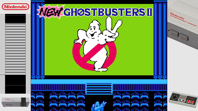
New NES overlays
-
@backstander Duly noted for the future. That's because of the spaces in the rom filename.
-
@backstander cfg's in the Repo updated (quotes added).
-
@meleu said in New NES overlays:
Actually the script is currently not able to install overlays to "home console" systems (arcade only). But this will change soon... ;-)
First post edited ;-)
And if you want an easy way to install Arcade overlays (Console support coming soon),
@meleu created a great dedicated script. -
@meleu said in New NES overlays:
The game specific launching images should be named RetroPie/roms/SYSTEM/images/RomName-lanching.png (or .jpg).
I'll try to update the wiki when I have time.Just updated the README.md in the Repo:
- Arcade vs Console
- launching images install
-
And here's a brand new generic NES overlay (includes also NES Classic).
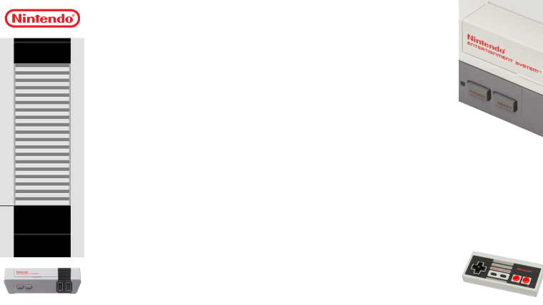
-
-
@backstander looks quite nice :-)
Of course suggestions for improvement are always welcome.
Thanks for making the screenshot. -
Of course suggestions for improvement are always welcome.
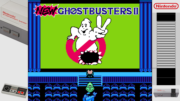
You might try swapping the bezel overlay images like this:
-
@backstander Ok, that's easy ! And you already did it it seems ;-)
-
@backstander @UDb23 I can't explain why, but I think the swapped version looks better (joystick on the left). :-)
-
@meleu Will change then. Tomorrow. ;-)
Cheers. -
@backstander @UDb23 Did you try this overlay with the game?
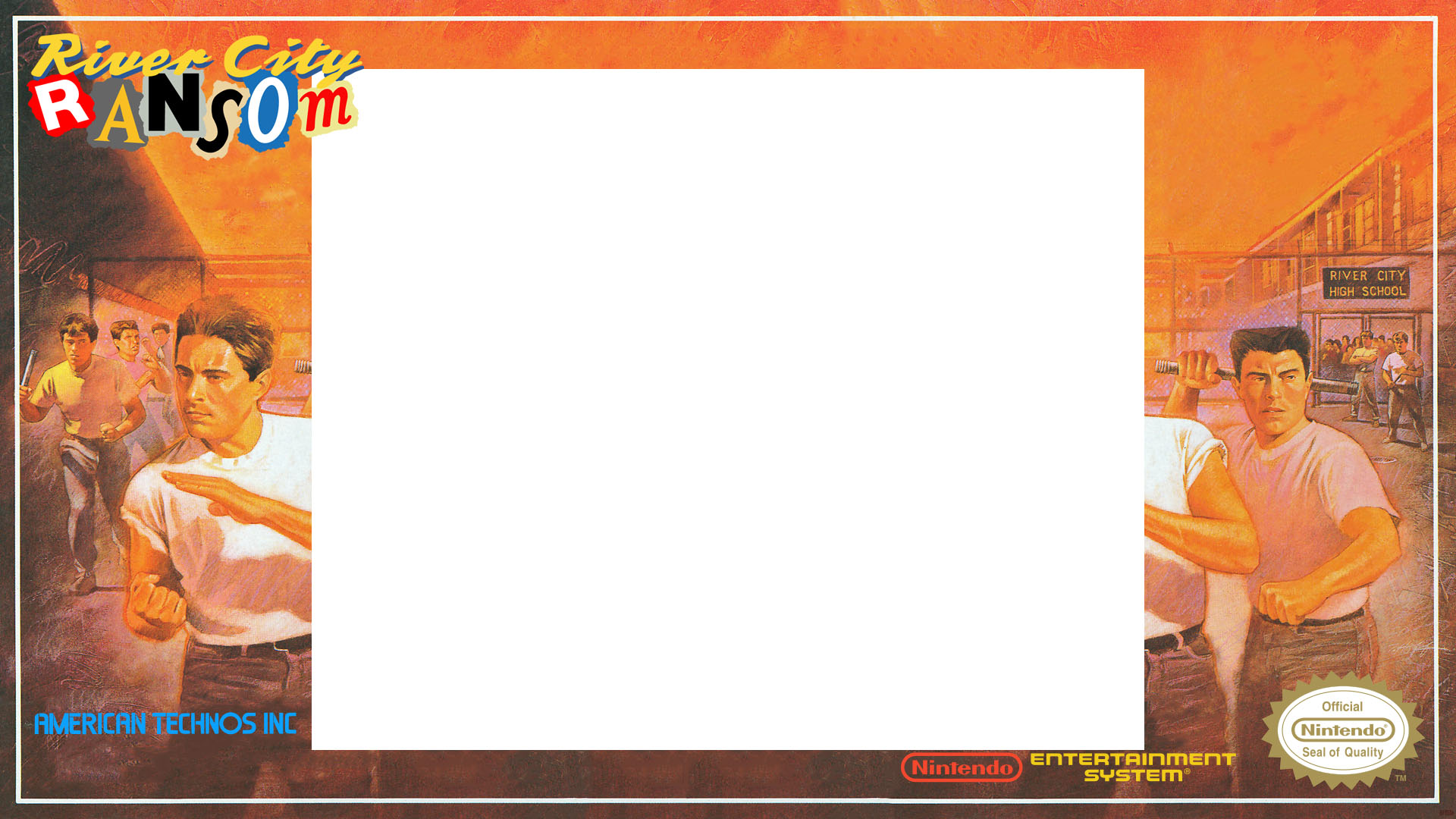
It didn't look good here. But I'm using a raspi1 and not sure if it's a resolution issue.
The overlay with sidebars only worked flawlessly!
@UDb23 I'm not sure but maybe it would be a good practice to release the sidebars-only overlays as default, and those that needs the
video_scale_integerbeing the optional. -
Did you try this overlay with the game?
No, I haven't tried it. I used the "sidebars-only" overlay because I knew it would be easier to setup and I don't want to shrink the game play area.
maybe it would be a good practice to release the sidebars-only overlays as default
I agree.
-
So just for fun and because I'm not an artist but I can do a simple picture crop and edit a couple text files...
I put together a generic "The Terminator" overlay for the NES (this could work with any of the Terminator games for the NES):
https://github.com/backstander/retropie-ovl/tree/master/nes/The Terminator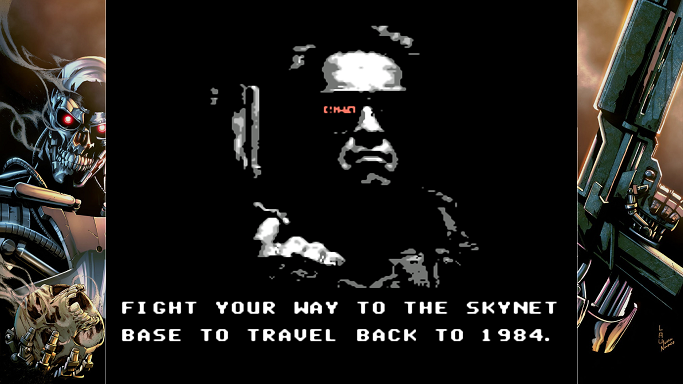
The image is from Ivan-NES and it is called "terminator-Robocop KillHuman1"
http://ivan-nes.deviantart.com/art/terminator-Robocop-KillHuman1-244529827I should also give @UDb23 credit because I just used his hard work as a template.
I might move the left bezel picture over a little bit but this was my first attempt.
-
@backstander Well done !!
-
@meleu said in New NES overlays:
Did you try this overlay with the game?
Yes, they were made for lr-FCEUmm (default: 1322 x1080 IS off / IS on: 1096 x 896 ).
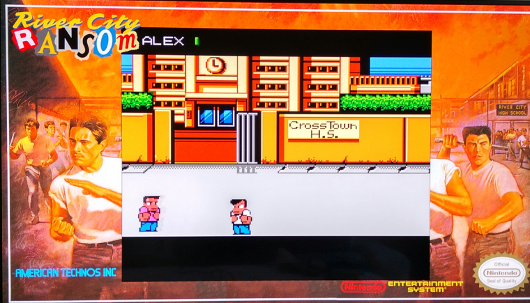
Lr-nestopia uses different game area size (see resolution.txt I placed in the nes folder in the repo).
But if sidebars works well I suppose you're already using FCEUmm.Also I fixed the quote issue in the cfgs now. Can you try again ?
I can't explain why, but I think the swapped version looks better (joystick on the left).
Done (plus gamepad recentered) .
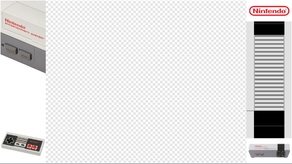
good practice to release the sidebars-only overlays as default,
Done. ;-)
Thanks for the suggestions. Repo updated.
-
I found out that The Terminator picture I used for my overlay was actually from a Terminator/Robocop crossover comic book by Rob Williams:
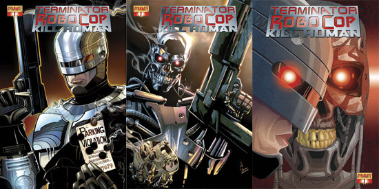
So why not make one for Robocop, you ask? Well here you go!
https://github.com/backstander/retropie-ovl/tree/master/nes/RoboCop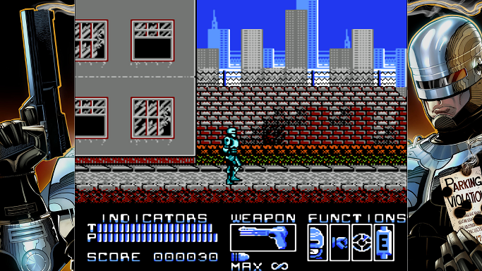
This could be used with any of the 3 Robocop NES games (or any other hacks).
Original image I used:
http://ivan-nes.deviantart.com/art/terminator-Robocop-KillHuman1-244530012Note I also tweaked the left bezel on the Terminator overlay today.
-
When I was on my way to work today I had the thought of using one of those original NES box covers and splitting the picture in half and placing each as bezels for an overlay. Then I was thinking of a game to test this out with and I went with Metroid.
https://github.com/backstander/retropie-ovl/tree/master/nes/MetroidI'm not sure how I feel about it but here are some screenshots:
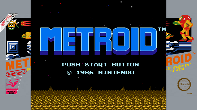
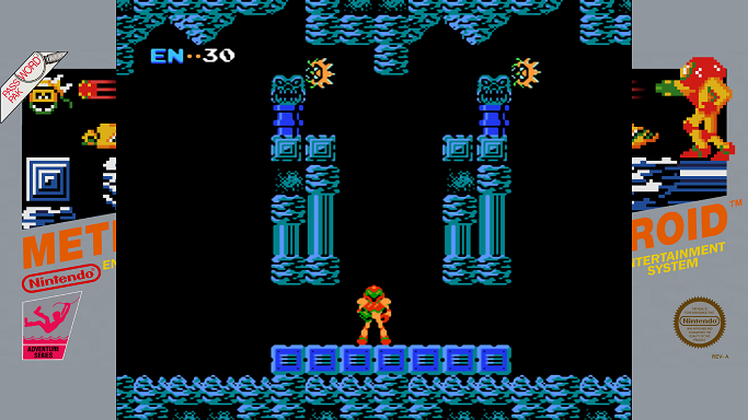
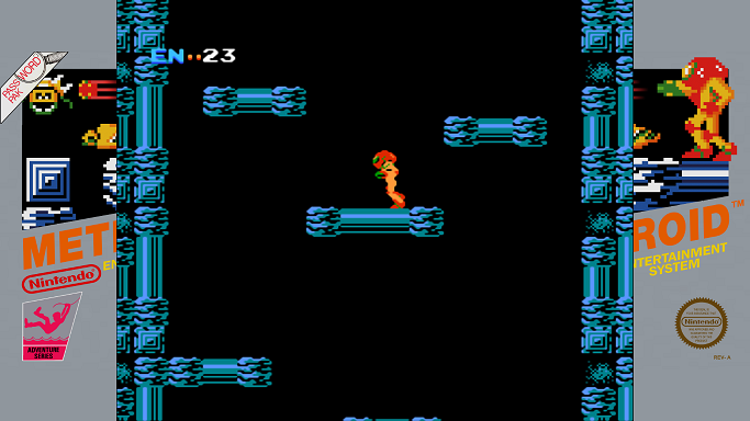
If you like this, please let me know. I might try some other split boxes.
-
Also while searching for a high res picture of the box art, I found this cool Samus Aran wallpaper and decided to cut it in half as well. Here are the screenshots:
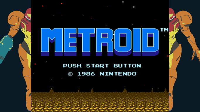
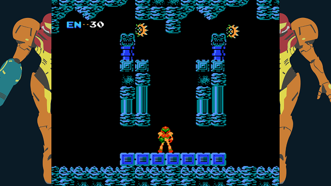
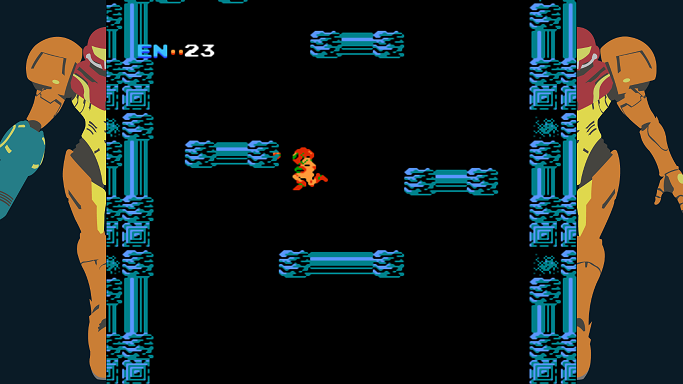
I don't know who the original artist of the picture is but here is the original:
http://i.imgur.com/tyM4Br4.png
(While splitting this picture in half I discovered that Samus is exactly 20 pixels off from being centered lol) -
@backstander said in New NES overlays:
If you like this, please let me know. I might try some other split boxes.
I liked! And would like to see this for Balloon Fight. :-)
Contributions to the project are always appreciated, so if you would like to support us with a donation you can do so here.
Hosting provided by Mythic-Beasts. See the Hosting Information page for more information.
