SNES mini theme
-
Looking good! I think your backgrounds look better than the SNES Classic's backgrounds.
-
Could you add a white variant of your colorfull background
-
@ruckage
I setted framebuffer to 480x270 and used 1920x1080 layout.
That don't look good. All rom texts are outframed. I got more luck with 320x240 the ROM texts are just one or two characters outside the boxes (see from left) -
@mattmanforever said in SNES mini theme:
Looking good! I think your backgrounds look better than the SNES Classic's backgrounds.
Thanks :)
@sergioad said in SNES mini theme:
Could you add a white variant of your colorfull background
Sure, there will be lots of options to choose from.
@cyperghost said in SNES mini theme:
@ruckage
I setted framebuffer to 480x270 and used 1920x1080 layout.
That don't look good. All rom texts are outframed. I got more luck with 320x240 the ROM texts are just one or two characters outside the boxes (see from left)I think you're going to have to show me some photos of the problem, without seeing it it's almost impossible for me to work out what could be wrong. Something can't be right as at that resolution it should display perfectly.
-
I've made a bit more progress. The theme was a bit laggy on the pi due to all the layers so I've optimised it and it's running smoothly again (on a raspberry 3 at least).
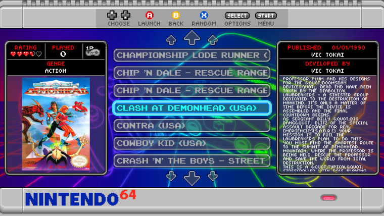
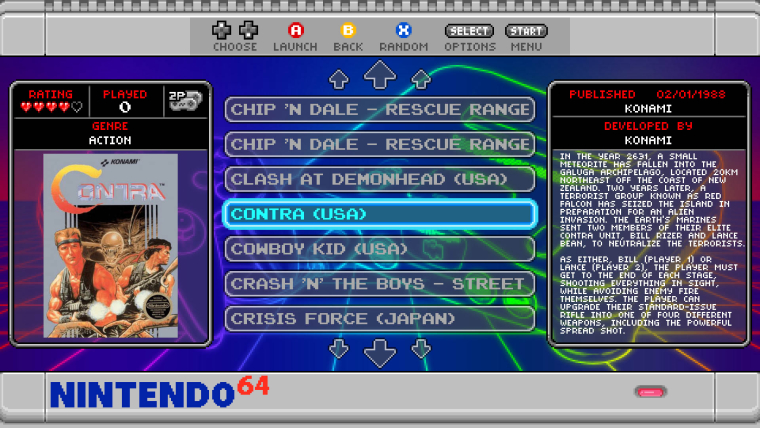
I've also added the controller icons for the number of players on the game select screen - these will actually change to reflect how many players the selected game supports. If you look at the screenshots below you can see a 1 player game and a 2 player game - notice the icon is different for each (lets see if you can figure out how I've done it ;) ).


-
-
-
@ruckage You did the same thing in your Neo Geo X theme you made a while back.
Plus I saw the opportunity for a stupid gaming related reference and ran with it.
-
@lilbud
Not quite. Look at the icons again - how could I have done it using the same technique I used for the neogeo as that would only allow 1 solid colour. -
@ruckage said in SNES mini theme:
how could I have done it using the same technique I used for the neogeo as that would only allow 1 solid colour
Look, I already called out your witchcraft in a post above, just tell.
-
@lilbud said in SNES mini theme:
Look, I already called out your witchcraft in a post above, just tell.
Nah, not yet. You give up too easily :p
-
i really like the design and colors of this theme I thought Nes-Mini was awesome and you one uped yourself man good job now I just wanna see the us version preview and I will be happy no rush just excited
-
<text name = "md_lbl_players"> <path>./../assets/player_1.png</path </text> -
@lilbud
No, wouldn't work - try again ;). Firstly that's for a label - it wouldn't change based on the metadata. Secondly you can only use text for labels as far as i'm aware (hence the text tag). -
-
@greekmanx said in SNES mini theme:
i really like the design and colors of this theme I thought Nes-Mini was awesome and you one uped yourself man good job now I just wanna see the us version preview and I will be happy no rush just excited
Thanks. The US version will be coming soon, i've already drawn the borders. It will actually all be the same theme, there will an option file so it can be switched between the different versions, colours, etc.
-
sweet thanks ruckage and I am excited to install this on my pi your nes mini is one of the few new themes that is super smooth with no lag on the pi and I hope this is the same. Also are you working on collections for this theme to at least my collections not individual ones so much a my collections menu like some themes I mean
-
@ruckage This looks really cool. I have to be honest, I'm most intrigued by how you've created the console artwork in the backgrounds. Did you take existing photos of the consoles and then run them through some filters (in photoshop or whatever)? Or did you actually draw each console individually?
I tried doing it the first way for my Indent theme, but couldn't get it to look how I wanted, so I ended up doing it the second way. It took a long time and I wasn't fully satisfied with the outcome.
-
@ruckage Is it a a custom font that is black that is overlaying/hiding portions of an underlying image? For some reason the 1p image isn't loading for me so I can't really compare them.
-
Trully gorgeous, can't wait to use it !!!
Do you plan to do others systems, like Atari ST/Amiga please ? :)
Contributions to the project are always appreciated, so if you would like to support us with a donation you can do so here.
Hosting provided by Mythic-Beasts. See the Hosting Information page for more information.
