Grid tile background size
-
@a12c4 I like both ideas. I feel that it should be up to the theme maker to decide what they like.
It'll probably be a few months until I can get back to theming, got a lot of work for school and (unfortunately) that comes first.
-
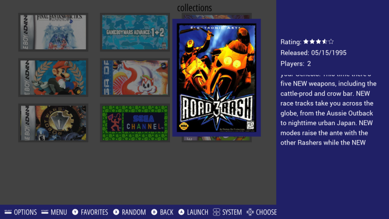
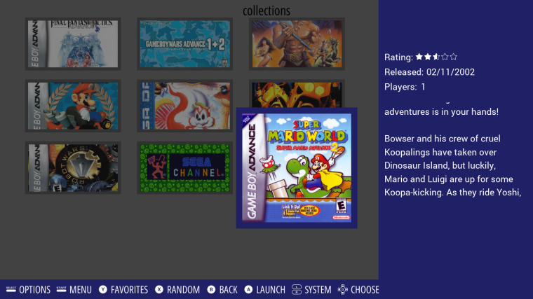
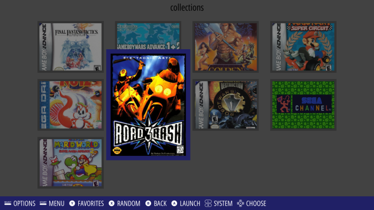
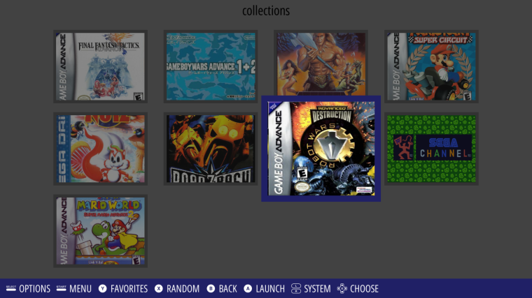
.
.
Damn it look so clean. But the big problem is this :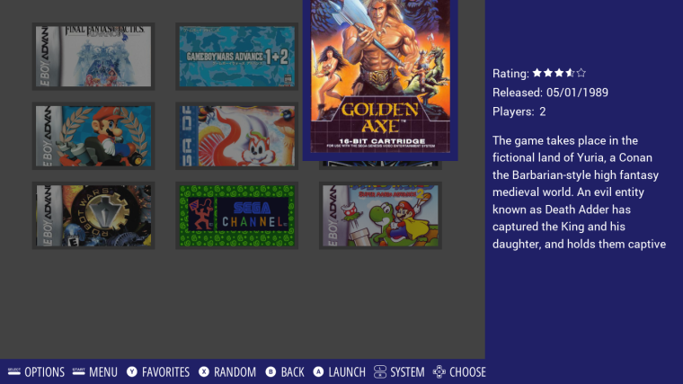
EDIT : I need to add extra more code so the selected tile position change dynamically if it's close to a border of the grid (first/last row/column), brb I need to check if it render properly.
-
@lilbud If it was only up to me I would allow theme makers to do whatever they want. But the thing is, giving more options to theme makers create more complex code.
So, we have to judicious eliminate bad options (those which have no or nearly no use case, those which add way too much complex code for too little benefits, etc ...)
At least that's how I see it, maybe @jdrassa have a different opinion.
-
@a12c4
I like the way its going, we could find a solution when the top and bottom rows are reached.
maybe restricting the selection row only for the middle one, and when you scroll up the snaps go down and the same when going down. In that case you will avoid the overlapping of the selected game and the top/bottom of the screen.
I love the aspect ratio of the third image, it will take more advantage on square and portrait images making the crop smaller -
@lilbud
You are right! I think it will be a lot of instructions for him. That's what I did with my entire library -
@chicuelo As I said previously, it's ok for bottom and top row, we can center the selected row without problem.
But, we have the same problem with left and right column, and I can't use the same solution because that mean the grid would scroll both vertically and horizontally, which look really strange.
Another solution would be to change the position of the tile, so when the selected tile is in the left column for example, we make sure only the top/right/bottom side grow and the left side don't move, so we don't get out of the grid.
That's what I'm currently trying to do, but it's way harder than I expected, if we combine that with giving the theme the 3 possibilities I proposed earlier (fit the image inside the tile, fit the image inside the tile + stretch the background to the image, resize the image to the tile + cut the extra part), then I fear the code will be completely unreadable.
-
@a12c4 could you implement different code for vertical art and square art? Like if the art is taller than wide, one code is used but if it closer to square then another code is used.
Sorry if this makes no sense, I know jackshit about programming...and jack left town
-
@lilbud How do I decide if the art is taller than wide ? For all game independently ? For the whole collection ? What about custom collection then ? This ones can have very different art aspect ratios.
I think I should take a step back from this, stop working on this part of the grid for the moment and come back to it later on.
-
@a12c4 Maybe have the image size reported, or a simple inequality
Like if y > x, art is tall, or portrait. Genesis/NES
If x > y, art is horizontal. SNES
X = Y, art is square. GB
-
@a12c4
I see, the solution you are trying is the best, because making the grid moving horizontally will make look strange -
Hi everyone and @A12C4
I'm a bit late but do you think some things like this could be doable with the grid view ?
So basically, a screenshot/fanart of the game or whatever for the background (default system background if nothing else available) and a logo for the game name (default font if no logo found).
And of course a place on the background where game infos would be displayed.Thanks for your work ;-)
-
@neeeeb Pinpoint me the time in the video, it's 14 minutes long and he try many different layouts.
-
@a12c4 ah sorry, I was pretty sure I had copied the link to the exact moment I wanted to show in the video...skip to 2:32 that's what I want to show.
-
@neeeeb There is 3 things I see that could prevent you from creating an ES theme with the exact same behavior.
First, the grid game list view don't have scrolling animation for now.
Second, this have been asked a couple of times already, the cursor of the grid isn't always centered, it can go left or right when close to the beggining or the end of the list.
Third, I'm not sure about this one and it doesn't really depend on me. I think you would have to take your own screenshots, because from what I saw, the scraped screenshots usually have low resolution so if you set them fullscreen they may be a bit pixelated.
-
Ok, well the third point is not a big problem, that could be added to ScreenScraper by a simple and kind request to the Admins ^^
The 2 other points are more problematic yes.
Well I'll be patient, I'm pretty sure sooner or later you'll come up with something so much customizable that it will allow that kind of thing ^^
Again, many thanks for bringing the grid view to Retropie ;-) it was really missing ! -
@neeeeb Kodi esque layouts are probably more probable in pegasus
-
@herb_fargus oh nice, totally missed Pegasus, still have a lot to learn abour Retropie I guess ^^
-
@a12c4 So I finally had some time, to test grid view with the windows build from May 3.
And I accidentally found an image that I used as tile background and it looks pretty awesome.
Apart from the already mentioned missing stuff (No extra media) and some other stuff, I noticed that the grid was using the images from<thumbnail>which are screenshots in my case.
One question, what's the best way to center a grid?<origin>is (at least in my build) not available. By the way, thanks again for adding<origin>to<helpsystem>, it makes it so much easier to try fonts. -
@ectoone Yes the grid use the
thumbnailtag for now. If you know what a thumbnail originally is, it make a lot of sens, as the grid have to display many small images. But in ES thethumbnailis used display small screenshots in the place of the video when it's not playing. Allow the theme or user to use any type of media (screenshot, marquee, 2d box art, 3d box art, ...) will be one of the first enhancement I will focus on after the V1 of the grid view is out.Yes,
originisn't available for now, but centering a component manually isn't that hard, you just need to do a bit of math to calculate the position depending of the size. -
Hey @A12C4 I've been having a play with the grid, very good work! Loving it.
Just a quick question, is there any way to add padding to the background in the current version?
Basically I have set an image background and would like the boxart to sit in the middle of it without it overlapping the background edges (stroke/outline) if that makes sense?
Contributions to the project are always appreciated, so if you would like to support us with a donation you can do so here.
Hosting provided by Mythic-Beasts. See the Hosting Information page for more information.