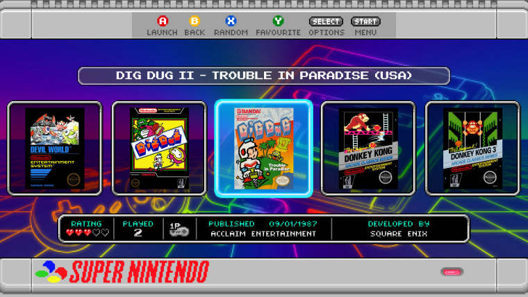
SNES mini theme
-
Awesome work ruckage, love so much nes mini theme, you plan to add Kodi support?
-
@ruckage It look really nice, love what you have done with my sweet little grid view.
By the way, you can make it so the last row is truncated (or the last column if the grid is scrolling horizontally). I think it could look nice in your first mock up (the one row horizontally scrolling grid).
-
Looks incredible! I really love the third option. Just wish it had the title displayed somewhere but am not sure where to suggest it could go.
-
@a12c4 said in SNES mini theme:
@ruckage It look really nice, love what you have done with my sweet little grid view.
By the way, you can make it so the last row is truncated (or the last column if the grid is scrolling horizontally). I think it could look nice in your first mock up (the one row horizontally scrolling grid).
Thanks for the reply. I had experimented with having the edge tiles truncated with the carousel style as that would be the ideal look but unless I'm missing something that only seems possible with the very last column which means it would only be truncated on the right hand side and the grid wouldn't be centred. I can enter a negative x position to centre it but then the first item on the list is never fully displayed on the screen. Is truncating at both the beginning and end of the list possible in some way?
@livefastcyyoung said in SNES mini theme:
Looks incredible! I really love the third option. Just wish it had the title displayed somewhere but am not sure where to suggest it could go.
Thanks. Glad you like the larger grid view, I think for big lists of games especially that would be a much more useful way of navigating. I'd like to get the game title in that view as well, I think maybe replacing the publishing information with the game title would be a good option.
-
@ruckage said in SNES mini theme:
Thanks for the reply. I had experimented with having the edge tiles truncated with the carousel style as that would be the ideal look but unless I'm missing something that only seems possible with the very last column which means it would only be truncated on the right hand side and the grid wouldn't be centred. I can enter a negative x position to centre it but then the first item on the list is never fully displayed on the screen. Is truncating at both the beginning and end of the list possible in some way?
No, that's not possible at the moment. I had some plan on making the cursor movements more "realistic", by that I mean the grid would only scroll when you come close to one of the borders, instead of this dummy algorithm currently used : "cursor is always centered unless you are close to the beginning or the end".
I already gave it a few tries but I couldn't came up with something that truly satisfy me. So it's still planned but don't expect it to come anytime soon, there is better features on my todo list that are way less of an headache.
-
@a12c4 said in SNES mini theme:
@ruckage said in SNES mini theme:
Thanks for the reply. I had experimented with having the edge tiles truncated with the carousel style as that would be the ideal look but unless I'm missing something that only seems possible with the very last column which means it would only be truncated on the right hand side and the grid wouldn't be centred. I can enter a negative x position to centre it but then the first item on the list is never fully displayed on the screen. Is truncating at both the beginning and end of the list possible in some way?
No, that's not possible at the moment. I had some plan on making the cursor movements more "realistic", by that I mean the grid would only scroll when you come close to one of the borders, instead of this dummy algorithm currently used : "cursor is always centered unless you are close to the beginning or the end".
I already gave it a few tries but I couldn't came up with something that truly satisfy me. So it's still planned but don't expect it to come anytime soon, there is better features on my todo list that are way less of an headache.
No problem and thanks for the confirmation. I like the truncation but it doesn't look right for my theme if it's not centred so I'll stick to my original plan for now.
I can't wait for some of the features you've mentioned on the forum and in the wiki such as having videos and metadata in the grid tile and hopefully smooth scrolling/sliding tiles will also be implemented at some point as that would look amazing. -
@ruckage said in SNES mini theme:
A quick update, I've been working on mock-ups for the grid layout. Currently I have 3 different versions (but may add more) which you'll be able to choose from in the config file. For the first release the grid view will most likely only be supported in 16:9 screen modes.

I really like this view, would it be possible to customize it to remove the following:-
Ratings, Played, # of players, Published & Developed By? -
Option 1 would be great without the meta data.
-
@sp i think the metadata looks great in my opinion, makes it unique
-
I agree with @nestor1924 . Option 1 with metadata look better to me.
-
@ruckage Just wanted to say "wow". I know I'm late to the party, but this is a fantastic theme. I love it.
-
@nestor1924 said in SNES mini theme:
@sp i think the metadata looks great in my opinion, makes it unique
@a12c4 said in SNES mini theme:
I agree with @nestor1924 . Option 1 with metadata look better to me.
Thanks, I obviously agree myself but did have a feeling some people wouldn't like it as it deviates from the look of the NES / Snes classic menu. As there is currently no way to fully emulate the way that menu works anyway I see no harm in making some additions and think it's good to differentiate it from the original Snes classic menus. Personally I really like to see the metadata for games.
Having said that since one of the main aims of this theme is to offer as many customisation options as possible I will probably add an option to have that view without metadata so @Stuart2773 and @SP will have the look they want.
-
@pjft said in SNES mini theme:
@ruckage Just wanted to say "wow". I know I'm late to the party, but this is a fantastic theme. I love it.
Thanks, glad you like it :)
-
> Having said that since one of the main aims of this theme is to offer as many customisation options as possible I will probably add an option to have that view without metadata so @Stuart2773 and @SP will have the look they want.
thanks, for some reason i really hate metadata on all themes.
Hows the build going, any ideas on when a next release will be?
also, will the new version of the theme work straight out of the box or will we need to install that ES dev thingy in the experimental packages?cheers
Stuart.
-
@stuart2773 said in SNES mini theme:
also, will the new version of the theme work straight out of the box or will we need to install that ES dev thingy in the experimental packages?
The grid theme support is only available in the ES development branch, so you either install that or wait for the official release of the new ES version.
-
Far and away my favorite theme! I've just moved emulationstation to my PC, and I'm really, really missing it. Just wanted to say I'm looking forward to the updated version with more systems supported, and to thank you for doing such a fantastic job with it!
-
@geekcritique said in SNES mini theme:
Far and away my favorite theme! I've just moved emulationstation to my PC, and I'm really, really missing it.
What keeps you from installing the theme on Windows ? It should work there also.
-
@mitu said in SNES mini theme:
@geekcritique said in SNES mini theme:
Far and away my favorite theme! I've just moved emulationstation to my PC, and I'm really, really missing it.
What keeps you from installing the theme on Windows ? It should work there also.
It does work, but the main reason I moved to Windows was to add systems that my RetroPie wouldn't be able to run, such as the Saturn, Wii, and PS2. The SNES Mini theme doesn't have support for those systems yet, but @ruckage has said he's thinking of adding them.
-
Hi Ruckage,
I work currently on a EmulationStation fork that removes some features like VLC support and works on Windows and Linux. Currently I recommended the users to download your theme directly on your GitHub website for the look of the software.
But in France, the use of logos is not possible for this type of use, can only be used for information purposes. So I decided to create a new theme without the logos of the compagnies.
I see that about your icons :
" This theme is being actively developed, a great deal of work has been put into the theme and art so please do not use the graphics I have created in other projects.
You are free to modify the theme for your personal use only - please do not share modified versions of this theme. "Therefore, I would like to ask you if it is possible for you to grant me permission to use the icons of your theme only (so I'm only talking about icons of different media that you have made : i put a example in the post ) on a new theme that I want to create. If you accept my request, what are the indications that you would like me to indicate in a future "README" and "LICENSE" file?
Example of one of your icons in your theme :

Thank you in advance for taking the time to read my post and for your answer, and sorry in advance if I made English mistakes in my text.
Best regards,
Jackobo The Chocobo -
Terribly sorry for bothering you, but any updates on the update?
Contributions to the project are always appreciated, so if you would like to support us with a donation you can do so here.
Hosting provided by Mythic-Beasts. See the Hosting Information page for more information.