Switch Theme 3.0 (UPDATED 08/12/18)
-
IF YOU WISH TO ADD NEW ICONS, SEE THIS PAGE ON HOW TO MAKE THEM: https://github.com/lilbud/es-theme-switch/wiki/How-to-make-new-icons.
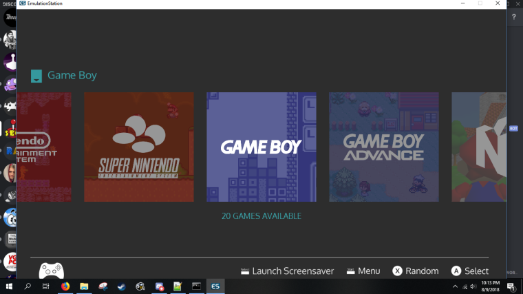
Over the last few days I have been working on this theme further. I updated all the icons a few days ago and decided to update the rest of the theme.
(Pictures Below)
There are many changes in this newest version, including:
- The Switch Theme no longer has two separate versions. As of this update, the light and dark variants have now been combined into one theme. The colors are toggleable via the
theme.xmlconfig.xml file. - You now have the option to switch between Playstation and Xbox buttons. (Also toggleable via the
theme.xmlconfig.xml) - The theme now supports 4:3 aspect ratio (Theme.xml)
- Colors updated to match system
- Selector bar has been added. Slim line next to selected game name.
- Marquee is now centered under video
Another big thing is the slimming down of the theme. Between the combination of light and dark colors and compression on the tiles, the whole theme is now under 5mb! Also, the memory needed is shrunken as well. You can get away with as little as 20mb of VRAM. Good news to those with full game sets and videos!
Pictures
System View - Light and Dark

PS & Xbox Buttons

4:3 System View

4:3 Gamelist

Link to download: https://github.com/lilbud/es-theme-switch
(Will be in the theme downloader soon)
- The Switch Theme no longer has two separate versions. As of this update, the light and dark variants have now been combined into one theme. The colors are toggleable via the
-
@lilbud looks very nice, congratulations and thanks for that!
-
If Y'all update. I added the number of games indicator.

-
@lilbud can’t wait to give this a spin. Thank you!
-
Tested light and is very laggy with default vram (80mb) on Pi3B.
Also lacks some systems.
Top notch quality, though. -
@darishzone What systems are missing? I know I took out a few worthless ones (Acacia, Adventure Vision,etc.)
-
@lilbud capcom systems for example ;)
-
@cyperghost you mean CPS?
-
@lilbud
yes ;) cps1 cps2 (and maybe cps3) are good platforms and worth a own "ES system entry" ;) -
-
@lilbud said in Switch Theme 2.0:
@darishzone What systems are missing? I know I took out a few worthless ones (Acacia, Adventure Vision,etc.)
X68000, libretro-Mame (ones i remember, sorry, can't check further)
-
@darishzone I'll get X68000. I kinda designed the Arcade section to be a catch-all. But I'll do a general Mame icon.
-
@lilbud I just tested this on my 4:3 CRT (pc monitor) at 640*480 resolution. It is missing the image on main page for Mame2003 and I think Game & Watch. Also when clicking a system, the text on top right is overlapping a little with its parts.
I currently use the previous Switch Light theme and it works perfectly. Text is perfect for this, way better than all other themes and every system image is on place. In fact, I don't have almost nothing to complain about it and tried the new one for curiosity. Just wanted say that.
-
Lilbud, here's all system missing i found:
X68000
Collections
Game and Watch
Mame-Libretro
PortsTheme needs vram set to 100mb on Pi3B, even this still taxing to me. Would be better if optimized for default value.
Keep on working on it mate, it's a great theme. -
@thelostsoul I made it a point on the github that 4:3 hasn't been tested. Could you send a picture of what you mean?
-
@darishzone I'm not even sure where I would begin with optimizing for default vram.
I am working on redoing the code and redoing some images. For example, the button prompts are entirely redone in vector and can be added on top. Therefore, the backgrounds don't have to be big 720p images. They can be shrunken down.
I am also combining the two themes. Making it easier on me to change code and add new systems.
-
@lilbud Can't you just do something like I did on my Flatline theme for the background? Using a 1x1 pixel as background color and for the lines and then add your icons/text on top of that. Maybe you need a better image that can be stretched for the lines to make it look more smoothly though.
But with that method it would also be simple to change colors. -
@ectoone That is the plan. I'm either going to use a 1x1 image and tile it to the background and add the lines separately. Or I will make the background with the lines and make it really small and have it scale up.
-
@lilbud I was never a fan of upscaling images so I never tried it on any of my themes. And like I said, using individual images makes it way easier to switch colors. If you would use an image which has lines already, it would be less flexible in my opinion.
Yet, using my method might look to rough so I'm sure you will find something that you like. -
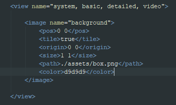
Anyone have an idea why this is happening?
So I am using a 1x1 image for the background and coloring it. That works on the basic/detailed/video views. But for some reason, it won't work on the system view


Contributions to the project are always appreciated, so if you would like to support us with a donation you can do so here.
Hosting provided by Mythic-Beasts. See the Hosting Information page for more information.
