Backdrops in mame2003-plus
-
It might be worth noting the background brightness/clarity between Plus and AdvMAME. They are quite different but both are using the same brightness setting in the .art file.
@Clyde - I forgot the ask does that no line shader work on the Pi or what does it do?
-
@Clyde and @grant2258 I commented out the yellow overlay for Omega Race. Thanks!
-
@markwkidd Thanks !!
-
@Riverstorm put tate mode on and see if it looks any better to you
-
@Riverstorm Which resolution do you use? Your forum images are significantly smaller than mine. Maybe that plays into the different vector lines?
I can look into my vector settings when I'm home, but maybe only tomorrow, because I will be home late today. (Weekly pub meetup. o/ᵁ ᵁ\o )
I'm using the VecX shader on my Pi using standard Retropie 4.4, but I don't know where I got it from. I found it in the directory I where keep @ghogan42's zfast shaders, but I couldn't find it for the sake of my life on the web. Really, where the heck did I get it from??
@markwkidd Thanks from me, too! \o/
-
@grant2258 - Ok, so I tried you're suggestion and that got me thinking and I tried it on a monitor and Plus actually looks great. I think I almost prefer it over AdvMAME. The lines are bit sharper (than the arcade) but still very nice and with the signature flicker.
So it's my TV that's causing the issue. I have no idea what I can do to fix that. I will try it on a few other TV's for testing. I am running RetroPie 4.4.4 and Retroarch 1.7.6 on a Pi3.
@Clyde - Sorry I sometimes resize them if I can't get them to upload on the forums. I think it's 1MB max or something along those lines. I could never link a image that displays properly on the forums. I use an HD TV so 1920 x 1080. A weekly pub meetup is sounding pretty darn good right about now. If you can't find it when you get back and recover, if needed, maybe you can upload it later this week.
Omega Race - 1912 x 1080 (1912 instead of 1920 which is those lost pixels we discuss)
Tempest - 810 x 1080 -
Played quite a lot with the backdrop image of the Omega Race cockpit to make it look like the "black light" picture above;
that's the best I was able to do: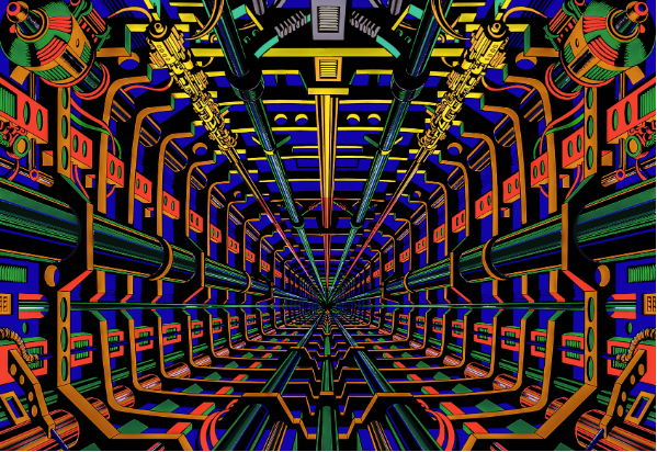
I'm not that good at Photoshop when it comes to complex color editing with adjustment layers and similar... maybe someone else can do a better job.
Full res file available here.
-
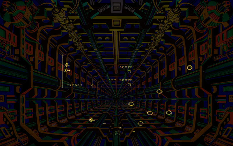
@UDb23 - I like the UV look. Here's the BD at 25%. I recalculated the position for 1920 x 1200 for my PC monitor. For some reason my TV renders in HD then up scales to 4k and it does it perfect for non-vector games but vector games not so well for some reason. The nice streamlined vector lines become chunky monkeys.
Omega Race UV BD at 25% brightness ( display 1920 x 1200 & game area 1600 x 1200):
-
@Riverstorm set your artwort res multiplier to x1 see id that helps with the tv
-
@UDb23 @Riverstorm Here's the UV backdrop at 0.25 brightness on my Pi (this time shrunk to 1024x768 to beat the upload cap of 1MB).
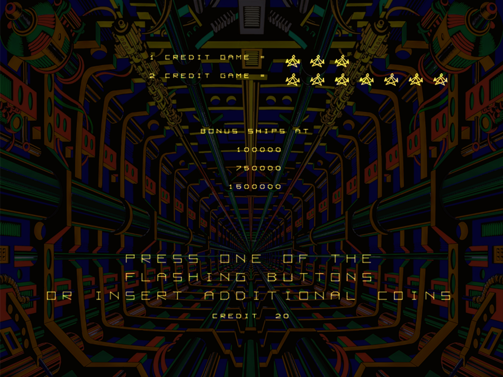
Hm … difficult to choose. I think I like the non-uv slightly more, but mainly because the uv version's yellow parts at the top blend in with the yellow vectors. If the vectors become white in the near future thanks to @markwkidd, I think I'll prefer the uv version. Thanks for giving us this version for comparison!
-
@grant2258 - I will try that setting tonight and see if it makes a difference on a TV.
@Clyde - Damn, you're snaps are sharp! What type of monitor are you using? I can get AdvMAME to look that good but still no dice on Plus. I am going to try the setting Grant suggested tonight.
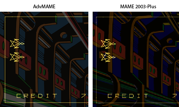
This side-by-side pic should help you clearly see what the difference is showing for me and why I keep using AdvMAME. When I look at @Clyde's snaps they look fantastic in Plus. Here's a side by side comparison on 1920 x 1200 monitor. I did verify the
resolution multiplier (Restart core)is set to 1. I also tried to remove the BD but that didn't change the vector lines.I was trying to get a snap of AdvMAME post-processing effects but all the snaps are pre-processing so I can't show you the final 3-triad effect of the vector lines.
I see you can click on the pic to get it full size if your browser window is small. This is on a monitor and not a TV, just to clarify.
-
Even the BD is quite a bit sharper and less pixelated. Is anyone else experiencing this or maybe I have something off in my settings.
-
you artwork res multiplier should be 1
your vector res should be 3 or 2 at least
-
@grant2258 - Check and check.
Resolution multiplier (Restart core)is set to 1 under Settings -> Video.Vector settings used:
mame2003-plus_vector_antialias = "enabled" mame2003-plus_vector_beam_width = "1" mame2003-plus_vector_flicker = "20" mame2003-plus_vector_intensity = "1.5" mame2003-plus_vector_resolution_multiplier = "3" mame2003-plus_vector_translucency = "enabled" -
@Clyde said in Backdrops in mame2003-plus:
If the vectors become white in the near future thanks to @markwkidd, I think I'll prefer the uv version.
(If you rebuild from source now you will have white vectors.)
-
@Riverstorm What version of ADVmame are you using ? 3.9 provided good res but had performance issues.
-
@Clyde said in Backdrops in mame2003-plus:
@UDb23 Your zip file works fine on my Retropie. See for yourself:

crt or vector shaders are a good example of why backgrounds ultimately will need to be implemented in retroarch rather than the core.
the shader in the above screenshot applies to the whole image (including background) but on the real machine it would only affect the projected graphics. you wouldn’t get any scanlines on the backround art.
if it was done via retroarch and not the core, retroarch could potentially apply the shader to the right part, not the whole image.
-
@Riverstorm the only setting you need to play with from above is your beam width form the settings above.
Ill test the aspect ratio core provided changes we done and check if this caused it to happen vector games as its not a 1:1 anymore from the original hardware point of view. I dont think it that though the only way i can get mine to look like yours is using the default 1x scale. x3 and im good to go on my tv and monitor
-
@Riverstorm said in Backdrops in mame2003-plus:
@Clyde - Damn, you're snaps are sharp! What type of monitor are you using? I can get AdvMAME to look that good but still no dice on Plus.
Maybe it is the shader "VecX" that I don't remember where I got it from? (It was some Retropie/Retroarch shader repo on Github I think.) I can test how it looks without the shader when I get home.
My monitor is an 21" TFT with native 1600x1200. It is connected to the Pi's HDMI port with an HDMI-to-DVI adapter. I can look up the model at home.
I could also show you my
retroarch.cfglater. -
@Clyde this one's for you:
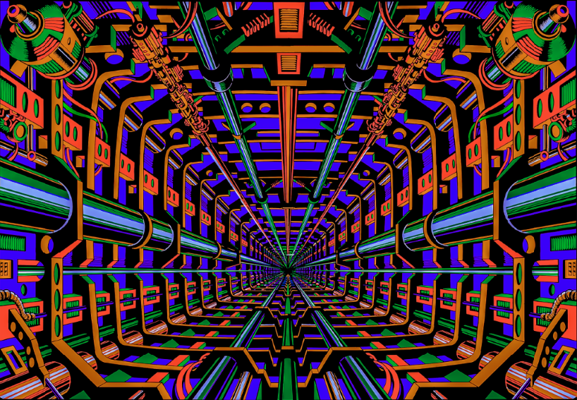
UV without the yellow "top part" ;-)
Available in same folder as previous.
Contributions to the project are always appreciated, so if you would like to support us with a donation you can do so here.
Hosting provided by Mythic-Beasts. See the Hosting Information page for more information.