SNES mini theme
-
I've updated the theme. Download here: https://github.com/ruckage/es-theme-snes-mini/archive/master.zip
@greekmanx The help buttons have been updated so they include 'Favourite' and 'screensaver'.
@greekmanx I've added an option to display number of players as text.
@FatWhiteLump Fixed the filename for the nds logo.
Changed ${system.name} to ${system.theme} as advised by @jdrassa.
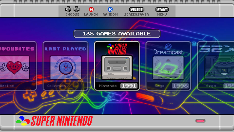
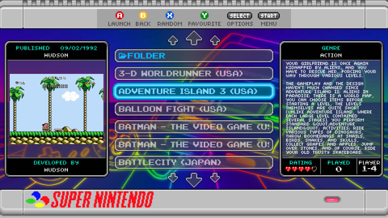
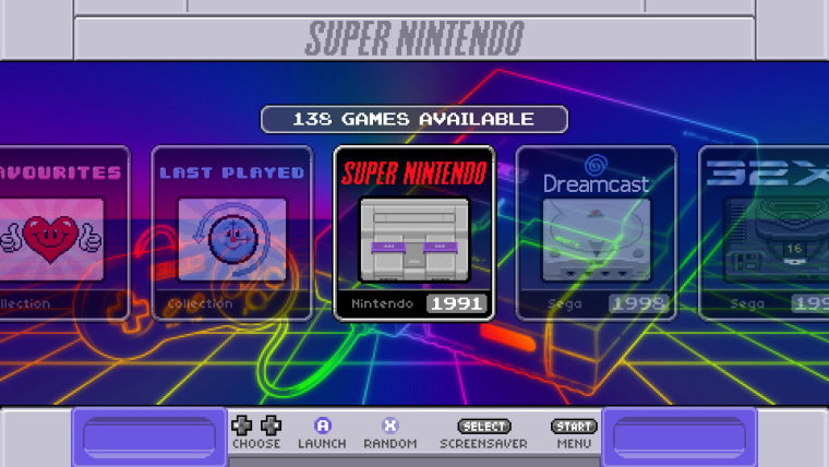
Here are some pics showing the new help buttons for the carousel and gamelist. It also shows the players as text option.


-
downloaded the theme and is customizing it Oh cool, you even used the American English spelling of "favourite" on the gamelist and system help images. Nice touch!
-
@invader-tak
Thought it was only right the US version should have US spellings :) -
I notice the colors for the ABXY buttons are reversed on the US gamelist and system help images. The A and B buttons should be dark purple and the X and Y buttons should be lavender.
-
@invader-tak said in SNES mini theme:
I notice the colors for the ABXY buttons are reversed on the US gamelist and system help images. The A and B buttons should be dark purple and the X and Y buttons should be lavender.
Thanks for letting me know, not sure how I managed to get that wrong. I will correct it in the next version.
-
@ruckage Glad to help!
-
@ruckage great job man! Is there a way to change the SNES logo to the US version? Switched to "usa" in config file, background works, but logo is still showing the Famicon version.
Cheers!
-
@greedoshotfirst You can just go to "art\icons" and change "snesus.png" to "snes.png"
-
@fatwhitelump They're talking about the logo that appears on the top of the system select menu, not the icon.
-
@invader-tak Oh, nothing is included in the theme. I just cropped out the Super Famicom logo thing: https://i.imgur.com/WgbLsM1.png
-
@ruckage said in SNES mini theme:
@lord-raziel
Yes, I hid the tty logs, there are several tutorials explaining what to change to make the boot as silent as possible.To hide the EmulationStation splash screen you have 2 options:
-
Option 1) Make a splash video thats long enough so that ES has already loaded by the time the video ends.
-
Option 2) add the argument --no-splash to autostart.sh. The line should read: emulationstation --no-splash #auto (this is the method I used).
Thank you Ruckage for the tips, even I had seen how to do a silent boot before I never got interested until seeing your pie booting, I have now a silent boot with no ES logo as well and I've removed some not necessary services (at least to me) like Samba, TriggerHappy, etc, now my pie takes 6.1 sec to boot ( it was 28 sec before), however something that I noticed is that it from starting to the splashscreen (a 720p codec h264, container mp4 file) takes around 4 seconds, so I have a black screen during that time before the splashscreen plays, I'm using a Raspberry Pi 2, could it be the reason? what do you suggest me to reduce that time? overclocking or using force turbo on /boot/cmdline.txt ?
-
-
@fatwhitelump Funny, that’s exactly what I did, too! I’m sure there’s probably a way to specify a different logo and system icon in the “usa.xml” file, but editing the filename and cropping the logo was more straightforward!
-
@greedoshotfirst @FatWhiteLump @Invader-TAK @RolexTC
My initial response was going to be that it's not possible to affect which version of the icon/background/logo is used via the config.xml but then I thought about it for a bit and think I've figured out a way, I'll have a look sometime today and hopefully have an update later. -
I just installed the theme in my HTPC and it looks quite good in my 720p tv set. The titles are a bit off in the gamelist, but the displacement is hardly noticeable, I don't know why but much less than in NESMini.
Also, now when loading my Saturn games, there is this generic list which is a really nice feature. -
@svmariscal
Glad it works well. The misalignment probably doesn't show as much as the nes mini theme due to the selector bar in this version being bigger (kind of masks the misalignment). There will be a 720p version though so the alignment will be perfect.
The generic gamelist isn't really intentional but a side effect of how this version works but I hope to be able to have a proper generic system and custom collections at some point in the future. -
Just updated the theme. DOWNLOAD
@greekmanx - I've removed missing.png from detailed view as it was sometimes showing when not needed.
@Invader-TAK - I've fixed the button colours for the US help images.
@greedoshotfirst @FatWhiteLump @Invader-TAK @RolexTC - If you select USA as the style in the config.xml it will now automagically change the icon,logo, and background to the USA version. Make sure you use the config.xml provided as the order has changed and it won't work with the old config.xml

-
@ruckage great friend :) if someday is added to ES the Slide minimal animation mode or if its added a no animate background toggle I will get it :)
-
@sergioad said in SNES mini theme:
@ruckage great friend :) if someday is added to ES the Slide minimal animation mode or if its added a no animate background toggle I will get it :)
You can already, I replied to you last week in another thread:
@ruckage said in 8-Bit Config Menu Icons:
@sergioad said in 8-Bit Config Menu Icons:
if the RetroPie devs bring back the slide minimal transitions (present in a beta of RetroPie 4.3 and wich worked wonderfuly with the NES / FC / SNES / SFC themes) its not doubt I will get them alongside @ruckage 's Famicom mini and enjoy them :)
'Simple slide' is still available though(more or less)? Just now you can control the carousel separately.
You set 'transition style' to 'instant' so the backgrounds change instantly and 'Carousel transitions' to 'on' so the the icons on the carousel scroll by smoothly.
The only difference is in the game list view when using 'quick system select' to change systems they also change instantly but personally I prefer that (I don't mind the sliding too much but I don't like the zoom in effect when selecting a game with slide).
Seems a strange reason not to use a theme anyway, simple slide wasn't even available when I first released the nes-mini theme and no one ever saw it as a problem.
-
@ruckage I responded you too there, and while you are right for me consistence is king 😀 I love your theme but for me there are themes where the background scroll or fade does not fits with it, another good example are the Playstation theme and the switch theme, nothing against your theme, I love it (and even I was the first to suggest it) but for me consistence is king, to the point that even I preffer gamepads with SNES layouts over the ones with XBOX layouts, this is why I bought a Pokken pro pad only for my pi and RetroPie and why I cant use Recalbox wich for ES uses an XBOX input layout while on RetroArch uses the SNES one, even on my PSP I skip gmes that uses ∆ to cancel
-
@sergioad said in SNES mini theme:
@ruckage I responded you too there, and while you are right for me consistence is king....
I have no idea what you mean by that, not sure what's inconsistent here.
You're free to use whatever theme you like but it's twice that you've posted now to say you won't be using my theme because of no 'simple slide' and I gave instructions on how to do that in the latest versions of ES (set 'Transitions Style' to Instant and 'Carousel transitions' to On) and it behaves virtually identically to simple slide (carousel scrolls by and the background changes instantly).
You can see it working in my preview video:
Are you expecting something different to this?
Contributions to the project are always appreciated, so if you would like to support us with a donation you can do so here.
Hosting provided by Mythic-Beasts. See the Hosting Information page for more information.