SNES mini theme
-
Sorry if I missed this in all the comments, I did look. Wondering if there's a way for me to theme my custom collections. This theme is awesome, but it's also very different from the themes I've played with before.
I've made icons for the 2 custom collections. In other themes you just create a same-named system folder and ES picks up on it. Wonder where I would go in this theme to tweak a little to theme my custom collections.
They aren't as good as what ruckage would make on his own, but these are the 2 icons I made. I don't know the trick to get that blocky, aliased script like he does.


-
@hailtostarscream cool-thanks man, ill try that
-
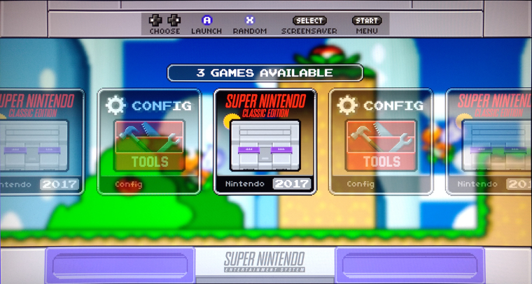
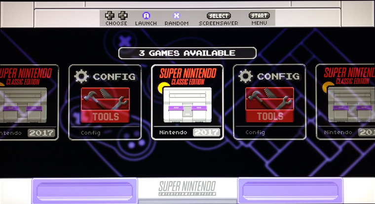
I tweaked it a little for my personal use just to get it a little closer to the SNESc UI:
Extended the Power and Reset buttons to match original
Swapped nav bar/logo spots and replaced the stock logo with the original SNES logo as used on SNESc
Added the SNESc music to play as you browse games/config
Recreated the original background image as close as I could just by going off videos on youtube of walkthroughs
And I used Pomme's SNESc icon to see what it would look like..thanks :)While the SNES outline background is closer to the original, i like the SMB background just for the pop it adds.

.
.
-
@pomme many thanks, the icons look great. Could you perhaps make an icon with a PAL SNES?
-
@ruckage
hmmm..... I'm wondering if i could change the current font type to others...
I damn like this theme.... -
@vice86 said in SNES mini theme:
I tweaked it a little for my personal use just to get it a little closer to the SNESc UI:
Extended the Power and Reset buttons to match original
Swapped nav bar/logo spots and replaced the stock logo with the original SNES logo as used on SNESc
Added the SNESc music to play as you browse games/config
Recreated the original background image as close as I could just by going off videos on youtube of walkthroughs
And I used Pomme's SNESc icon to see what it would look like..thanks :)While the SNES outline background is closer to the original, i like the SMB background just for the pop it adds.
Glad you're having fun with this. There are reasons for the design choices I made though.
The reason for having the logo at the top instead of the bottom on the USA snes mode is that some of the system logos are quite long. You can force them to fit in the space at the bottom but in doing so they no longer match the same pixel size as the rest of the theme which is a big part of the overall look of the theme.
Moving the help icons to the bottom made more sense because of the logo size issue, however even the help icons wouldn't fit in that space if I kept the buttons as big as they are on the SNES- Classic. So it made more sense to reduce the size of the purple buttons.
Both of these differences will also be essential for when I add the 4:3 aspect ratio support.
It was never a priority to be an exact match anyway, it's not possible to exactly mimic a snes-classic style ui in EmulationStation so the aim was just to create a theme with a similar look and feel and with a consistent look for all systems.
-
@pomme said in SNES mini theme:
Sorry if I missed this in all the comments, I did look. Wondering if there's a way for me to theme my custom collections. This theme is awesome, but it's also very different from the themes I've played with before.
I've made icons for the 2 custom collections. In other themes you just create a same-named system folder and ES picks up on it. Wonder where I would go in this theme to tweak a little to theme my custom collections.
Not quite as easy on my theme as on others due to the structure of the theme, you need an icon for both US/Europe, a logo for both USA/Europe and a background for each of the background types. Adding these 2 collections would make a lot of sense so I will make official versions in an update for both USA and Europe.
I don't know the trick to get that blocky, aliased script like he does.
:D, no trick to getting the 'blocky, aliased script', you get it by drawing it by hand.
-
@chinjw said in SNES mini theme:
@ruckage
hmmm..... I'm wondering if i could change the current font type to others...
I damn like this theme....You can't just swap out the font unfortunately as the gamelist would no longer line up correctly. It may be possible for me to add if a suitable font that supports Chinese characters can be found, then I could maybe add it as an alternative font that could be selected in the options. I'll see what I can do.
-
@ruckage said in SNES mini theme:
Not quite as easy on my theme as on others due to the structure of the theme, you need an icon for both US/Europe, a logo for both USA/Europe and a background for each of the background types. Adding these 2 collections would make a lot of sense so I will make official versions in an update for both USA and Europe.
@ruckage That sounds great! :-) Thanks a lot for this.
-
-
@ruckage Thanks in advanced dude~!
-
@ruckage Hello, how's the update with the additional system icons coming along? Saw your superb job on the updated NES mini theme.
-
@ruckage said in SNES mini theme:
@vice86 said in SNES mini theme:
I tweaked it a little for my personal use just to get it a little closer to the SNESc UI:
Extended the Power and Reset buttons to match original
Swapped nav bar/logo spots and replaced the stock logo with the original SNES logo as used on SNESc
Added the SNESc music to play as you browse games/config
Recreated the original background image as close as I could just by going off videos on youtube of walkthroughs
And I used Pomme's SNESc icon to see what it would look like..thanks :)While the SNES outline background is closer to the original, i like the SMB background just for the pop it adds.
Glad you're having fun with this. There are reasons for the design choices I made though.
The reason for having the logo at the top instead of the bottom on the USA snes mode is that some of the system logos are quite long. You can force them to fit in the space at the bottom but in doing so they no longer match the same pixel size as the rest of the theme which is a big part of the overall look of the theme.
Moving the help icons to the bottom made more sense because of the logo size issue, however even the help icons wouldn't fit in that space if I kept the buttons as big as they are on the SNES- Classic. So it made more sense to reduce the size of the purple buttons.
Both of these differences will also be essential for when I add the 4:3 aspect ratio support.
It was never a priority to be an exact match anyway, it's not possible to exactly mimic a snes-classic style ui in EmulationStation so the aim was just to create a theme with a similar look and feel and with a consistent look for all systems.
Yeah, i noticed when i had other test consoles on the setup that the logos wouldn't fit like NES and MAME but I'm keeping this a SNES only Pi3 like my pi2 that I kept as a NES only Pi using your NES Mini theme :)
For a 3rd Pi with a bunch of systems I'll be putting on I'll be keepign your SNES Mini theme as is...thanks again for the great themes!
-
@lilbud said in SNES mini theme:
@vice86 someone extracted the music and the proper backgrounds here You could get even closer to the official SNES Mini.
DOH, i was wondering if all that could be ripped. Only issue is that looks like its all from the Euro version model...i need the US version. I have a SNESc but no idea how to rip the info like that from it. Any suggestions or link to how to?
-
@vice86 look into hakchi2
-
@ruckage said in SNES mini theme:
Adding these 2 collections would make a lot of sense so I will make official versions in an update for both USA and Europe.nice! I'll wait patiently for the next update. Thanks for all your work on this great theme.
-
@lilbud said in SNES mini theme:
@vice86 look into hakchi2
Thanks...just did and now I have FTP access to my SNESc and can rip the US images.
-
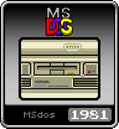
I made an icon for PC :)
I just reused the icon for fds (disk system) and made it PC-yellow-ishIcon

And a logo

-
@pellejones said in SNES mini theme:
I made an icon for PC :)
I just reused the icon for fds (disk system) and made it PC-yellow-ishHi, PC/Dosbox is in the next update, I added it to the NES-mini theme last week.
https://retropie.org.uk/forum/topic/8391/cardboard-mini-nes-nes-mini-and-famicom-mini-themes/1179
The next Snes-mini update should be sometime this weekend.The following will also be in the nest update:
Amiga
Game & Watch
PC engine CD
MSX
MSX2
Snes classic collection (USA and European versions)
Super Famicom Classic Collection
Nes Classic collection
Famicom classic collection -
@ruckage speaking of custom collections, the way you setup the theme, ES doesn’t allow to set custom collections from theme since there are no individual folders for each system.. Somthing to think about.
Contributions to the project are always appreciated, so if you would like to support us with a donation you can do so here.
Hosting provided by Mythic-Beasts. See the Hosting Information page for more information.