SNES mini theme
-
I loved your Retropie/Nintendo opening, but for my collection it wasn't a long enough to cover the load time for all my games. I made an extended version which I hope you all enjoy.
-
@iiechapman I would have personally swapped the order of clips, having it end with the RetroPie logo. Perhaps do a reupload and render it out as a mp4 and try and decrease the file size a bit. It's a bit huge. Haha
-
The TG16 was seriously massive. My next door neighbor had one growing up. Thing was ColecoVision long and that was only that big to store those massive controllers.
-
@livefastcyyoung
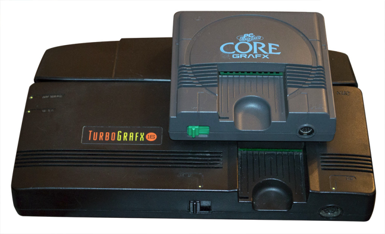
I'm guessing at the time they thought the US customers would value it more if it was bigger - who knows for sure but it's got to be down to marketing as there is no other reason for it to be so much bigger. Just to give everyone an idea of the difference here's a comparison shot showing the Core Grafx vs the TG16 (the Core Grafx is the same size as the original PC engine). Incidentally it was very hard to find comparison photos, this was the only one I found and I actually cut this out from the background as the photo wasn't very clear otherwise.

-
That shot is interesting. All the switches and ports line up.
Always thought the most absurd thing about this system was the single controller port. I’ll never understand why they thought that was a good idea.
-
Holy crap! The PC-Engine was that small!? That's like Classic Edition size, which coincidentally is the theme of this thread. ;)
-
I've been working on getting 4x3 support added, it's quite time consuming tweaking everything but I have it working for a few resolutions now. I plan to add ntsc and pal support as well but I can't guarantee that they will be in the next release as they require even more modifications. I've also adjusted the US border slightly so the purple buttons are slightly further apart as it looked a bit cramped previously.
So the plans for the next update are:
New option to choose between large or small gamelist font.
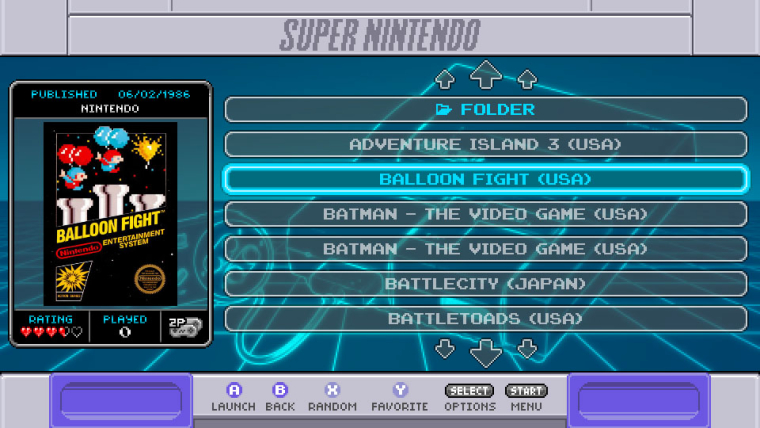
Choice of various resolutions including 4:3 resolutions.Here's how 4x3 mode looks:


-
@ruckage I like that 4x3 look. I’ve never been a fan of game info metadata. Maybe make a 16:9 version of that look?
-
@lostless said in SNES mini theme:
@ruckage I like that 4x3 look. I’ve never been a fan of game info metadata. Maybe make a 16:9 version of that look?
Maybe, no guarantees though. I wouldn't do it with the nes-mini theme as it required too many changes but it's more feasible with this theme as all the elements are separate.
edit: Screw it, sure I'll commit to adding that too. The more options the merrier.
-
@ruckage ruckage you are awesome your themes are amazing and you go way out of your way to make the theme work for each and everyone of us thanks for all your hard work man!!!
-
@greekmanx said in SNES mini theme:
@ruckage ruckage you are awesome your themes are amazing and you go way out of your way to make the theme work for each and everyone of us thanks for all your hard work man!!!
Thanks, you're welcome :).
-
@lostless
I have a widescreen minimal-meta layout working, it should be in the next update. I'll also add an option so you can choose how the text is aligned in the list (left, center, or right). I just need to test it on the pi to double check that it works correctly.
-
@ruckage This is the only picture that can describe my reaction

-
@lilbud
I'm hoping that's a good reaction - it's difficult to tell :D -
@ruckage It is, its a face of excitement. Can't remember where I found it though
-
@lilbud
Not sure I've ever seen excitement expressed quite like that before :D, I'm still trying to decide if it's photoshopped or not. -
That new minimal layout should also take care of the long name issue. There is plenty of space.
-
@flyingtomahawk said in SNES mini theme:
That new minimal layout should also take care of the long name issue. There is plenty of space.
I recently moved my setup to a 15 inch 1024x768 monitor and I like all the 4x3 layouts for your themes. The carousel icons are larger and the game list shows what is necessary and it matches the retro feeling.
Yeah, I was thinking the same thing regarding long names. I think it should please a few people, @nj180grados being one of them I suspect.
Good to hear that you've used 4:3 mode on my other themes, it's sometimes difficult to know which features are popular. Still a bit of work to do but I should have the new update ready for this theme soon. -
So will the update be available to download through ES themes or do we have to do it manually again?
-
@redbatman said in SNES mini theme:
So will the update be available to download through ES themes or do we have to do it manually again?
Yeah, it will be. You don't need to worry about that stuff, as updates to a theme doesn't affect the availability of the theme on the ES theme downloader. (Wow, I used the word "theme" a lot in this post.)
Contributions to the project are always appreciated, so if you would like to support us with a donation you can do so here.
Hosting provided by Mythic-Beasts. See the Hosting Information page for more information.