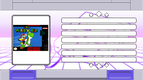
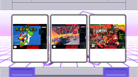
SNES mini theme
-
@kal-el-1981
I appreciate you're trying to help but as I've said in the past I really want to work on the themes alone, I know that not everyone agrees with me regarding this but that's my personal choice. I realise progress has slowed recently but I will get back to adding more systems soon, I've just been a bit busy lately and sometimes just need a bit of a break so I don't get burned out. -
@ruckage I apologize man. I never meant to give you the impression that I was trying to help or do any kind of work for you. I’m very aware that this is your theme 100% and I wasn’t trying to get in your way. I just like to tinker and more so just wanted your advice and thoughts on different things. I in no way expected you to use a design of mine over one of yours. Your theme is great man and you’re doing an amazing job. I apologize again if I came off as trying to do things for you or anything like that.
-
@kal-el-1981 Thank you, it's beautiful snes-cd!
I would like to add this system to emulation station under retropie 4.2, you could explain to me step by step how it arrived? I would have preferred to do it in private message but a priori it is not possible or so I did not find how we do.
-
@hyruleslink I know who is the theme developer, but @KAL-EL-1981 is doing a so great work with unofficial icons, I decided to ask him instead of @ruckage because I don't wanna delay the theme development. So, thank you @KAL-EL-1981!!! I really enjoyed the new icon. Thank you too @ruckage for the theme, it's really great!!!
-
@kal-el-1981
Apologies if I misinterpreted your intentions, I have no hard feelings toward you. It's nice you're so enthusiastic about the theme and the icons you've done are very good but I've just really set my mind on completing this entirely myself so didn't want any misunderstandings. -
***** Finally an Update *****
I've just updated the theme and have made the following additions/changes.
Support for multiple resolutions in the config file
640x480
800x600
1024x768
1280x720
1280x960
1366x768
1440x1080
1920x1080
ntsc
pal6 New no-meta layouts
See the ## LAYOUT GUIDE ##.pngFont Size option for the game list in the config file.
Text alignment option for the gamelist in the config file.
The usa border has been adjusted slightly so the help icons aren't as cramped.
Pc-engine icon has been improved
Dreamcast logo colour has been changed if USA is selected.
For the resolutions I'm unable to test the ntsc/pal option on a real TV so if someone can check if they display correctly that would be helpful.
-
@ruckage Thanks for the update! Is it possible to have a full "no metadata" option that does not show anything but the gameslist and artwork/video?
-
@supermagicom I didn't test the theme yet, but did you try the"no_meta" layouts? They displays the gamelist, artwork and probably just some little info like number of players, release date and rating. But if you don't like these things, you can just edit a no_meta layout to hide these little things. But remember: just for personal use.
-
@danielmewhouse The "no_meta" layouts really only hide the game description blurb. I'd like to get rid of ALL metadata. Like you said, I can probably figure out how to edit the xml files and remove it all but I'd rather not mess with @ruckage 's code unless I have to, even for personal use. I'm sure others would appreciate a "bare bones" layout with just the gamelist and artwork/video too so I figured I'd ask. ;)
-
I don't really get why hiding every last piece of metadata matters, maybe I should have called these minimal-metadata layouts but it does remove the description, genre, and developed by metadata allowing for a much wider gamelist. If you've scraped your roms then you should have all the information so does it matter if some of it is displayed?
I can remove every last scrap of metadata but it's going to look pretty bare and I don't consider it a high priority. Apart from anything else I think the metadata adds to the overall look of the theme. Is there really a lot of demand for themes with no metadata at all?
-
@ruckage said in SNES mini theme:
Is there really a lot of demand for themes with no metadata at all?
there seems to be a trend at the moment for metadata-less themes, i personally am not a big fan of metadata only because the info that is scraped is usually incorrect with typos and long-winded game descriptions, the new no metadata options you included with the latest release are perfect, i agree with you if every last bit was removed it would look bare.
Your neo-geo theme is a great example of how a no/minimal metadata theme should be, all that is needed is the name of the game, boxart, and the number of players & possibly ratings.
looking forward to seeing your next project.
-
I can remove every last scrap of metadata but it's going to look pretty bare and I don't consider it a high priority. Apart from anything else I think the metadata adds to the overall look of the theme. Is there really a lot of demand for themes with no metadata at all?
@ruckage, I get the @SuperMagicom idea: he wants something similar to Xbox One, PS4 or Snes Classic Mini gamelist. They just display the game boxart and nothing more. But, my opinion, this just looks good on Grid View or Carousel View. This is a sample of all no-meta:

Without your rating, players and times played looks strange. But if it gets a Carousel View:

The question is: EmulationStation is capable of do this? I just found "concepts", but not a single real theme with this function.
-
Your first pic illustrates how bare it would look so it kind backs up my reasons for not omitting all metadata.
Unfortunately you can't use the carousel for a gamelist - if you could I definitely would have designed the theme that way to begin with.
There has been some talk of adding carousel support to the gamelist and also gridview was being worked on - if these are ever implemented fully into ES then I would definitely add support for them.
-
@ruckage yeah, I know this fact. If this feature comes true, will be an awesome add for this great frontend!!! But hey, I saw a video on your youtube channel showing a SNES cartridge carousel. You did this on the system screen?
-
@danielmewhouse
Yes, that was just a concept using the system select screen to test how it would look - something I will probably re-visit if carousel support is eventually added. -
@danielmewhouse @ruckage Depending on the height of the boxart I think it looks okay so long as you remove the border. I was able to modify the code myself relatively easily so there's no need for this to be an official feature.
-
@ruckage I'm in agreement about the no metadata looking bare. I like metadata, personally. I usually edit it if I feel I could write something better. It's part of the fun in making your own build.
-
@ruckage I know you are busy with a lot of projects, but did you considered Pegasus Frontend? Looks promissor and have the Carousel and Grid View for gamelist! Take a look at this post:
-
@ruckage said in SNES mini theme:
Your first pic illustrates how bare it would look so it kind backs up my reasons for not omitting all metadata.
When the last update hasn't coming with the 4:3 support, I was messing around with your graphics and icons, and done a custom theme for my use. Take a look at this @ruckage :
https://retropie.org.uk/forum/topic/14316/system-select-icons-spacing/6
-
Hi @ruckage
just started on my own retropie build with your skin and i totally love it! the whole feel on the skin just makes the whole experience complete when i boot up my raspberry pi but im just curious about some things.
I have kodi and moonlight (steam streaming) installed on my homescreen but there are no icons installed on your skin that support these "console types" so they turn out in a black font type with a rainbow background ":D
Is there any way i can import some icons myself or maybe it something you are working on?
I know its a lot of work to get everything nice and smooth but i just wanna ask you to make sure if i need to wait some time to set it up as a perfectionist or maybe i could tinker with it myselfAnd Again, awesome job on the whole skin :)
Kind regards
Contributions to the project are always appreciated, so if you would like to support us with a donation you can do so here.
Hosting provided by Mythic-Beasts. See the Hosting Information page for more information.