SNES mini theme
-
Well those who have grown using PAL in their childhood are used to that speed. Better quality on the small screen improves the experience a lot
-
@hex
I guess it's personal choice, I also grew up with pal and I wouldn't want to go back to it - everything just feels slow as most games weren't programmed to account for the difference in framerates. I was really happy once TVs and games began to support 60hz.I mention PAL60 as that has the best of both worlds - the higher resolution of pal combined with 60fps.
Edit: Thinking about I'm pretty sure pal60 wouldn't work with composite connection anyway.
-
@ruckage said in SNES mini theme:
Hi @jdrassa , did you have a chance to look into this for me? I can work around it and just make sure it works correctly on the pi but it would be nice to understand why there is a difference. Thanks.
I haven't had a chance, but hopefully I should find some time soon. Anyway you can share the theme or at least just the font and overlay image? My email is in my profile if you don't want to post a public link.
-
@jdrassa
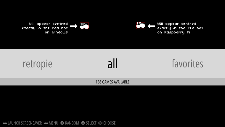
Thanks, I made a simple test theme that shows the difference clearly, I've uploaded it to mega: DownloadThe test theme has 2 red boxes with the font displayed in each box. On Windows the left box and font line up exactly and on RPI the right box and font lines up exactly. It looks to be an 8 pixel difference in y position for a 1920x1080 display.
Thanks for having a look at this for me, it's not particularly urgent as I can just compensate for it but it would be nice to figure out what causes the difference.
-
@ruckage I spent some time debugging this. I have a theory about the cause and how you may be able to correct it on your end. It looks like the font code uses a capital 'S' as a baseline to determine the height for the font. Since your font doesn't include a capital 'S', it is falling back to default fonts it expects to be available on the system. These are platform specific (see logic here). Since, the default font is different on each platform, the size is likely different as well.
What I would suggest trying is to define capital 'S' in your font and make sure it is the same height as the other characters.
-
@ruckage Looking awesome! can't wait for release :)
-
@jdrassa
Brilliant, I'll give that a try and let you know how it goes (I would never have figured that out). Thanks for your help. -
@jdrassa
Just tested your fix and it works perfectly :) , thanks again for your help. -
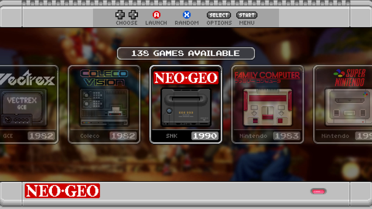
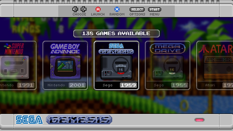
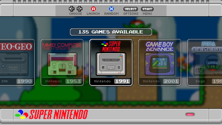
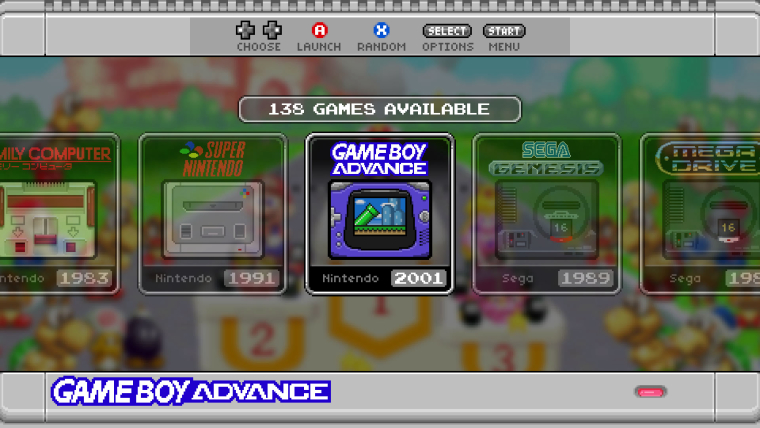
I've made second set of backgrounds for this theme based on blurred game screenshots. These will be able to be displayed as they are or with a black or white semitransparent overlay. (The previews below are using the dark overlay to darken the background.)
-
@ruckage That's gorgeous. I also love the transparency on systems that aren't selected.
-
@mattmanforever said in SNES mini theme:
I also love the transparency on systems that aren't selected
I think the transparency is default ES carousel behaviour.
-
@ruckage AMAZING! Cannot wait anymore, could you bless us with an ETA please^^
-
@mattmanforever said in SNES mini theme:
@ruckage That's gorgeous. I also love the transparency on systems that aren't selected.
Thanks :). @mattrixk is correct, the transparency for unselected systems is default behaviour but it does suit this theme well as semi transparency is used quite a lot.
@hailtostarscream said in SNES mini theme:
@ruckage AMAZING! Cannot wait anymore, could you bless us with an ETA please^^
Not sure, still have a few things to do yet but soon.....
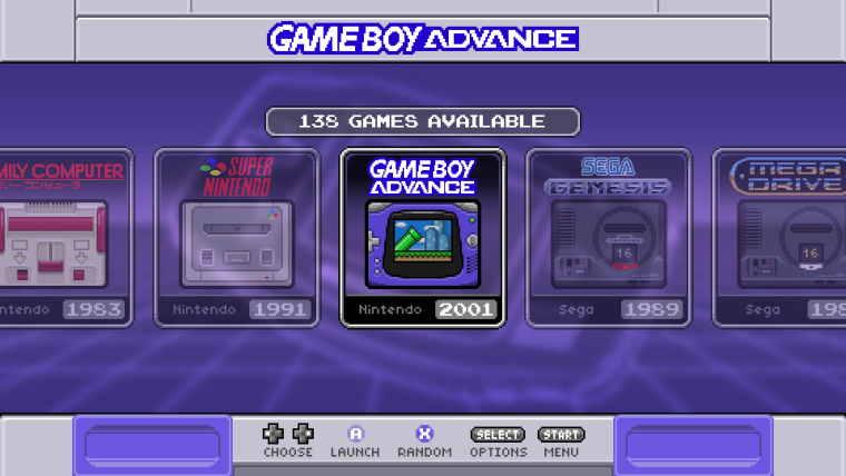
I have the US SNES variant working which you can see below, it also shows the blurred tron style backgrounds with a purple colour scheme.
-
-
@ruckage need the SNES version ! 😁 will make a donation as soon as it is released !
-
Please stop making new themes!
It is so hard to decide which one to use.
Famicom-mini? Neogeo? SNES-mini?
Unless you have multiple devices of course. -
Great job!, the nes/famicom mini themes are my favorites on Retropie, keep the good work!
-
Sorry for the lack of updates, I have been busy working on this though and should be releasing it very soon.
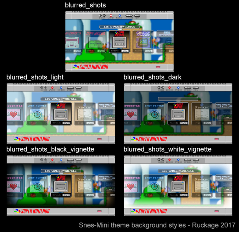
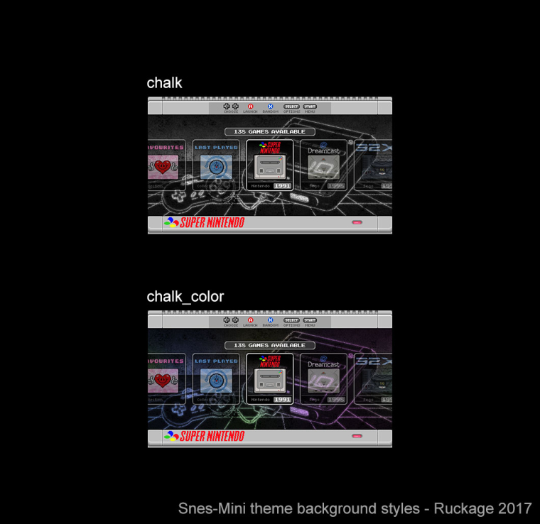
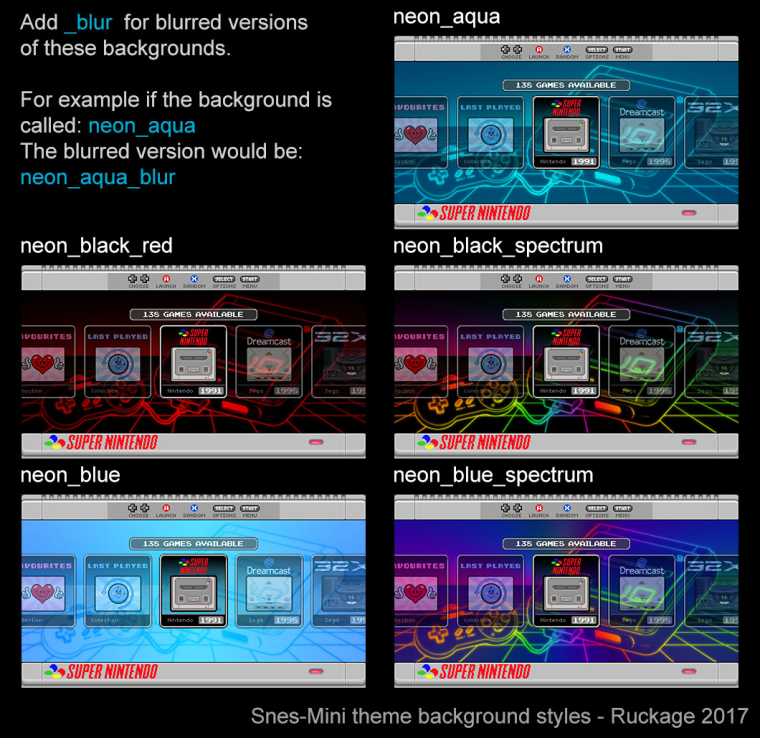
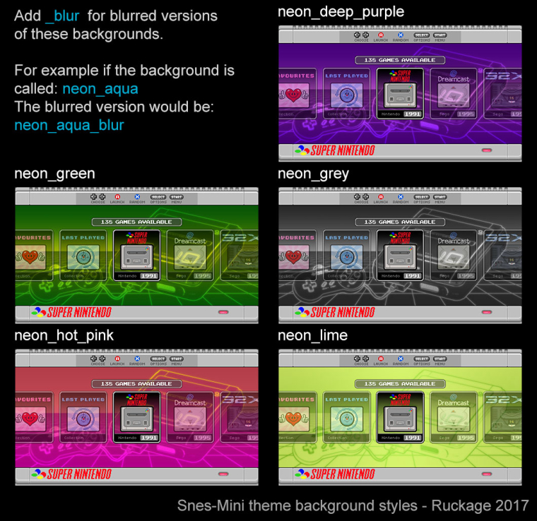
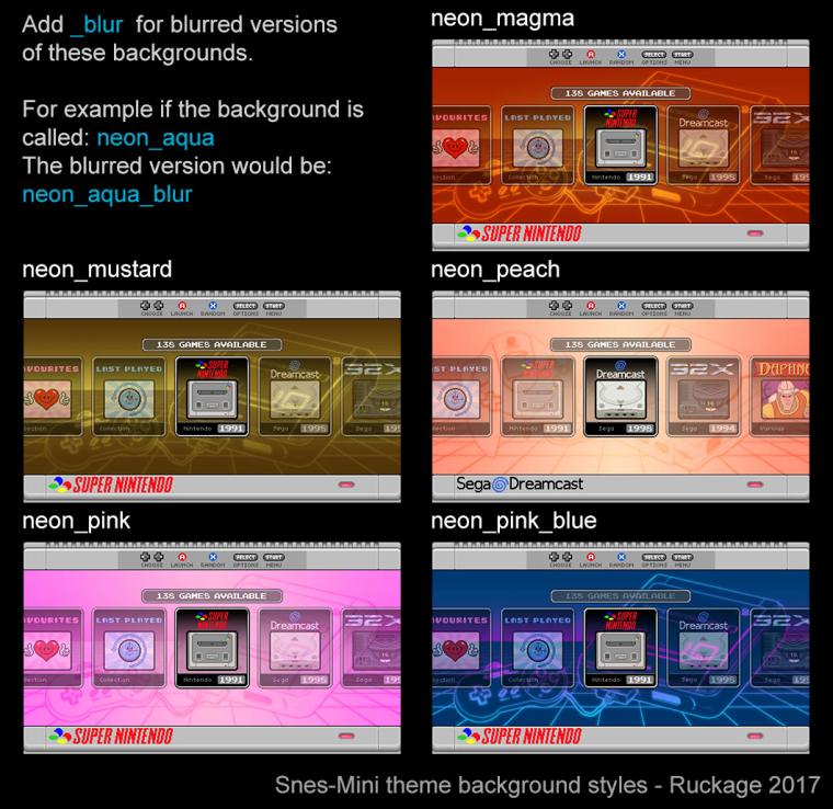
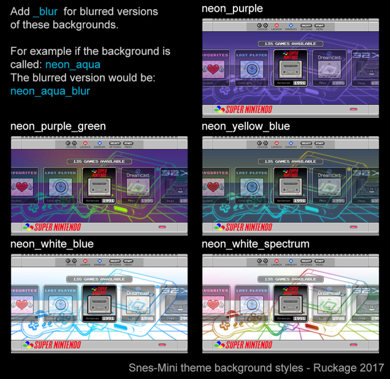
Here is a guide to all the background variation that will be available with the first release (47 in total including the blurred variants).
The theme also supports all the layouts that were in the nes mini theme (24 total), borders for both European/Japanese and the USA style Snes, and 2 different ratings icons (hearts or beads). Hopefully this should give enough customisation options to suit most peoples needs.
-
@ruckage really nice, i have a noob question, how do you change or switch the background styles like lets say i have that super mario world stage blury background and wanted to change it to a neon console background, how do you do that exactly?
-
@nestor1924 said in SNES mini theme:
@ruckage really nice, i have a noob question, how do you change or switch the background styles like lets say i have that super mario world stage blury background and wanted to change it to a neon console background, how do you do that exactly?
You have to edit a config.xml file that is in the theme directory, it currently looks like this:
<!--
theme name:		snes-mini
version:		1.0
author:			ruckage
-->

<theme>
    <formatVersion>3</formatVersion>

<!-- Choose your layout (see ## LAYOUT GUIDE ##.png) -->
	<include>./layouts/a.xml</include>

<!-- Choose your resolution -->
	<include>./layouts/1920x1080.xml</include> <!-- Only 1920x1080 is currently supported-->

<!-- Choose your background (see background_guide.pdf) -->
    <include>./background/neon_aqua.xml</include>

<!-- Choose your style (europe or usa) -->
	<include>./style/europe.xml</include>

<!-- Choose your rating symbol (heart or ball) -->
	<include>./rating/heart.xml</include>

</theme>
To change the background you would replace 'neon_aqua' with the background of your choice.
On my setup I will have several copies of the theme installed with different names and with different backgounds defined in the config.xml so i can just switch between them in ES.
Contributions to the project are always appreciated, so if you would like to support us with a donation you can do so here.
Hosting provided by Mythic-Beasts. See the Hosting Information page for more information.
