Grid tile background size
-
@chicuelo I actually love the result, even if it's a bit harder the first times to identify the images, the user should quickly memorize it if his game collection isn't too huge.
Maybe I misunderstood you on the selected game. My thinking was the following :
- For the unselected games, we resize the smallest side to the size of the tile, and use the same ratio for the biggest side, and cut it.
- So, naturally, the reasoning for the selected game is the same, but we don't cut it, and adapt the background to its new size.
The biggest problem with this is when the selected game is in the first/last row/column. It can easily go offscreen or on top/under other elements.
-
@a12c4 said in Grid tile background size:
Dark background + fit background to the tile = good result
It's the best for me.
If we can choose how many covers by line and the max size it's perfect. like taht they have all the same size it's more beautiful.
And for my part i lost many time on Photoshop to make all my covers to have the same sise in the same system, it is the best solution to have something perfect. -
@a12c4
I like the idea of adapting the frame to the art. For the bottom row I don't know if its possible to make: once the last row is showed, put the top row below of it so you never have to scroll to the bottom of the screen and you always have the selected game o the center of the screen. For the A- starting games, you could do the same. It could work -
@darknior said in Grid tile background size:
And for my part i lost many time on Photoshop to make all my covers to have the same sise in the same system, it is the best solution to have something perfect.
You can scrape all the images and then with an action in Photoshop make all the same size. Go to Actions, RECORD a new one and do the following: Resize the image to the size you want, save for web and close. STOP RECORDING. Play this action every time you open an image and in a fraction of time you will have all the images with the same size and proportions
-
@chicuelo said in Grid tile background size:
Go to Actions, RECORD a new one and do the following: Resize the image to the size you want, save for web and close. STOP RECORDING. Play this action every time you open an image and in a fraction of time you will have all the images with the same size and proportions
If you go to File > Automate > Batch. You can select a folder, the software will open each file, perform the action, and save it. Takes only few minutes if that.
-
@chicuelo Yes that's what I thought but the same problem happen when you select a game in the first column or in the last column, if we keep the selected game in the center of the screen in that situation it will look strange because it will feel like the grid is scrolling both vertically and horizontally.
-
@lilbud I wonder if we can work with TheGamesDB or similar database or even creating our own, with one major difference : proposing different collections of images for all the games, like one collection with the base box arts, one collection with 3d box arts, one collection of screenshots ...
Maybe I'm seeing too big, it's possible. Maybe similar stuff already exist.
-
@a12c4 said in Grid tile background size:
Maybe I'm seeing too big
Yes, Yes you are.
There are already databases of these games out there, stuff like screenscraper and emumovies has what you are asking for. The Launchbox DB has really good art but it is slow to access unless you have Launchbox.
-
@lilbud Nothing is big enough for my sweet little grid view ;)
Ok let's stop this is going a bit offtopic.
What do you think about what I proposed in my first message and what chicuelo proposed ?
-
@a12c4 I like both ideas. I feel that it should be up to the theme maker to decide what they like.
It'll probably be a few months until I can get back to theming, got a lot of work for school and (unfortunately) that comes first.
-
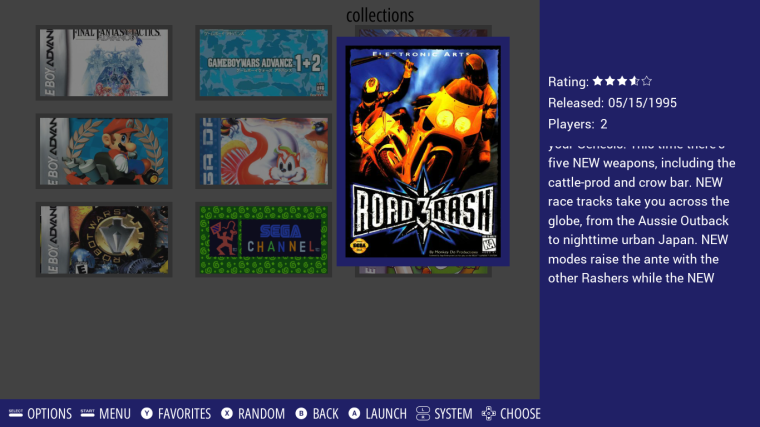
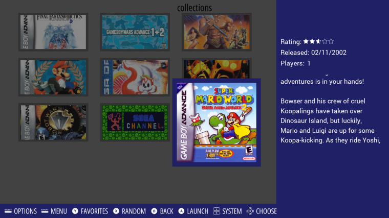
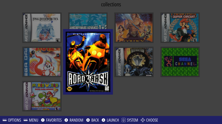
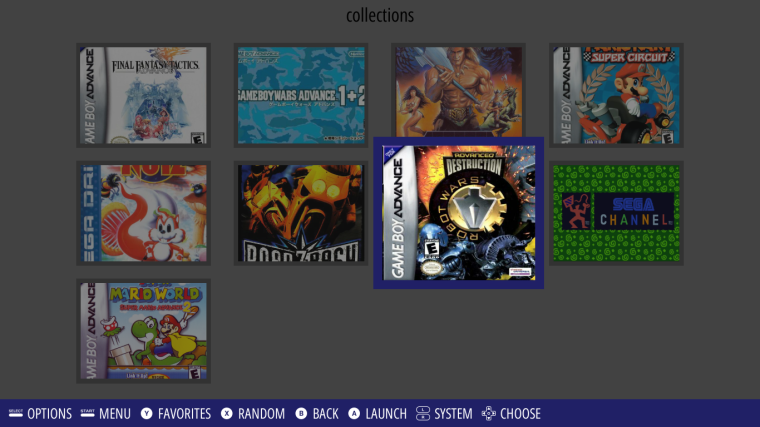
.
.
Damn it look so clean. But the big problem is this :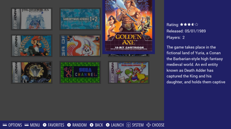
EDIT : I need to add extra more code so the selected tile position change dynamically if it's close to a border of the grid (first/last row/column), brb I need to check if it render properly.
-
@lilbud If it was only up to me I would allow theme makers to do whatever they want. But the thing is, giving more options to theme makers create more complex code.
So, we have to judicious eliminate bad options (those which have no or nearly no use case, those which add way too much complex code for too little benefits, etc ...)
At least that's how I see it, maybe @jdrassa have a different opinion.
-
@a12c4
I like the way its going, we could find a solution when the top and bottom rows are reached.
maybe restricting the selection row only for the middle one, and when you scroll up the snaps go down and the same when going down. In that case you will avoid the overlapping of the selected game and the top/bottom of the screen.
I love the aspect ratio of the third image, it will take more advantage on square and portrait images making the crop smaller -
@lilbud
You are right! I think it will be a lot of instructions for him. That's what I did with my entire library -
@chicuelo As I said previously, it's ok for bottom and top row, we can center the selected row without problem.
But, we have the same problem with left and right column, and I can't use the same solution because that mean the grid would scroll both vertically and horizontally, which look really strange.
Another solution would be to change the position of the tile, so when the selected tile is in the left column for example, we make sure only the top/right/bottom side grow and the left side don't move, so we don't get out of the grid.
That's what I'm currently trying to do, but it's way harder than I expected, if we combine that with giving the theme the 3 possibilities I proposed earlier (fit the image inside the tile, fit the image inside the tile + stretch the background to the image, resize the image to the tile + cut the extra part), then I fear the code will be completely unreadable.
-
@a12c4 could you implement different code for vertical art and square art? Like if the art is taller than wide, one code is used but if it closer to square then another code is used.
Sorry if this makes no sense, I know jackshit about programming...and jack left town
-
@lilbud How do I decide if the art is taller than wide ? For all game independently ? For the whole collection ? What about custom collection then ? This ones can have very different art aspect ratios.
I think I should take a step back from this, stop working on this part of the grid for the moment and come back to it later on.
-
@a12c4 Maybe have the image size reported, or a simple inequality
Like if y > x, art is tall, or portrait. Genesis/NES
If x > y, art is horizontal. SNES
X = Y, art is square. GB
-
@a12c4
I see, the solution you are trying is the best, because making the grid moving horizontally will make look strange -
Hi everyone and @A12C4
I'm a bit late but do you think some things like this could be doable with the grid view ?
So basically, a screenshot/fanart of the game or whatever for the background (default system background if nothing else available) and a logo for the game name (default font if no logo found).
And of course a place on the background where game infos would be displayed.Thanks for your work ;-)
Contributions to the project are always appreciated, so if you would like to support us with a donation you can do so here.
Hosting provided by Mythic-Beasts. See the Hosting Information page for more information.