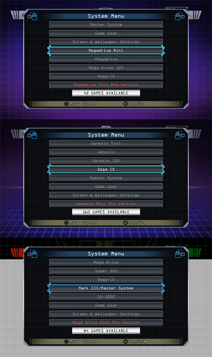
[Theme] Mega Drive mini theme
-
Great work as always @ruckage thumbs up!
I too build a version for my personal build of all 3 variants a while back. You mentioned about the menu, I opted for the settings approach in the system select with the LogoText tag with the carousel . Maybe this would be easier for users adding extra systems in your build, I dunno.

-
Thanks, I'm looking forward to those gridview improvements you've been working on so I can have more options in the future ;P
Do you know if @A12C4 is still contributing to grid view as well or is he taking a break? I know he had a list of proposed additions but haven't seen any mention from him for a while.He pops up here on the forums occasionally, but must be taking a break. Hasn't made any additionally contributions.
-
@ruckage said in [Theme] Mega Drive mini theme:
I may do with this one as it looks like the attention to detail is really good, I particularly like the look of the Japanese release as you can buy the 'stack' as well which comes with the Mega CD, 32X, and Sonic and Knuckles cart so you can recreate the whole ugly tower in miniature :D .
I'm definitely gonna wait for the reviews before deciding to drop $80 on yet another emulation box.
I would love it if Sega threw a backdoor into the software so a hack could be done by the community. Ya know, not tell anyone until it is out there.
And also add support for stuff like Game Gear/Master System, 32X, CD, etc.
-
Mt first reaction to this was OMGOMGOMG!!!
This looks absolutely stunning! The perfect compliment to my Mega Drive Pi. I cannot wait to see the finished article in use on my system.
At the moment I'm just using a slightly modified version of Eudora, which is a very nice and customisable theme for people like me with no artistic skills whatsoever. I've stolen bits and bats from the CRT theme, added some Sega music and a cool bootup video. But this is something else entirely. Thank you for spending your time on this!
-
@chiribas10 said in [Theme] Mega Drive mini theme:
Playstation do not plan to put in access?
Hi, I'll probably release the Playstation theme at some point, It just needs a few finishing touches first.
@paffley said in [Theme] Mega Drive mini theme:
Great work as always @ruckage thumbs up!
I too build a version for my personal build of all 3 variants a while back. You mentioned about the menu, I opted for the settings approach in the system select with the LogoText tag with the carousel . Maybe this would be easier for users adding extra systems in your build, I dunno.
Hi, I hadn't realised anyone else had attempted a version of this - did you release it? Your screenshots of your system select look very slick.
Logotext is great, I actually used it exclusively on the NeoGeo mini theme as it meant all systems were automatically supported. I have logotext as a fallback on the theme for when a logo is missing but logos aren't my main concern regarding adding other systems - it's the grid layout itself. The reason being that the layout is designed for portrait images so any landscape shaped boxes would result in huge gaps at the top and bottom of the box image. I could re-define the grid for every system but that still wouldn't help with systems that have boxes of various shapes and sizes. The only compromise I can think of is to make the grid square so most games have a bit of a gap around them but not too much.@Ranma said in [Theme] Mega Drive mini theme:
Mt first reaction to this was OMGOMGOMG!!!
This looks absolutely stunning! The perfect compliment to my Mega Drive Pi. I cannot wait to see the finished article in use on my system.
At the moment I'm just using a slightly modified version of Eudora, which is a very nice and customisable theme for people like me with no artistic skills whatsoever. I've stolen bits and bats from the CRT theme, added some Sega music and a cool bootup video. But this is something else entirely. Thank you for spending your time on this!
Thanks, glad you like the look of it. I'm sure it will be perfect for your build, I also have an intro video I made which is an HD version of the iconic Sonic Sega intro (where he runs past the logo). I made a mega-tech theme a while back as well if you're interested: https://retropie.org.uk/forum/topic/18851/mega-tech-theme-for-sega-based-builds
-
@ruckage said in [Theme] Mega Drive mini theme:
Hi, I hadn't realised anyone else had attempted a version of this - did you release it? Your screenshots of your system select look very slick.
Logotext is great, I actually used it exclusively on the NeoGeo mini theme as it meant all systems were automatically supported. I have logotext as a fallback on the theme for when a logo is missing but logos aren't my main concern regarding adding other systems - it's the grid layout itself. The reason being that the layout is designed for portrait images so any landscape shaped boxes would result in huge gaps at the top and bottom of the box image. I could re-define the grid for every system but that still wouldn't help with systems that have boxes of various shapes and sizes. The only compromise I can think of is to make the grid square so most games have a bit of a gap around them but not too much.Hey mate, yeh did it a while back for my personal sega build. Never released it as it's far too complicated for the end user when it comes to the gridview imo. I ended up creating separate gridviews for most of the sega systems as the box art is all different (megacd, gamegear etc). I also created a bunch of custom scripts for my retropie settings (choose theme, screen ratio and wallpaper etc) so therefore it got more complex theme wise.
Been working with gridview for a while and although it is awesome when you get the hang of it, it still has some flaws. I'm hoping at some point it will have a <maxSize> kind of approach so its easier for all boxart, although it does in a weird kind of way but its not the same as maxSize - you'll know what I mean by this.
Imo, LogoText would work great with your theme as it would give you more time and effort to work on the actual gridviews of the individual systems and we both know that's gonna be a pain when it come to supporting it haha! Feel free to use the same approach with the 'settings adaptation' system menu logotext.
Like yourself, I re-created all the artwork so if you need anything just holla.
Keep up the great work mate! :)
-
@ruckage looks amazing, can’t wait to give it a spin. You really know how to blow the socks off of us around here.
-
I want this! LOOOOOOVEEEE!!!
-
@ruckage I hadn't logged in in a while but just did so to upvote this. Impressive. Well done, as usual!
-
@ruckage theme looks incredible, would love it to extend to other systems 👍 I'd definitely use it if it could be
-
@ruckage mini music -
-
Nice work! This is very similar to what I had in mind (and am still working on):
-
hello , ES o AM ?¿
-
Here's something that I created from scratch, feel free to use it if you want and decide to add arcade games support.
It's based on the Sega Mega Tech marquee / side art logo (like this https://www.flameport.com/equipment_repairs/sega_mega_tech/sega_mega_tech_system.jpg).
Transparent high resolution PNG file:
https://mega.nz/#!iotSAYpA!CwLxK41Myq6czargVxkWPfu7SiNXKobnn134Fl-Cpjc -
I'm eagerly looking forward to this when it comes out. I love your themes and this one looks like a great general purpose one.
-
By the way, about my arcade games support suggestion, I've found out that the "Wheel" visual option from Universal XML Scraper (only the arcade game lettering/logo with transparent background) works out really well as a replacement for the game covers, especially if you have a cover background frame.
-
I love it @ruckage and by the way PSP and Neo Geo also use vertical boxes
-
I love this theme! Super excited for its release!!!
-
This is an awesome theme, the graphics are totally authentic. I assume this is for grid view?
-

Contributions to the project are always appreciated, so if you would like to support us with a donation you can do so here.
Hosting provided by Mythic-Beasts. See the Hosting Information page for more information.