Input needed: ES theming improvements
-
Things I like to see option to do.
(Optional)
-
I like to replace the emulation station boot loading screen I really hate it , the 2 step loading look
-
Remove any part that has retro pi displayed on screen , to me the word retro makes me pissed off as I ain't that old I had most of thease as a child and have a few still . Also remove wording that reminds me I am on a pi , I don't need reminders that it's all fake.
-
I'll probably replace emulation station soon anyway with attract mode . As it's not being worked on as far as I can tell and these. Issue will persist forever
-
-
@Rookervik said in Input needed: ES theming improvements:
New suggestion by another user, and I'd love it too.... have game name available as a theming element.
Is it not? I was not aware of that, but it is certainly something to add (if only for completeness sake, all metadata tags should be included ideally)
-
I'm not sure if this is the correct place for these, but I have some things I'd like to see:
-
I'd love to be able to filter by the different metadata, eg: filter by genre, so it only shows driving games, or only beat 'em ups.
-
I'd also like to filter by number of players. If I have a mate over, It can be annoying having to wade through 100s of single player games to find ones we can play together.
-
I'm currently using the Child-Friendly ES, and it's a great concept, but I mainly use it for the favourites. It would be great to see that become a core component.
Nintendo (1984), 4 players
-
Another option for this could be turning off the metadata info you don't want to see. I personally really only care about Genre and Number of Players, so It would be nice if I could hide the info for developer/publisher, how many times I've played a game or when I last played it.
-
I'm also using the RetroPie-Joystick-Selection script from @meleu and I find it indispensable.
As I said, I don't know if this is the right place for these, but I love RetroPie, and these are just things I think would make it even better.
-
-
@Zigurana said in Input needed: ES theming improvements:
While it's not so difficult to make an extra theming element to set the color, changing the location (or scroll-orientation) got me stuck in a swampy bog quickly.
So I guess changing the console carousel to something like this:

(big image is picture of the console, all names using logos, all data scraped from theGamesDB)is probably out of the question?
I like being able to see more than just 3 names on the screen at once. It makes it much easier to see how many times I have to press the controller button for me to get to the option I want.
-
The ability to color the logos on the carousel. Like using a white svg and being able to dictate what color it will be on the system select. It can be done in the gamelist.
-
@Rookervik said in Input needed: ES theming improvements:
One easy thing to do is change the color of the carousel. I know Herb has found the code, and like you said, it's in the color tag. FFFFFF(FF) the last 2 are the opacity. Just set the opacity of the carousel to 00.
Can you tell me what the code is for the carousel? Something like:
<carousel name="system_logo">
    <color>ffffffff</color>
</carousel>
Within root theme.xml?
I just don't know how to target the carousel.
-
@mattrixk it's not themeable, it has to be edited in the source code and recompiled
-
@herb_fargus said in Input needed: ES theming improvements:
@mattrixk it's not themeable, it has to be edited in the source code and recompiled
Indeed, its hardcoded here.
Making it a themable element is one is the features I intent to implement. -
@herb_fargus said in Input needed: ES theming improvements:
it's not themeable, it has to be edited in the source code and recompiled
I must have misread Rook's original statement. Darn. I'm having fun playing with theme XML stuff, but I think messing with the source is a bit beyond me. Cheers for letting me know.
Making it a themable element is one is the features I intent to implement.
I'm looking forward to it. I also just want to say that I'm really enjoying the Child-Friendly ES. Being able to have favourites is wonderful.
-
I just remembered something else that bugs me about ES, and I don't know if you would be able to change it, but I would like the menus to be able to cycle, so when you are on the top menu item and you press up, it takes you to the bottom menu item, and pressing down while on the bottom menu item it takes you to the top item.
-
@mattrixk said in Input needed: ES theming improvements:
I just remembered something else that bugs me about ES, and I don't know if you would be able to change it, but I would like the menus to be able to cycle, so when you are on the top menu item and you press up, it takes you to the bottom menu item, and pressing down while on the bottom menu item it takes you to the top item.
Yeah, I hear you loud and clear.
The irony is that the textlists can be enabled to be cyclic very easily. But changing the textListComponent to be cyclic breaks the controller input-wizard, because it auto continues automatically to the next item, which for a cyclic list is, well, you see where this is going...So I was pondering to A) create a new type of list specifically for the controller setup wizard, or B) change the exit mechanism to exit one you press two buttons simutanously (i. e. Up + Start).
Both are ugly hacks for this issue, and there must be a better fix.
In any case, it's on my radar!
-
@Zigurana said in Input needed: ES theming improvements:
So I was pondering to A) create a new type of list specifically for the controller setup wizard, or B) change the exit mechanism to exit one you press two buttons simutanously (i. e. Up + Start).
I can see how that could be difficult to work around. I'd also like a way to cancel out of the controller config without a keyboard too if that is possible.
I have to ask you something as well: I'm making a theme and using your child-friendly icons. How do you want me to attribute them to you? So far in readme.txt I just have:
- Hidden, Child-Friendly and Favourite icon SVGs made by Zigurana (https://retropie.org.uk/forum/user/zigurana)
Is there a way you would prefer me to do it?
-
@Zigurana not sure if it's there, just delving into it now, but could the metadata lnclude "times played", "time played", the rom file name?
Also, would it be possible to have multiple types of image folders, i.e. Boxart, Title, ingame, cabinet, flyer, and then switch between which of them is displayed while browsing a game by press left/right trigger?
-
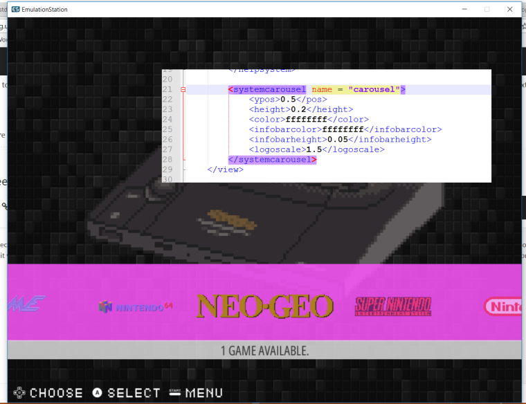
Ok, so its been a while, but because @fieldofcows has been so nice to write down how to compile and build on Windows, I thought it would be nice to give you guys a small peek-preview on what I am working on currently:

I am splitting out the carousel bar as a separate theming element, so we can move it around and change the color, location, height etc.
What do you guys think?NB: WIP, not done yet, universe might explode before completion.
-
-
@Zigurana I love you.
Edit: Too forward?
-
@mattrixk No, this is how you would say it...

-
@lilbud: Like this?

-
Yep, theming that bar would be about the greatest thing to ever happen to ES. That and having a separate "Chosen Game Title" element we could put in. So under the screenshot/gameart could be the name of the game in big letters. But eh, it's all a dream. LOL.
There's another group working on grid. Would any of this stuff make it to RetroPie? Like, if this carousel bar change could be added to default RetroPie that would be flipping amazing. Otherwise I probably wouldn't install a fork of ES. I'd be too scared to screw something up.
-
Can we have opacity on that????? OMG!! its christmas right now!
Contributions to the project are always appreciated, so if you would like to support us with a donation you can do so here.
Hosting provided by Mythic-Beasts. See the Hosting Information page for more information.
