Suggestions for button config
-
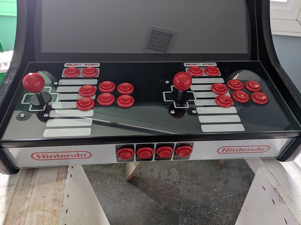
I was gifted a tabletop cabinet from Game Room Solutions that has a 2 player config. Each player has one joystick, 6 action buttons, one 'select' and 'start' each. On the lower front there are 4 buttons labeled 'exit' 'mode' 'start' 'play'
Wondering if anyone has any suggestions for how to utilize this best when setting up controls in RetroPie?
-
 M mitu moved this topic from Ideas and Development on
-
@smardaz
what's the physical layout of the buttons?assuming you want to play arcade games, and it's a standard 3x2 action button layout i would go for:
player 1                                                   player 2

Y X L                                                      Y X L
B A R      P1 Start  P1 Select     P2 Start  P2 Select     B A R
this will give you sensible defaults in arcade cores lr-mame2003 and lr-fbneo. the select buttons will act as insert coin in arcade cores for those players.
the other 4 buttons are a little tricky. a simple case would to use 'mode' to be your hotkey and ignore the rest. alternatively you could do away with hotkeys and bind them to individual functions in retroarch, but it's not immediately obvious to me how they would translate.
-
@dankcushions aren't those upside down? I thought the "YXL" went on top in YXL-BAR.
Also: start-select-start-select, or start-select-select-start? Personally, if they are in between the players' control sets like that, I would mirror them. If they were up above each control set, I would still leave them in the same order so the control sets were identical, but when they're in the middle, you already have one player reaching left and the other player reaching right. In that case, I think the logical way to group them would be "a little to the middle" and "closer to the middle" rather than "which button is on the left or on the right."
-
@sleve_mcdichael said in Suggestions for button config:
@dankcushions aren't those upside down? I thought the "YXL" went on top in YXL-BAR.
yes, you're right. fixed!
Also: start-select-start-select, or start-select-select-start? Personally, if they are in between the players' control sets like that, I would mirror them. If they were up above each control set, I would still leave them in the same order so the control sets were identical, but when they're in the middle, you already have one player reaching left and the other player reaching right. In that case, I think the logical way to group them would be "a little to the middle" and "closer to the middle" rather than "which button is on the left or on the right."
the start/select part was just meant to be illustrative rather than prescriptive, as OP has already said they have labeled buttons within a cabinet, and not shown the physical layout, so they should just use p1 start as... p1 start, etc :) but sure, if you can relocate the buttons then do whatever layout you feel like
-
@dankcushions Thx, good info so far. Layout looks like this:

Contributions to the project are always appreciated, so if you would like to support us with a donation you can do so here.
Hosting provided by Mythic-Beasts. See the Hosting Information page for more information.