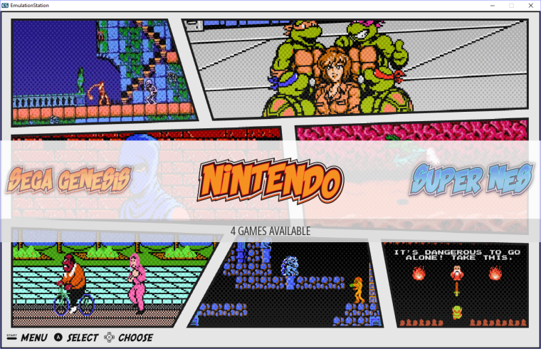
New comic theme and SVG problems
-
I've managed to save a SVG file on inkscape, but it can't have any raster image ou opacity effects, but now i have a logo.ong with 60kb and a logo.svg with 500KB.

-
@lipebello ES does not support SVG transparency levels or blurring as far as I know.
It does support gradients. Looking at your screenshots there should be no reason to have raster parts in your System logos; they can be made with vectors; I see no particular complexity that justifies so big svg files as you're mentioning.
Can you post just the png of one of your logos ? -
@UDb23 - Sure. The first is the old logo, with shadows and a rasterized halftone on it. Second is the new version with no raster at all, but the halftone pattern is in color burn opacity.


-
@lipebello Are the vector haltone dots a single "entity" ? If you can combine them in Inkscape you could apply a vertical gradient from dot color (top) to the letters internal color (bottom). In that way it should give similar result as opacity levels .
-
Funny idea for a theme, love it.
Looking forward too see the rest of it. -
@FlyingTomahawk Only problem with SVGs is that they're going to push the Pi beyond it's memory limit. There is a fix coming for EmulationStation soon that will load wallpapers dynamically, remedying this problem, but it's not here yet.
So don't be afraid of PNG. You don't have to have a single SVG in your entire theme for it to run just fine.
-
@Rookervik What would dynamic wallpapers bring to the table?
-
@lilbud no more White Screen of Death.
-
Could you explain it a bit more?
-
@lilbud https://retropie.org.uk/forum/topic/2389/solution-for-white-screen-of-death/132
I think it basically comes down to being able to use large images for many systems without the theme breaking. It think it required a major change to how ES displays each system.
-
@Rookervik but rookervik! What about the rpi8 that outputs 5K TV?! How will they scale then!
-
@herb_fargus Good lord I hope to not still be using ES when 8k TVs come out. LOL
-
@Rookervik - Thanks a lot, i will just continue as it is.
-
Amazing, hope to see it soon on my retropie :D
-
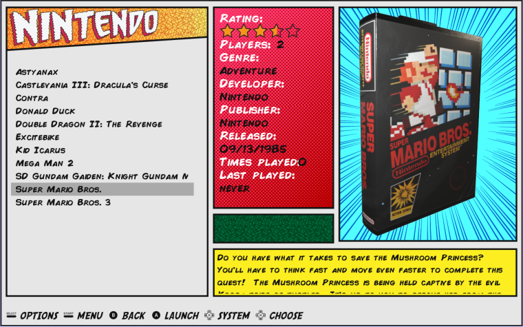
Update on the detailed menu.

-
@lipebello I like it a lot. The lines behind the box art look great.
I think I like the font you used for the Logo on the System View more than this one though.
-
@mattrixk Thanks, this logo is just a test. i'm thinking in remake the logos to match booth system and menus
-
@lipebello Have you implemented video support for this theme?
-
I'm comming a little after the war ^^ but 80Ko for a png logo is "huge"...
Did you try some "compressor" ?
I recommand you optipng or pngquant... your png logo will be near the same size as svg ;)
(Your Theme is great ^^ do you think of create a MIX template with UXS ? maybe you can give a comics style to the media you show in the detail vue with some more media (like you did on the system view, some cut between the cover and a screenshot for exemple... If you want I can give it a try ;) )
-
I Love the look of this theme! Are you planning on doing all 80+ systems?
Contributions to the project are always appreciated, so if you would like to support us with a donation you can do so here.
Hosting provided by Mythic-Beasts. See the Hosting Information page for more information.