Cardboard Mini NES + Nes mini and Famicom mini themes
-
@ruckage said in Cardboard Mini NES + Nes mini and Famicom mini themes:
Fast forward to about 1 1/2 years ago and all my symptoms and more came back with a vengeance- nothing helped, couldn't sleep could only eat small amounts and felt sick all the time. I've had loads of tests but no conclusive cause for all the symptoms - the only major finds so far are confirmed acid reflux and hiatal hernia (knew I had those anyway) and that my esophagus doesn't work so when eating and drinking food isn't pushed down as it should be - it pretty much drops down by gravity alone.
Luckily I seem to get periods where I feel normal again, like now, fingers crossed I won't feel ill again for quite a while.Wow I almost have exactly the same, it's horrible to have trouble swallowing food. Constantly feeling hungry but sick at the same time... I'm doing some test now.
Hope you get better soon! And I really love the cardbord NES it's insane :o
-
@denisuu said in Cardboard Mini NES + Nes mini and Famicom mini themes:
@ruckage said in Cardboard Mini NES + Nes mini and Famicom mini themes:
Fast forward to about 1 1/2 years ago and all my symptoms and more came back with a vengeance- nothing helped, couldn't sleep could only eat small amounts and felt sick all the time. I've had loads of tests but no conclusive cause for all the symptoms - the only major finds so far are confirmed acid reflux and hiatal hernia (knew I had those anyway) and that my esophagus doesn't work so when eating and drinking food isn't pushed down as it should be - it pretty much drops down by gravity alone.
Luckily I seem to get periods where I feel normal again, like now, fingers crossed I won't feel ill again for quite a while.Wow I almost have exactly the same, it's horrible to have trouble swallowing food. Constantly feeling hungry but sick at the same time... I'm doing some test now.
Hope you get better soon! And I really love the cardbord NES it's insane :o
Thank you, I'm feeling quite well myself at the moment with just a few days a week that are bad. Never goes completely but it's manageable.
I hope you feel better soon and that your tests go okay (not knowing what's wrong and waiting for test results isn't nice I know). For nausea try some ginger - don't over do it as that can make things worse if you have too much (found that out the hard way), I always have some 'gin gins' in the house (ginger sweets) which help when I feel bad. Another thing that can help which sounds weird is sugar free mint gum, especially if you feel worse after eating.
-
@ruckage Hey, I don't know if this is too much to ask but, could you release the non-video version you already have with the nintendo ds theme? I only need that theme to start using your theme as my main and i'm to anxious :D haha
-
@Squilenator Let him release things at his own leisure and when he feels is right. Making demands or trying to rush someone can annoy people, just sayin'.
-
@MapleStory Sry for sounding demanding, i'm just too anxious ;c
-
@Squilenator If you're anxious read up on the docs and create what you envision. More gratifying that way than piggybacking off another project. We all do this in our free time and nothing is stopping you from making something great!
-
Hi,
It's fine, at least I know people are interested in my themes :). There will be a new version released soon but it will probably be once the githup repo is up and running. I actually have the Git repository pretty much ready, really just need to get the readme how I want it . I wanted to speak to @Rookervik regarding that to see what he suggested, basically I would prefer there not to be copies of it released by others - at least while I'm actively working on it and adding to it, I just need to get the wording right. I know the retropie project relies on sharing but hopefully this doesn't seem unreasonable, most of the work I've made on this is theme is for the benefit of others as I don't use most of the systems myself.
-
hows the update/build going?
-
Wow impressive case! And really like the themes, well done! Been using Pixel but might have to give yours a spin once you have them ready...
-
Hi everyone, just thought I'd check in so you didn't think I'd gone AWOL. Sorry for the lack of updates, I've had a busy couple of weeks but will resume theme production soon :).
-
@ruckage s'all good man :)
-
anyone else tried this attract mode version?
-
Not tried it but it does look a very nice version and is very close to the real nes mini. Attract mode itself looks very impressive as it's much more advanced and you can customize pretty much everything. I wouldn't be surprised if attract mode became the default frontend in time.
-
finally got around to installing this on a build i'm sending to my brother - love it! as with most themes i find it looks best with the 'slide' transition.
great work :D
-
@ruckage said in Cardboard Mini NES + Nes mini and Famicom mini themes:
Not tried it but it does look a very nice version and is very close to the real nes mini. Attract mode itself looks very impressive as it's much more advanced and you can customize pretty much everything. I wouldn't be surprised if attract mode became the default frontend in time.
I installed the attract mode nes mini theme and it's very nice, but I'm a noob when it comes to attract mode as this is the first time I've really experimented with it and still trying to get familiar with it lol, but you should check it out. 😀
-
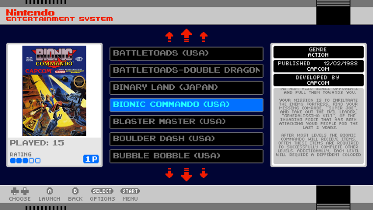
I'm considering altering the layout of the theme slightly and would appreciate some feedback.
The reason for the proposed changes is that at the moment the boxart area only works properly if the gameboxes are all a standard size, for example all portrait boxes for NES, all landcape boxes for SNES etc. The trouble is that some systems have a variety of different shaped boxes and this leads to the artwork being stretched and if a user prefers screenshots to boxes these will also be stretched.
What I propose is to mimic the look of the real nes mini game tiles to a degree - moving some of the metadata below the boxart. The boxart will now be confined to a square area above this and will scale to fit this whilst keeping the aspect ratio.
The pros for this are:
- No more issues with stretched artwork and screenshots will also display perfectly if used.
- I will no longer need to define box art sizes per system which is one less thing for me to do while making the theme.
The cons are:
- The box art will be smaller
- In my opinion the metadata area is now not quite as interesting looking.
Here's a mock-up of how it will most likely look:

Let me know what you think, I like the theme as it is at the moment but do feel that with so many systems which don't have uniform box sizes that this may be be the best option. On the plus side I would only need to edit a few of the backgrounds and the rest of the changes are within the xml itself so it won't take very long to make the changes.
-
I kind of like the new proposed look, I understand what you mean about the metadata box now looking bland, I think I have an idea to fix that issue, leave it with me and I will get back to you within the next day with a possible solution, in the meantime is there any chance you have a mockup screen of the famicom mini with a landscape box art?
Thanks
Stuart.
-
I like the idea of the rating and number of players under the box art/screenshot... That is actually something I am doing on a theme I am working on... I feel like it balances better instead of having just a game list in one column, metadata in another, and art by itself...
Hope that helps...
-
@Stuart2773 said in Cardboard Mini NES + Nes mini and Famicom mini themes:
I kind of like the new proposed look, I understand what you mean about the metadata box now looking bland, I think I have an idea to fix that issue, leave it with me and I will get back to you within the next day with a possible solution, in the meantime is there any chance you have a mockup screen of the famicom mini with a landscape box art?
Thanks
Stuart.
I don't have a famicom mockup at the moment but a landscape box would look just the same only there would be white borders at the top and bottom instead of on the sides (the preview box is square). For games with more square boxart (gameboy, playstation) it would fill the area more and have less border.
I think the metadata area looks slightly bland now simply because the rating and player icons added a bit of colour and visual interest. I'm still thinking of ideas myself - ideally anything added needs to fit well and have a purpose, if you have any ideas let me know (it's a shame that genre can't be displayed using different icons as that would have looked nice).
-
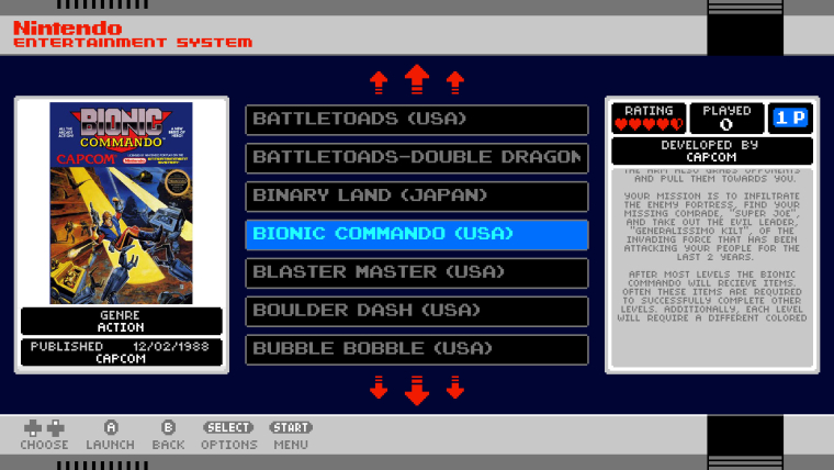
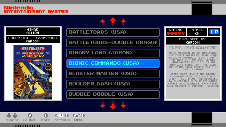
Had another idea so I just quickly threw together a few mockups, this time keeping rating/played/players on the right which looks nicer to me and have 'published by' and 'genre' either under the boxart or above the boxart. Going to work on it a bit more but what do you think?


Contributions to the project are always appreciated, so if you would like to support us with a donation you can do so here.
Hosting provided by Mythic-Beasts. See the Hosting Information page for more information.