Cardboard Mini NES + Nes mini and Famicom mini themes
-
After reading through the carousel thing now I'm curious. What is stopping us from themeing the menu you get when you press start?
If both the carousel and that menu could be modded we could at last have fully cohesive themes and our RetroPie setup would look much better in my opinion. The only thing that actually detracts from any pixel theme feeling as pixelly as it should are both the start menu and the "x games avaliable" text not being pixelly at all.
-
@Serj-Targarien
With the carousel code you can choose your own text for the Games Avaliable list. So all @ruckage needs to do is use his nes font and pixelly theme all around besides the menu.As far as I know the only thing stopping us from themeing the menu is code being added to emulationstation that allows us to do it.
-
@ruckage said in Cardboard Mini NES + Nes mini and Famicom mini themes:
@dankcushions said in Cardboard Mini NES + Nes mini and Famicom mini themes:
It has now been added to the retropie theme installer, so you can install/update via that if you 'Update RetroPie setup script'. :)
That's great, thanks :) . As @Serj-Targarien said, how do updates work with the theme installer? Will it automatically get updated when I make changes to my git repository?
yes! after you have installed a theme, you can 'update' it which is just pulling in the latest version from git. as long as you keep to the same git repos, users can update directly from the theme installer :)
-
@Syhles said in Cardboard Mini NES + Nes mini and Famicom mini themes:
@ruckage
If you don't care I'm going to post example code for the two styles of carousel in the thread for @TMNTturtlguySure, go ahead. As long as the thread doesn't get turned into the Carousel discussion thread :P
I have to say my only real gripe with this forum is the lack of a PM function, it makes communicating with individual members pretty much impossible.@Serj-Targarien said in Cardboard Mini NES + Nes mini and Famicom mini themes:
After reading through the carousel thing now I'm curious. What is stopping us from themeing the menu you get when you press start?
If both the carousel and that menu could be modded we could at last have fully cohesive themes and our RetroPie setup would look much better in my opinion. The only thing that actually detracts from any pixel theme feeling as pixelly as it should are both the start menu and the "x games avaliable" text not being pixelly at all.
With the carousel theming you can change the font on the 'games available' (it will be the first thing I do). I'm sure the menu could also be themed but someone would need to modify the code. Probably best to ask in the thread @Syhles linked to. Personally I would prefer the gamelist bugs to be fixed first though (I'm starting to sound like a broken record now - I'll try to stop mentioning the gamelist bugs :P)
-
<carousel name="systemcarousel">
	<type>horizontal</type>
      	<pos>0.5 0.6</pos>
	<size>0.5 0.20</size>
	<color>FFFFFFff</color>
	<logoScale>1.5</logoScale>
	<logoSize>0.10 0.3</logoSize>
	<maxLogoCount>3</maxLogoCount>
</carousel>

<carousel name="systemcarousel">
	<type>vertical</type>
	<pos>0.025 0.05</pos>
	<size>0.33 0.7</size>
	<color>4ca0ad75</color>
	<logoScale>1.5</logoScale>
	<logoSize>0.20 0.15</logoSize>
	<maxLogoCount>5</maxLogoCount>
</carousel>

<text name="systemInfo">
	<pos>0.65 0.82</pos>
	<size>0.3 0.12</size>
	<backgroundColor>3bc5db75</backgroundColor>
	<fontPath>./art/font.ttf</fontPath>
	<fontSize>0.033</fontSize>
	<color>0f363dff</color>
</text>
This is from @Zigurana 's
dev.xml that was posted.I currently don't have the <feature supported> code but from what I remember is if you already have the video <feature supported> just use that and replace video with carousel. Just make sure only the Carousel stuff is inside of <feature supported> or you will break the rest of the stuff that inside that block.
-
Thanks for the heads up, I hope that piece of code ends up being added.
I know there are other Frontends being coded at the moment to get around the lack of customization in EmulationStation, but i personally love the simplicity and usefulness of it, and hope to have it fully themed in the future.
@dankcushions, so we have to remove the theme from /opt/retropie/configs/all/emulationstation/themes and then install it through the theme installer, right?
EDIT: Never mind, already done that.
-
@Syhles thanks, to be polite I won't comment more on this string as it is for an awesome theme! I use the code you posted but also didn't have the carousel feature. So I tried my own and it didn't work. I could have had an error though.
-
@ruckage
I'd like to be able to use all of the metadata image fields in detailed view besides the video, video on the system(carousel), themeable menu, the extra sounds that are available to recalbox, and favorites like recalbox does it.
This is super off topic but no one in my house is interested in this so... -
@ruckage Thank you! That fixed it.
-
@Syhles said in Cardboard Mini NES + Nes mini and Famicom mini themes:
@ruckage
I'd like to be able to use all of the metadata image fields in detailed view besides the video, video on the system(carousel), themeable menu, the extra sounds that are available to recalbox, and favorites like recalbox does it.
This is super off topic but no one in my house is interested in this so...I'm sure those features will be added in time as lots of people would appreciate them (particularly the extra metadata images). I was quite upset myself when I realized most of the sounds didn't work in current ES. I'd also like animated gif support in some form (with transparency) as that would allow lots of fun possibilities.
-
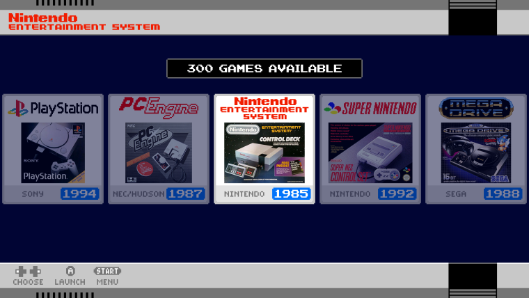
I've been experimenting with the new carousel theming and I'm thinking of going for something like this.

It will require making each of the system logos individually but I should be able to get them all done in a few days (the hardest part is finding good photos of box art). As these would look odd as logos in the old version of ES I think I should be able to use the 'feature' tag so that these are only used on the new version that supports carousel theming.
-
It gives it a more corporate/conservative look, but I don't think that's necessarily a bad thing. What box type images do you plan on using for non-system menu items, such as Ports, RetroPie and Arcade?
-
@mediamogul said in Cardboard Mini NES + Nes mini and Famicom mini themes:
I gives it a more corporate/conservative look, but I don't think that's necessarily a bad thing. What box type images do you plan on using for non-system menu items, such as Ports, RetroPie and Arcade?
I thought this would give a bit of the feel of the real menus used on the Nes Classic (that's what I was going for anyway). Not sure what I'll use to depict all the non system items yet but I'm sure I'll think of something.
-
I'm sure I'll think of something.
I look forward to seeing your solutions. Watching your inventiveness here has been the main draw of following this thread.
-
@ruckage , just being curious (and a bit childishly impatient... -_-), when are you going to release the version with the ports and psp logos? I'm eager to see those in action.
Otherwise, the new carousel is looking really good. Will there be options to use the old design with the new "x games avaliable" sign once it's finished? I loved the layout options you provided for the games screen and I don't know if something like that would be possible in this case. Anyway, keep up the good work.
-
I registered just to say that carousel looks awesome! Can't wait to see the next update. Keep up the great work @ruckage and hope your health is better!
-
@Serj-Targarien said in Cardboard Mini NES + Nes mini and Famicom mini themes:
@ruckage , just being curious (and a bit childishly impatient... -_-), when are you going to release the version with the ports and psp logos? I'm eager to see those in action.
I won't give a definite release date for the next version but soon, I will probably wait until I've made the changes to the carousel.
Otherwise, the new carousel is looking really good. Will there be options to use the old design with the new "x games avaliable" sign once it's finished? I loved the layout options you provided for the games screen and I don't know if something like that would be possible in this case. Anyway, keep up the good work.
Thanks. I would like to do that and have been trying to think of a way I can achieve it but I don't think it will be possible (well, it is possible but not easy and would make future changes to the theme much more difficult which would be bad). I'm still thinking about it though so I may come up with something.
@nahlakhai said in Cardboard Mini NES + Nes mini and Famicom mini themes:
I registered just to say that carousel looks awesome! Can't wait to see the next update. Keep up the great work @ruckage and hope your health is better!
Thanks, I appreciate it. My health has been much better these past months and hopefully it will stay that way.
-
@ruckage said in Cardboard Mini NES + Nes mini and Famicom mini themes:
I've been experimenting with the new carousel theming and I'm thinking of going for something like this.

It will require making each of the system logos individually but I should be able to get them all done in a few days (the hardest part is finding good photos of box art). As these would look odd as logos in the old version of ES I think I should be able to use the 'feature' tag so that these are only used on the new version that supports carousel theming.
looking awsome that carousel
-
@ruckage That looks so awesome :O
Is there video implementation yet? Is it planed? -
Thanks for the replies.
@DarkWolf said in Cardboard Mini NES + Nes mini and Famicom mini themes:
@ruckage That looks so awesome :O
Is there video implementation yet? Is it planed?No video support yet but I do plan to add it.
Carousel update
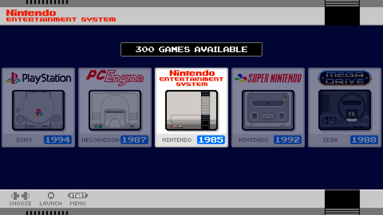
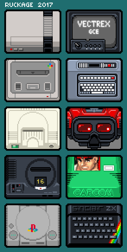
I've been re-working the carousel a bit as I wasn't sure I liked the boxart. I came across a beautiful set of icons by a reddit user called br1ans (link here) and I really liked the concept so I've been working on my own set of pixel art icons following the same concept (not copying though, its more fun to do from scratch and it will be interesting for me to compare how I interpret the consoles differently to br1ans).
Here is the mockup using the new pixel art. I think it fits the theme better than the box art.

And here are all the systems I've drawn so far.

Contributions to the project are always appreciated, so if you would like to support us with a donation you can do so here.
Hosting provided by Mythic-Beasts. See the Hosting Information page for more information.