Cardboard Mini NES + Nes mini and Famicom mini themes
-
@ruckage said in Cardboard Mini NES + Nes mini and Famicom mini themes:
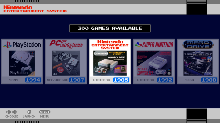
I've been experimenting with the new carousel theming and I'm thinking of going for something like this.

It will require making each of the system logos individually but I should be able to get them all done in a few days (the hardest part is finding good photos of box art). As these would look odd as logos in the old version of ES I think I should be able to use the 'feature' tag so that these are only used on the new version that supports carousel theming.
looking awsome that carousel
-
@ruckage That looks so awesome :O
Is there video implementation yet? Is it planed? -
Thanks for the replies.
@DarkWolf said in Cardboard Mini NES + Nes mini and Famicom mini themes:
@ruckage That looks so awesome :O
Is there video implementation yet? Is it planed?No video support yet but I do plan to add it.
Carousel update
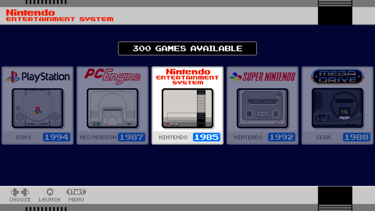
I've been re-working the carousel a bit as I wasn't sure I liked the boxart. I came across a beautiful set of icons by a reddit user called br1ans (link here) and I really liked the concept so I've been working on my own set of pixel art icons following the same concept (not copying though, its more fun to do from scratch and it will be interesting for me to compare how I interpret the consoles differently to br1ans).
Here is the mockup using the new pixel art. I think it fits the theme better than the box art.

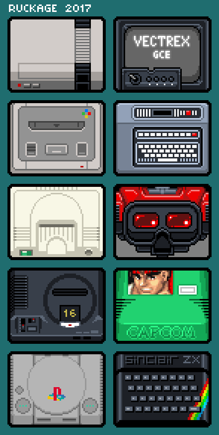
And here are all the systems I've drawn so far.

-
@ruckage wow, that's beautifull
No video support yet but I do plan to add it.
that would be awesome, thanks
-
@ruckage
Great pixel art icons! I think both the box and your pixel art icons look awesome! The pixel art icons might be more appropriate for this mini nes theme though lol! I enjoy reading the updates on this thread! -
I think it fits the theme better than the box art.
I like both in their own way, but this certainly retains the pixel aesthetic found in the rest of the theme. Very keen!
I enjoy reading the updates on this thread!
It really has been nice to see this thing come along so nicely from a single system menu. It's definitely one of the strongest themes out there now.
-
It's definitely one of the strongest themes out there now.
...but we still love you @Rookervik ;-)
-
Definitely, respect to Rook, to use the parlance of our times.
-
@ruckage
I like the direction your going with the carousel, the only suggestion I can think of at this point for this theme is instead of using the nes system border at the top and bottom for every system, make borders that resembles each system. Also all of the pixel art I've seen for the theme so far has been fantastic. -
@mediamogul @backstander
Thanks guys, glad you're enjoying the thread and the progress.I think the pixel icons are more in keeping myself but don't dislike the boxart versions either as it's a nice bit of nostalgia. In an ideal world I'd provide both with the option to choose between them within the xml but it's trickier to do that with the system icons due to the way the theme is setup. I suppose I could provide a separate zip which you could extract and overwrite the icons to replace them. Perhaps I'll give that a shot - but no promises.
@mediamogul said in Cardboard Mini NES + Nes mini and Famicom mini themes:
Definitely, respect to Rook, to use the parlance of our times.
Definitely, @Rookervik themes are great and the amount of time and effort he has put into them is amazing.
@Syhles said in Cardboard Mini NES + Nes mini and Famicom mini themes:
@ruckage
I like the direction your going with the carousel, the only suggestion I can think of at this point for this theme is instead of using the nes system border at the top and bottom for every system, make borders that resembles each system. Also all of the pixel art I've seen for the theme so far has been fantastic.Thanks :). Regarding borders, that has been discussed a few times and I like the idea of it but it's not something I'm planning to do just yet as it will be a lot of additional work - I can see myself doing it a at a later date though when the theme is more or less complete in every other way.
-
@ruckage
I like the pixel consoles better then the box's personally, they both look nice though. -
Dude, I may switch to this theme. :D Lemme know if 86 system icons is too much. I can help out. LOL.
-
love the pixel art themes! (as someone who prefers screenshots over boxart in the gamelist also!)
-
I actually like the box pictures better, they also have a retro feeling to them too. But the pixels look awesome! One suggestion or opinion I have is the text in the descriptions of the games is a bit hard to read. Not sure what font would work better but I find the text too pixelly and I just ignore it.
-
@ruckage I absolutely love the new pixel art icons, and I think they fit the theme much better than the boxes, with the added advantages of fitting every system (even arcade and ports) and not using any proprietary images. Great work in the ones you made so far!
-
Thanks for the replies :)
@Rookervik said in Cardboard Mini NES + Nes mini and Famicom mini themes:
Dude, I may switch to this theme. :D Lemme know if 86 system icons is too much. I can help out. LOL.
Thanks :D - I can't believe you have any time to actually use retropie though with all the theme making you do ;) .
I think I have fair bit of work to do to reach 86 systems, that takes some serious dedication. My theme is at 42 systems at the moment (maybe I should stop now as I'm sure the number 42 is incredibly significant in some way......)Thanks for the offer of help, it's kind of you. I'm okay at the moment though, luckily I love drawing pixel art and I like a challenge.
@nahlakhai said in Cardboard Mini NES + Nes mini and Famicom mini themes:
One suggestion or opinion I have is the text in the descriptions of the games is a bit hard to read. Not sure what font would work better but I find the text too pixelly and I just ignore it.
Thanks for the feedback. I don't really see a problem with the font myself, everything seems perfectly readable to me. I haven't had any other complaints regarding it and it fits the theme perfectly. If you're really not happy with the font you can easily swap it out for another that you prefer.
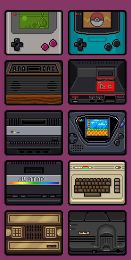
More icons
I've drawn another 10 icons, 22 left to do to cover all currently supported systems. It's time consuming work but I think it will be worth it.

-
@ruckage
The new icons look so clean, also do you feel like 42 is the meaning of everything? Lol -
Late to the party, but what are these icons going to be used for?
-
@itsnitro
but what are these icons going to be used for?
a Carousel update:

-
@Syhles said in Cardboard Mini NES + Nes mini and Famicom mini themes:
@ruckage
.......do you feel like 42 is the meaning of everything? LolThat could be it, I need to put some 'Deep Thought' into it :D
@itsnitro said in Cardboard Mini NES + Nes mini and Famicom mini themes:
Late to the party, but what are these icons going to be used for?
I'm working on theming the system select carousel so it will look something like this.

Edit: ooops, @backstander beat me to it.
Contributions to the project are always appreciated, so if you would like to support us with a donation you can do so here.
Hosting provided by Mythic-Beasts. See the Hosting Information page for more information.