Cardboard Mini NES + Nes mini and Famicom mini themes
-
@ruckage said in Cardboard Mini NES + Nes mini and Famicom mini themes:
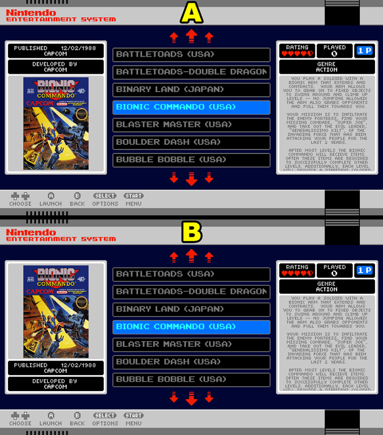
Here is the same layout with 'published by' and 'developed by' moved beneath the boxart. To me it looks unbalanced so I prefer it with that information above the boxart.
I personally like this one better as well... has better balance...
-
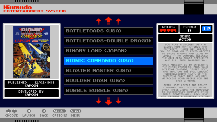
Okay, I'm confused now as to what people actually prefer. I personally like the information at the top as visually it looks more balanced to me but I will let you all decide.
If everyone interested could make a post stating either A or B as your preference from the image below that would be great.
-
Its close but I think B just edges it.
-
B for me.
-
This post is deleted! -
for those who cant decide lol :P
-
-
@Stuart2773
I actually like that way better. -
Thank You :)
-
@Stuart2773 said in [Cardboard Mini NES + Nes mini and Famicom mini themes](/forum
for those who cant decide lol :P
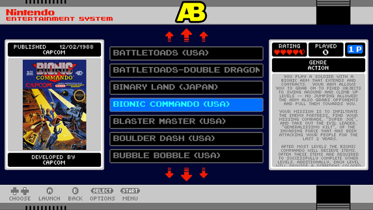
Good suggestion Stuart, can't believe I hadn't tried that (facepalm) though as a I like symmetry I would probably do the same on the other side as well. So how about this:
-
@ruckage I think we have a winner.
Anyways make it however you like, it's your theme and if someone doesn't like it they have the XML and can make it what they want it to be. Can't please everyone ;)
Fantastic theme all around.
If you read the documentation it will answer 99% of your questions: https://retropie.org.uk/docs/
Also if you want a solution to your problems read this first: https://retropie.org.uk/forum/topic/3/read-this-first
-
-
@ruckage
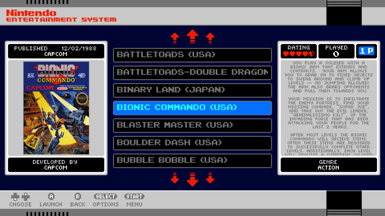
I like the new look symmetry is important, but personally on the right metadata box I'd flip it, (rating, player etc.) at the bottom, genre at the top. Also this is my personal opinion, I'd use the theme regardless. -
@ruckage Didn't see C but like the top and bottom version :)
-
i choose the mystery box! (C)
-
@Syhles said in Cardboard Mini NES + Nes mini and Famicom mini themes:
@ruckage
I like the new look symmetry is important, but personally on the right metadata box I'd flip it, (rating, player etc.) at the bottom, genre at the top. Also this is my personal opinion, I'd use the theme regardless.I'd agree with this.
-
Oops, forgot to label the mystery box but that seems to be the most popular. Here's one last change then as requested, I've swapped 'rating/played/players' with 'genre'.
SNES mini/Nes mini/Famicom mini theme developer.
If you'd like to support my work you can donate here: Donate
-
Im glad you like my mock-up AB, just after i realised that, it would look better if the ratings was balanced out on the right box , but obviously you had the same idea as me lol,
"C" is my favorite, if i was you i would just go ahead and make those changes and then release the next version :)
-
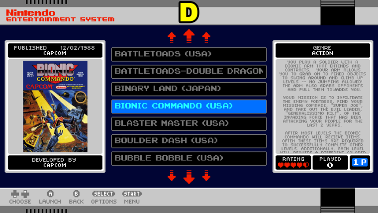
D>C>B>A
E is gonna be great. ;)
-
Lets just skip to F & upload that version!
;)
Only joking, D looks great.
I want the D!
Wait....that doesnt sound right.....
xD
Contributions to the project are always appreciated, so if you would like to support us with a donation you can do so here.
Hosting provided by Mythic-Beasts. See the Hosting Information page for more information.