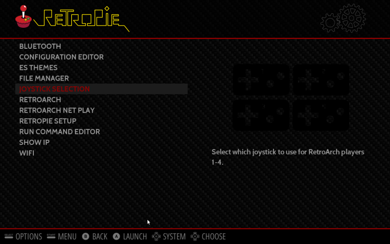
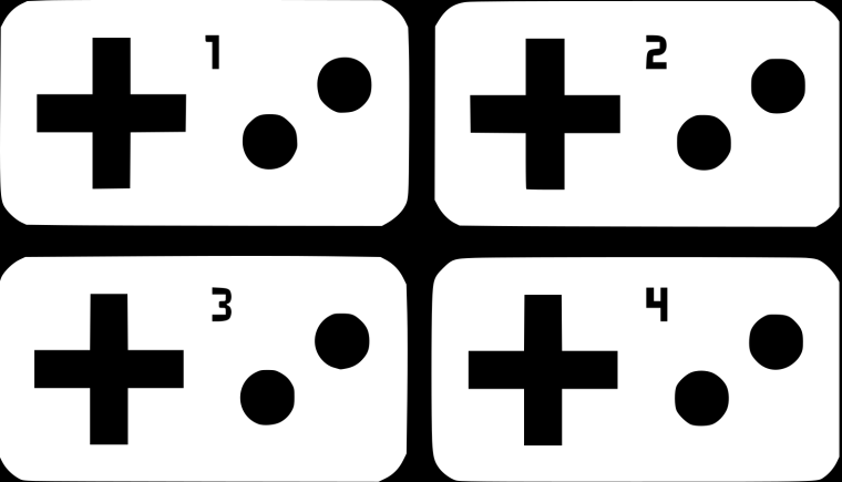
Here is a way to select joystick for players 1-4 (global or emu specific)
-
@meleu hey, just wondering any plan to add an image/icon for this in the retropie setup selection? if not, is it easy to make my own and add it?
-
@skrapps914 said in Here is a way to select input for RetroArch players 1-4:
@meleu hey, just wondering any plan to add an image/icon for this in the retropie setup selection? if not, is it easy to make my own and add it?
It's easy to add it. But if it is easy to make your own depends on your artistic skills. :-)
I would like to add an image there, but I don't have enough proficiency with CG softwares...
Actually I would love to see what @Rookervik or @lilbud can do in this regard, but I don't have enough intimacy to ask them for it... :-)
-
@meleu Er? I don't really know what kind of icon you're needing haha. Some sort of icon for setting up controllers for RetroArch? I've just redone all the icons for the retropie menu but haven't had any feedback so that project is on hold for the moment.
-
@Rookervik
This isn't an "official" tool, but some users are enjoying it.It's a tool to configure the joystick input for RetroArch players 1-4. Not to configure the buttons, it's just what controller will control the players 1-4.
https://github.com/meleu/RetroPie-joystick-selectionAfter the installation, the tool is launchable at RetroPie menu and it has a description.
I was thinking on a image with 4 mini-joysticks on the left and 4 numbered retroarch-space-invaders-like symbols on the right and some scrambled lines connecting each other side. Or something like that... But If you want to honor us with an image, I trust in your artistic skills, do as you want!
-
@meleu How about this?

-
@lilbud Looks good, but I'd remove the numbers. That'd make a great icon.
-
@lilbud Thanks!
I was thinking in something to refer to the possibility of reordering.
-
@Rookervik Fixed It
-
@lilbud Good stuff lilbud :D
-
@meleu
http://i.imgur.com/vSiUQjm.png what about this?
-
@lilbud the d-pad and the buttons are transparent, so it doesn't look fine with Carbon theme, for example...
-
@meleu I will fix it soon, I am not home at the moment.
-
@lilbud and what about that numbers inside the pads?
Let's wait you get at home... -
@meleu I will get on that
-
@lilbud hahaha. That Squidward Quincy Tentacles video was funny!
I mean the numbers inside the pads, not outside like the old. :-) -
-
@lilbud about the d-pad and buttons (and now the numbers) transparency:

-
@meleu this should be the white svg
https://drive.google.com/open?id=0B3U0bE6LTfFQX0NUbk1BUUhNVFk
-
@lilbud (let me know if I'm acting like the Bubble Budy. (yeah! I think I am))
Can the d-pad, buttons and numbers be opaque?
The transparency between the controllers are good, but the inside the controllers (d-pad and buttons) it looks strange (getting the background colors). -
@meleu what exactly do you mean? Post a screenshot. I will be leaving for a game soon. I'll get it when I get back
Contributions to the project are always appreciated, so if you would like to support us with a donation you can do so here.
Hosting provided by Mythic-Beasts. See the Hosting Information page for more information.

