Cardboard Mini NES + Nes mini and Famicom mini themes
-
@ruckage
I like the pixel consoles better then the box's personally, they both look nice though. -
Dude, I may switch to this theme. :D Lemme know if 86 system icons is too much. I can help out. LOL.
-
love the pixel art themes! (as someone who prefers screenshots over boxart in the gamelist also!)
-
I actually like the box pictures better, they also have a retro feeling to them too. But the pixels look awesome! One suggestion or opinion I have is the text in the descriptions of the games is a bit hard to read. Not sure what font would work better but I find the text too pixelly and I just ignore it.
-
@ruckage I absolutely love the new pixel art icons, and I think they fit the theme much better than the boxes, with the added advantages of fitting every system (even arcade and ports) and not using any proprietary images. Great work in the ones you made so far!
-
Thanks for the replies :)
@Rookervik said in Cardboard Mini NES + Nes mini and Famicom mini themes:
Dude, I may switch to this theme. :D Lemme know if 86 system icons is too much. I can help out. LOL.
Thanks :D - I can't believe you have any time to actually use retropie though with all the theme making you do ;) .
I think I have fair bit of work to do to reach 86 systems, that takes some serious dedication. My theme is at 42 systems at the moment (maybe I should stop now as I'm sure the number 42 is incredibly significant in some way......)Thanks for the offer of help, it's kind of you. I'm okay at the moment though, luckily I love drawing pixel art and I like a challenge.
@nahlakhai said in Cardboard Mini NES + Nes mini and Famicom mini themes:
One suggestion or opinion I have is the text in the descriptions of the games is a bit hard to read. Not sure what font would work better but I find the text too pixelly and I just ignore it.
Thanks for the feedback. I don't really see a problem with the font myself, everything seems perfectly readable to me. I haven't had any other complaints regarding it and it fits the theme perfectly. If you're really not happy with the font you can easily swap it out for another that you prefer.
More icons
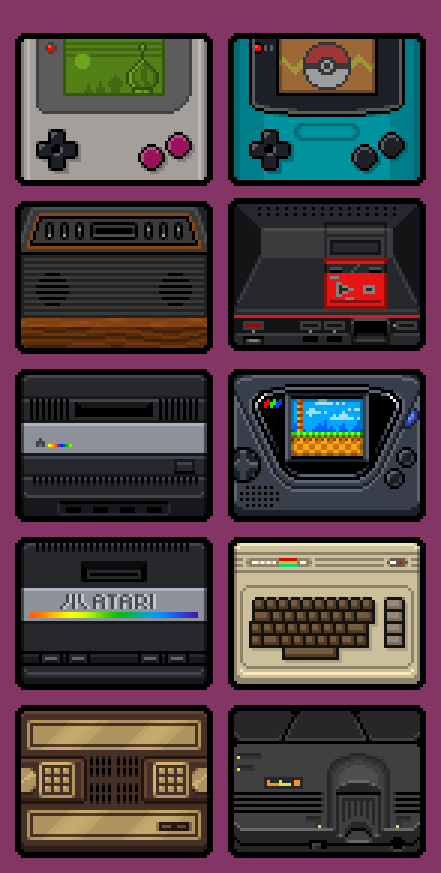
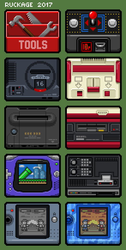
I've drawn another 10 icons, 22 left to do to cover all currently supported systems. It's time consuming work but I think it will be worth it.

-
@ruckage
The new icons look so clean, also do you feel like 42 is the meaning of everything? Lol -
Late to the party, but what are these icons going to be used for?
-
@itsnitro
but what are these icons going to be used for?
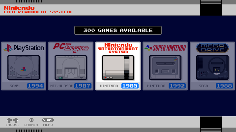
a Carousel update:

-
@Syhles said in Cardboard Mini NES + Nes mini and Famicom mini themes:
@ruckage
.......do you feel like 42 is the meaning of everything? LolThat could be it, I need to put some 'Deep Thought' into it :D
@itsnitro said in Cardboard Mini NES + Nes mini and Famicom mini themes:
Late to the party, but what are these icons going to be used for?
I'm working on theming the system select carousel so it will look something like this.

Edit: ooops, @backstander beat me to it.
-
Oh. Like it! If ya need help, let me know. I'm a graphic artist as well and I can try to do this. 42 icons seems a lot.
-
@itsnitro
Thanks for the offer but I'm happy doing it myself at the moment. And it's only 42 that need to be done to start with as the theme only has 42 systems so far (and I've already drawn 21 icons so I'm halfway). -
@ruckage GAH these look so amazing! Great job!
Also I know what you mean about working alone. When you put as much sweat and work into a project, it's hard to take on additional help because you want to push it all out yourself. (/me pats your shoulder) I totally get it. :D Keep it up! Looking AMAZING.
-
@ruckage to have someone make one complete theme with consistency makes my OCD scream with joy. The pixel consoles are beautiful
-
I must say I love this theme almost more than the pixel theme they have, I cant wait for you to get the other consoles finished, its gonna look awesome!
-
@Rookervik said in Cardboard Mini NES + Nes mini and Famicom mini themes:
@ruckage GAH these look so amazing! Great job!
Also I know what you mean about working alone. When you put as much sweat and work into a project, it's hard to take on additional help because you want to push it all out yourself. (/me pats your shoulder) I totally get it. :D Keep it up! Looking AMAZING.
Thanks :). Yeah, I totally agree. I just find it really satisfying to produce something single-handedly and it's nice to feel proud of something that was all your own work, (I know a few bits of this theme originated from the Nes classic menu but the vast majority of it is now my own work) I'm sure you feel the same way.
At this point sharing the workload on this theme would feel a bit like giving away my baby :D.
Right, back to work! No time for slacking, I have lots more icons to draw.
-
Another 10 icons completed.

-
Love the icons! Cant wait to see the layouts for the other systems when you get to them ^_^
-
Ruckage is killing it with this pixel art. WOW.
-
@felleg Me thinks @Rookervik might have a worthy opponent in the field of pixel art
Contributions to the project are always appreciated, so if you would like to support us with a donation you can do so here.
Hosting provided by Mythic-Beasts. See the Hosting Information page for more information.