Cardboard Mini NES + Nes mini and Famicom mini themes
-
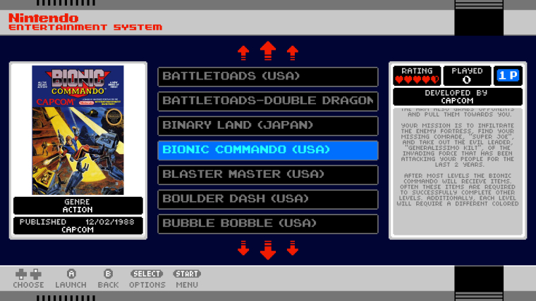
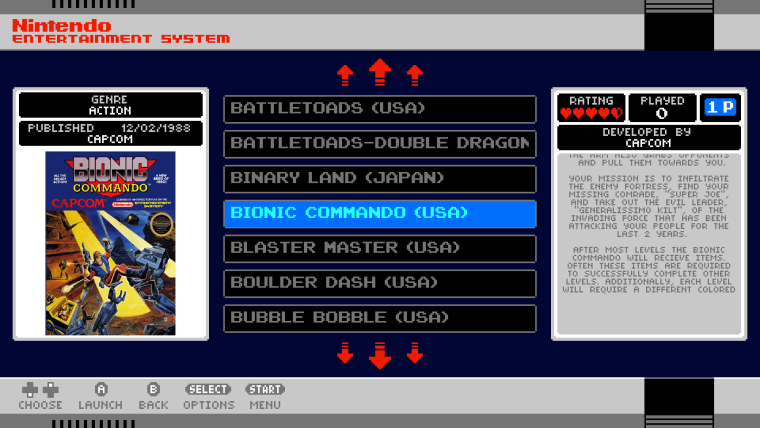
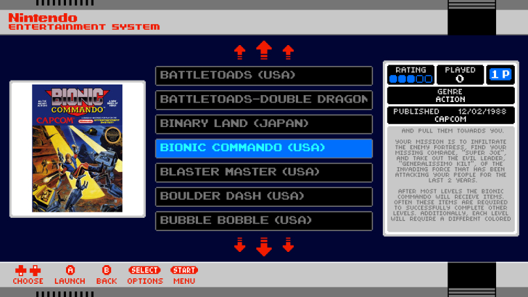
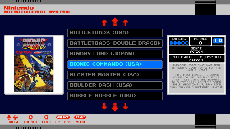
Had another idea so I just quickly threw together a few mockups, this time keeping rating/played/players on the right which looks nicer to me and have 'published by' and 'genre' either under the boxart or above the boxart. Going to work on it a bit more but what do you think?
-
looks good to me!
one thing i would prefer is left-aligned game description text. for large blocks of text i think it looks better than centred. but doesn't really matter :)
-
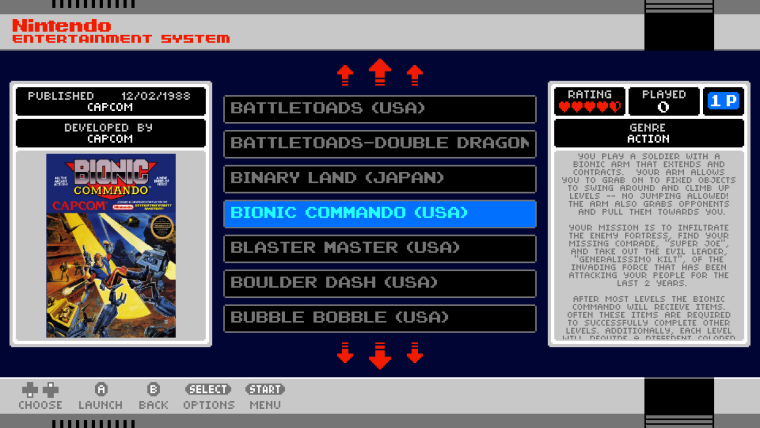
I would swap the developer and genre on the top one, but I like the top one best of the 3 mockups so far...
-
i had a few ideas, but i think this one works best :-
changing the field backgrounds from black to grey or blue,
adding the official system info icons from the nes mini,what do you think?
-
@Stuart2773 said in Cardboard Mini NES + Nes mini and Famicom mini themes:
i had a few ideas, but i think this one works best :-
changing the field backgrounds from black to grey or blue,
adding the official system info icons from the nes mini,what do you think?
Hi,
To be honest I like the black background for those boxes more as I tried grey before when I was creating the theme and felt that the black was more eye catching. Regarding the icons they don't really fit and aren't representative of any info in that area - plus some games have multiple genres so they would overun the icons.
Edit: actually I don't mind the coloured background for those boxes though it would probably need to be changed dependent on the system - I'll think about it some more.
-
Hello, the ports virtualboy and MSX are allready supported?
-
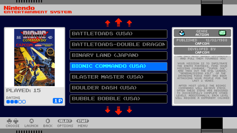
Why not just keep things as they were regarding the metadata box
resize & reposition the artwork box as shown,
replace the "hearts"as they are not representative of the nes/famicom miniif you wanted to keep both left and right boxes aligned just have a smaller area for game description:-
-
Not really bothered about remaining too faithful to the real nes mini, it's impossible to match it exactly so it was only used as inspiration. I simply wanted to make a theme with the same feeling though not necessarily a carbon copy. I think the hearts look nicer and are more fun and were used specifically as a homage to Legend of Zelda (if the real nes mini had shown ratings on the games I wouldn't be surprised if they also chose hearts to represent it).
I specifically don't want to shrink the boxes down as it will result in less space for the description and will leave too much empty space (had already tried that).
-
@dankcushions said in Cardboard Mini NES + Nes mini and Famicom mini themes:
looks good to me!
one thing i would prefer is left-aligned game description text. for large blocks of text i think it looks better than centred. but doesn't really matter :)
Sorry, missed this post earlier. Thanks for the feedback, regarding text alignment I think I was having some display issues when I set it to left aligned but I can't remember exactly what, I'll try it again and see.
@SuperSirLink said in Cardboard Mini NES + Nes mini and Famicom mini themes:
I would swap the developer and genre on the top one, but I like the top one best of the 3 mockups so far...
Sorry for not replying sooner, I missed your post as well. I agree developer and genre would be better the other way around. Would you mind clarifying which mockup you prefer as it's not clear from your post (do you mean the one with the metadata above the box art?).
-
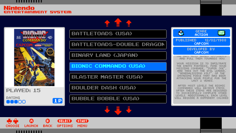
I've tweaked the layout a bit more.
- The metadata and boxart frames a slightly larger.
- Published by and developed by are placed above the boxart.
- There is now a grey background to the boxart area which mirrors the description area background.
I think it's looking better than the previous mock-ups now.
-
This looks amazing!
Just a suggestion, but is there a way for the boxart and the name of the game to scroll horizontally? (like in the NES Classic Edition?) -
@ruckage looking good to me!
-
@itsnitro said in Cardboard Mini NES + Nes mini and Famicom mini themes:
This looks amazing!
Just a suggestion, but is there a way for the boxart and the name of the game to scroll horizontally? (like in the NES Classic Edition?)Not possible I'm afraid, in standard ES you are limited to vertical text lists and a static screenshot/boxart.
-
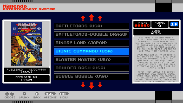
The newest mock looks great.
However, I personally think the publisher and developer text belongs below the boxart. Having it near the top makes it look like it's supposed to be a title.
-
@LiveFastCyYoung said in Cardboard Mini NES + Nes mini and Famicom mini themes:
The newest mock looks great.
However, I personally think the publisher and developer text belongs below the boxart. Having it near the top makes it look like it's supposed to be a title.
Thanks, It was my first instinct as well but it looked slightly odd to me underneath as it doesn't match the other side of the screen so well. I'll upload another mockup so you can see how it looks.
-
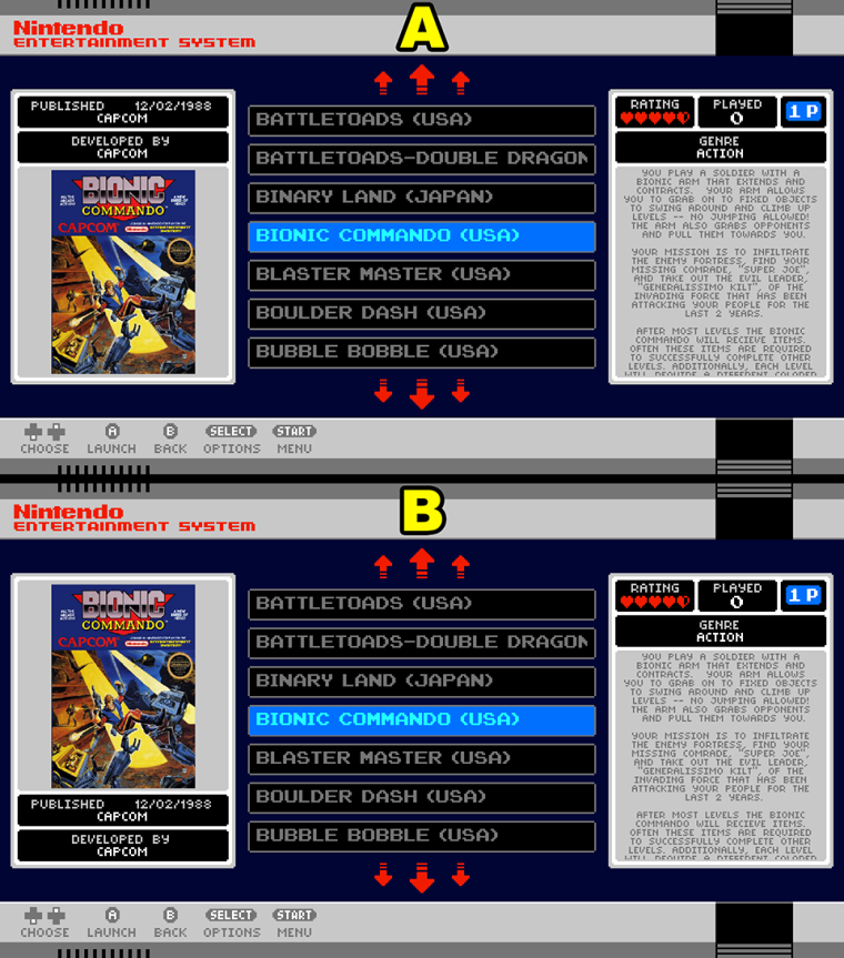
Here is the same layout with 'published by' and 'developed by' moved beneath the boxart. To me it looks unbalanced so I prefer it with that information above the boxart.
-
Hey @ruckage Your theme is amazing! Thank you!
@ruckage said in Cardboard Mini NES + Nes mini and Famicom mini themes:
Here is the same layout with 'published by' and 'developed by' moved beneath the boxart. To me it looks unbalanced so I prefer it with that information above the boxart.
-
@ruckage said in Cardboard Mini NES + Nes mini and Famicom mini themes:
Here is the same layout with 'published by' and 'developed by' moved beneath the boxart. To me it looks unbalanced so I prefer it with that information above the boxart.
I personally like this one better as well... has better balance...
-
Okay, I'm confused now as to what people actually prefer. I personally like the information at the top as visually it looks more balanced to me but I will let you all decide.
If everyone interested could make a post stating either A or B as your preference from the image below that would be great.
-
Its close but I think B just edges it.
Contributions to the project are always appreciated, so if you would like to support us with a donation you can do so here.
Hosting provided by Mythic-Beasts. See the Hosting Information page for more information.