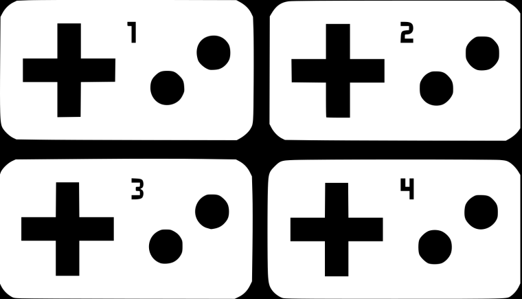
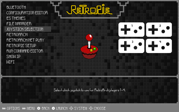
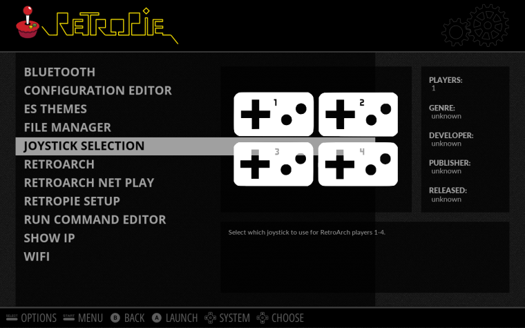
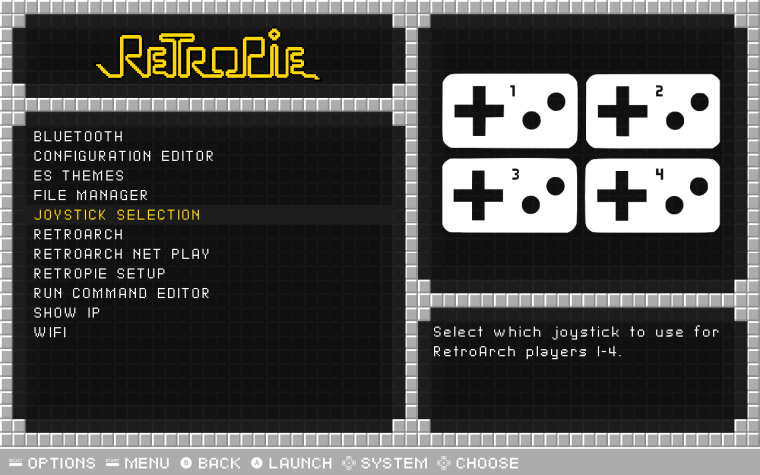
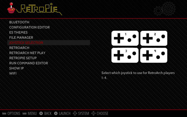
Here is a way to select joystick for players 1-4 (global or emu specific)
-
@Rookervik
This isn't an "official" tool, but some users are enjoying it.It's a tool to configure the joystick input for RetroArch players 1-4. Not to configure the buttons, it's just what controller will control the players 1-4.
https://github.com/meleu/RetroPie-joystick-selectionAfter the installation, the tool is launchable at RetroPie menu and it has a description.
I was thinking on a image with 4 mini-joysticks on the left and 4 numbered retroarch-space-invaders-like symbols on the right and some scrambled lines connecting each other side. Or something like that... But If you want to honor us with an image, I trust in your artistic skills, do as you want!
-
@meleu How about this?

-
@lilbud Looks good, but I'd remove the numbers. That'd make a great icon.
-
@lilbud Thanks!
I was thinking in something to refer to the possibility of reordering.
-
@Rookervik Fixed It
-
@lilbud Good stuff lilbud :D
-
@meleu
http://i.imgur.com/vSiUQjm.png what about this?
-
@lilbud the d-pad and the buttons are transparent, so it doesn't look fine with Carbon theme, for example...
-
@meleu I will fix it soon, I am not home at the moment.
-
@lilbud and what about that numbers inside the pads?
Let's wait you get at home... -
@meleu I will get on that
-
@lilbud hahaha. That Squidward Quincy Tentacles video was funny!
I mean the numbers inside the pads, not outside like the old. :-) -
-
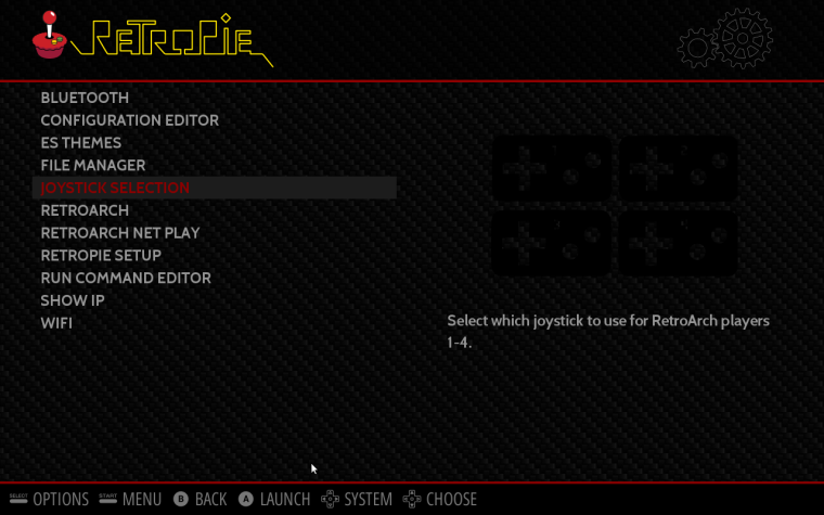
@lilbud about the d-pad and buttons (and now the numbers) transparency:
-
@meleu this should be the white svg
https://drive.google.com/open?id=0B3U0bE6LTfFQX0NUbk1BUUhNVFk
-
@lilbud (let me know if I'm acting like the Bubble Budy. (yeah! I think I am))
Can the d-pad, buttons and numbers be opaque?
The transparency between the controllers are good, but the inside the controllers (d-pad and buttons) it looks strange (getting the background colors). -
@meleu what exactly do you mean? Post a screenshot. I will be leaving for a game soon. I'll get it when I get back
-
-
@meleu Cheers for giving MetaPixel a try. Any thoughts or critiques for me?
Also, I'm working on something special that I think has been lacking from the Theme Scene, but it's going to take me a little time.
-
@mattrixk does anyone it have anything to do with grid view?
Contributions to the project are always appreciated, so if you would like to support us with a donation you can do so here.
Hosting provided by Mythic-Beasts. See the Hosting Information page for more information.
